- Agency: UX Team
- Client: Athena
- Category: App Design — Professional Services
- Location: Franklin Lakes, New Jersey, United States
- Project Brief: Design a unified XDR dashboard that consolidates cybersecurity data into a streamlined interface, helping security teams investigate threats faster with AI-assisted insights and intuitive workflows.
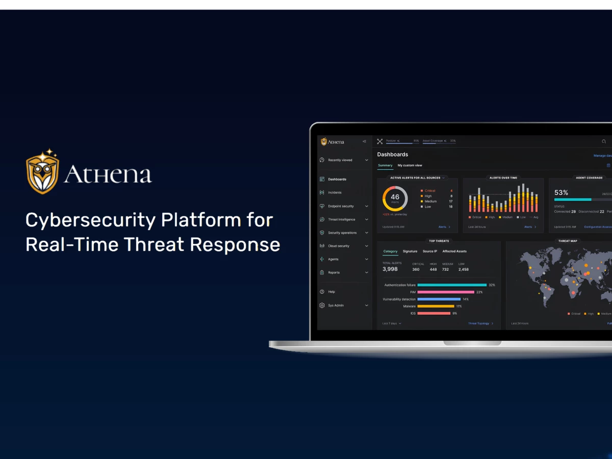
Professional services apps for security teams all pitch the same "single pane of glass" line. Most of those panes end up as one more screen to check. Athena is a rare case where the promise holds, pulling endpoints, threat intelligence, and cloud environments into one experience built for detection and response.
UX Team started with the ugliest part of an analyst's day: figuring out where an incident came from and how far it spread. Their fix is the incident flyout. Click a threat and the affected assets, IOCs, and recommended next actions open in a panel, so the whole investigation happens without leaving the dashboard. What used to take a tour through three tools now takes a click.
The AI layer carries the next goal. An AI analysis block sits at the top of every incident, reading the situation before the analyst does. UX Team says those summaries cut alert fatigue and speed up response, and that tracks. When the summary is already written, triage stops being research and becomes review.
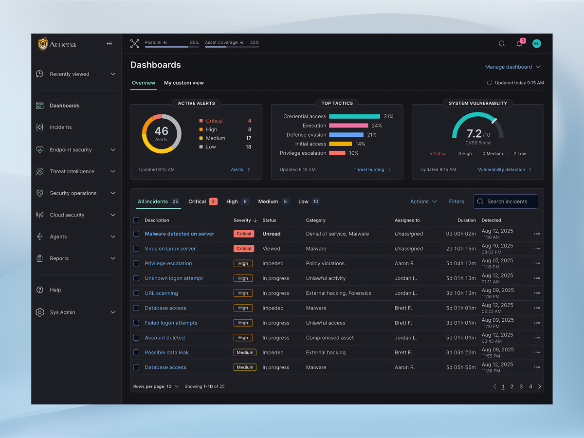
Then there's the noise problem. A wall of 46 alerts helps nobody, so the dashboard makes a call: severity filters and color coding push the four critical items forward and let the rest fade back. Real-time animations keep users aware of shifting metrics without pulling focus. The design decides what matters so the analyst doesn't burn attention deciding.
Accessibility at UX Team rests on outside credentials, not internal assumptions. Jessica Beck, the firm's on-staff accessibility expert, holds the DHS Trusted Tester Certification for web accessibility from the U.S. Department of Homeland Security, and the rest of the design team is completing the same program now.
The certification changes the work, not just the bio. "Early on, I review designs against the WCAG 2.2 AA standards," Beck says. "During critiques, I'm looking for potential barriers before they get built." Once designs mature, she runs them through keyboard-only navigation and screen readers.
That discipline shows in the dashboard's high-contrast severity cues and readable hierarchy, details that matter when an analyst stares at this screen for a full shift.
Ask the team why they built the expertise in-house instead of buying a compliance audit before launch, and the answer is blunt. "A lot of the things we do to make our designs more accessible also make our designs more usable," Beck says. "The two really go hand in hand."
Athena is the proof. The same choices that serve a screen reader user serve an analyst under pressure at hour seven of a shift. The commitment runs from the first wireframe through the final prototype and front-end assets, and clients walk away with a product they can market as accessible.
UX Team sums up the result as less cognitive load and a stronger ability to catch and handle threats in real time. In a product where seconds decide outcomes, that's the win the whole design points at.
Impact and Results
- Unified dashboard consolidating endpoint, threat intelligence, and cloud data into one experience
- Real-time animations keeping users aware of shifting metrics without distraction
- AI-driven summaries reducing alert fatigue and speeding response
- Incident flyouts allowing full investigation without leaving the main dashboard
- Accessibility built in from the first wireframe, tested against WCAG 2.2 AA by a DHS Trusted Tester
- Lower cognitive load and stronger real-time threat detection and response