Team Behind the Design
Smart buildings need smarter interfaces. With Neuro’s new management app, UX Team delivers exactly that: a platform that turns dense technical data into structured, readable insight across every user role.
App Design Analysis
What stands out to me in any strong tech app is how it handles flow, focus, and hierarchy. Neuro’s redesign nails all three and successfully turns technical complexity into something anyone can use with confidence.
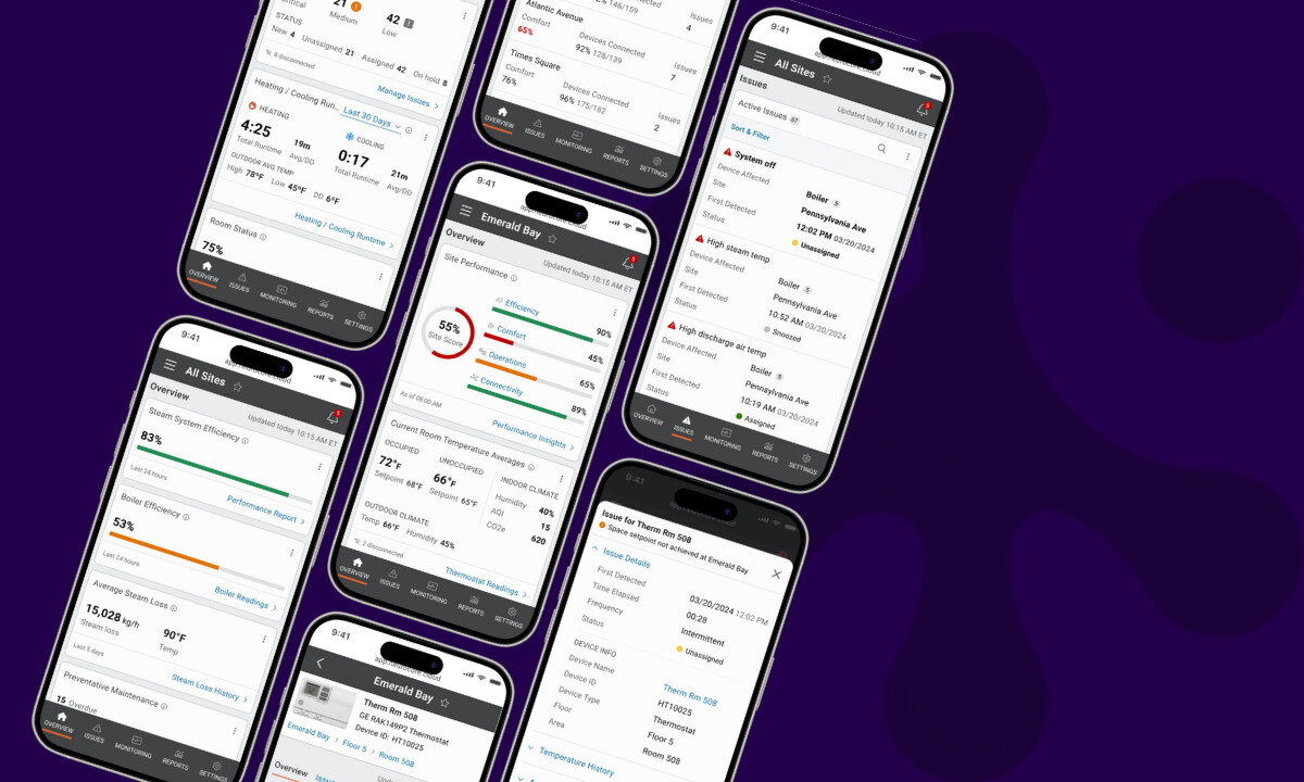
- Interaction Flow: I appreciate how the navigation creates seamless transitions between monitoring, issues, and reports. Users can access complex IoT data in one or two clicks, a notable improvement for workflow efficiency.
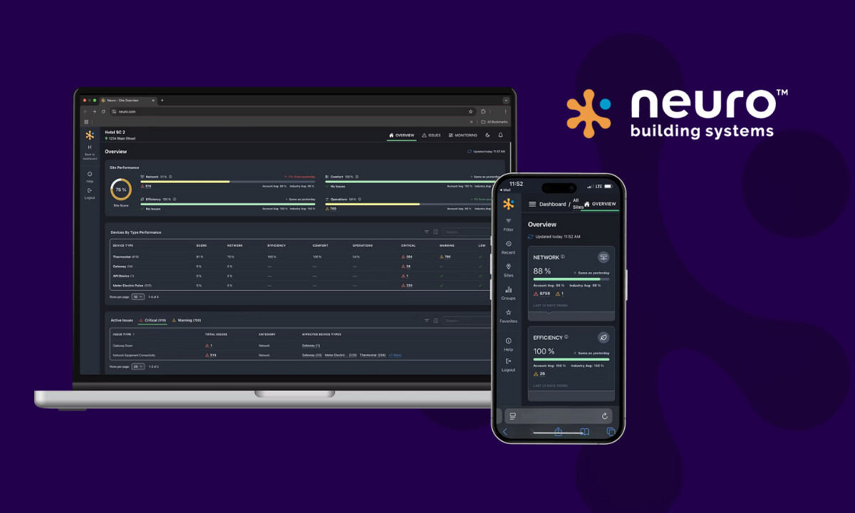
- Visual Hierarchy: Neuro’s modular cards for Network, Efficiency, Comfort, and Operations scores work well. Data visualizations feel digestible, not overwhelming. Clean typography, consistent iconography, and lightweight animations help turn what could be a dashboard of spreadsheets into something genuinely readable.
- Role-Based Dashboards: Personalized layouts for hotel managers, technicians, and executives ensure that each user sees data relevant to their goals. This approach can significantly reduce cognitive load and improve daily task flow.
- Scalability & Branding: Adding white-label flexibility was a smart long-term move. Neuro’s clients can rebrand the interface without breaking its logic. It keeps consistency where it matters (grid, navigation, and data hierarchy), while giving enterprises room for their own branding.
What Agencies Can Learn from UX Team
This project reads like a field manual for anyone designing platforms where data, people, and decisions intersect.
And here are a couple of things you want to take note of:
1. Simplify Without Dumbing Down
What I like about UX Team’s approach is that they didn’t flatten the system. Instead, they framed it. Through hierarchy and smart categorization, they made building analytics speak a common visual language that both engineers and executives can understand.
2. Personalization is the New Default
The role-based dashboards turn one product into many. For multi-role systems, that’s the smartest UX investment you can make. It gives relevance without multiplying design debt.
3. Design for Scalability, Not Just Launch
White-label readiness might not look glamorous, but it’s what future-proofs a platform. UX Team understood that design systems need to serve both brand identity and operational consistency.
4. Data Needs Rhythm, Not Just Graphics
I like how the visual system treats data visualization as part of a narrative, not just a chart. Small things like sparklines, card states, and subtle motion make it easier to spot patterns and act faster.
About DesignRush Featured Designs
At DesignRush, we review hundreds of digital projects every month. The featured designs stand out for their creativity, functionality, and strategic execution.
Projects like Neuro’s Building Management App exemplify how data-driven design can transform complex software into intuitive tools. The most outstanding entries advance to our Monthly Design Awards, recognizing excellence across industries.
Explore More Designs
- Best App Designs
- Best Website Designs
- Best Logo Designs
- Best Print Designs
- Best Packaging Designs
- Best Video Designs
For a full list of design agencies and related services, visit our Agency Directory.

-preview.jpg)