- Agency: Unseen Studio
- Client: Illoca
- Category: Logo Design — Architecture
- Location: London, United Kingdom
- Project Brief: Design a refined architectural identity that reflects the craft of hand-drawn design through layered visual elements, custom typography, and a precise, scalable logo system.
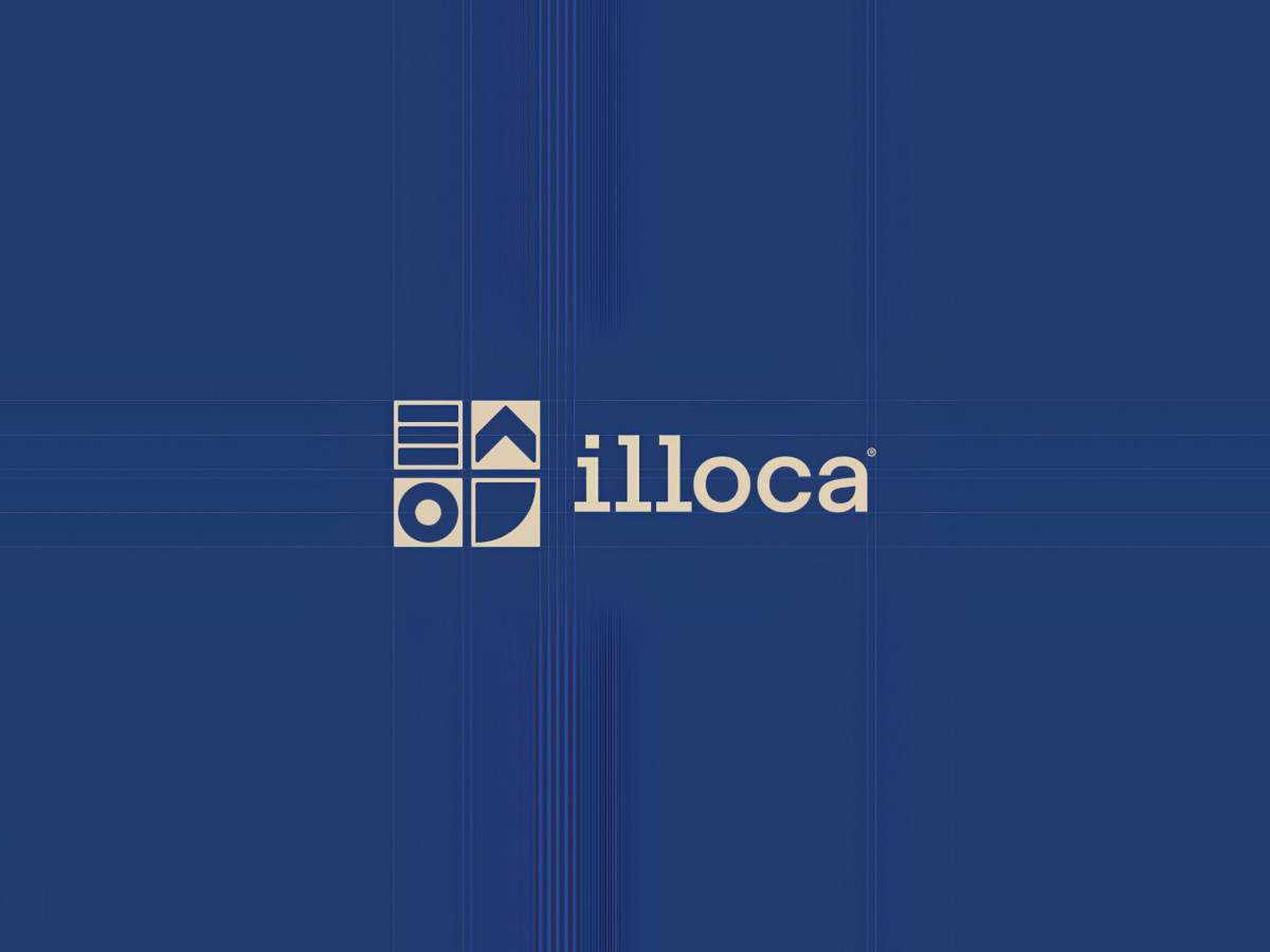
Logo design for an architecture brand carries the most weight when the mark holds the logic of building before any element reads as literal. Illoca answers with a four-part square that combines stacked drawing layers, an upward roofline, a plan circle and a quarter arc into one compact system.
The grid holds each idea in equal weight, with every cell a distinct architectural gesture rendered in flat geometry. Blue keeps the read cohesive across the light and inverted applications.
The wordmark pairs Haffer SemiMono Medium with optically adjusted letter spacing, which gives the lowercase forms an even, technical rhythm. That mono influence ties the type back to drafting tools and construction sheets.
The lockup sets mark and wordmark side by side on the same construction guidelines, so the balance stays fixed at any scale. Unseen Studio built an identity that works as a tool for architects rather than ornament.