- Agency: H:12 Creative Studio
- Client: Momentum
- Category: Logo Design — Technology
- Location: Treviso, Italy
- Project Brief: Create a logo and visual identity for Momentum that expresses voice-first dating and authentic human connection through a distinctive soundwave symbol and a flexible visual system.
Technology built for dating runs on swipes and profile photos, so a voice-first app needs a symbol that points somewhere else. This identity for Momentum, a dating platform built around listening turns a sound wave into its logo, then carries that wave through the rest of the brand.
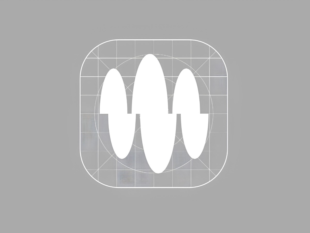
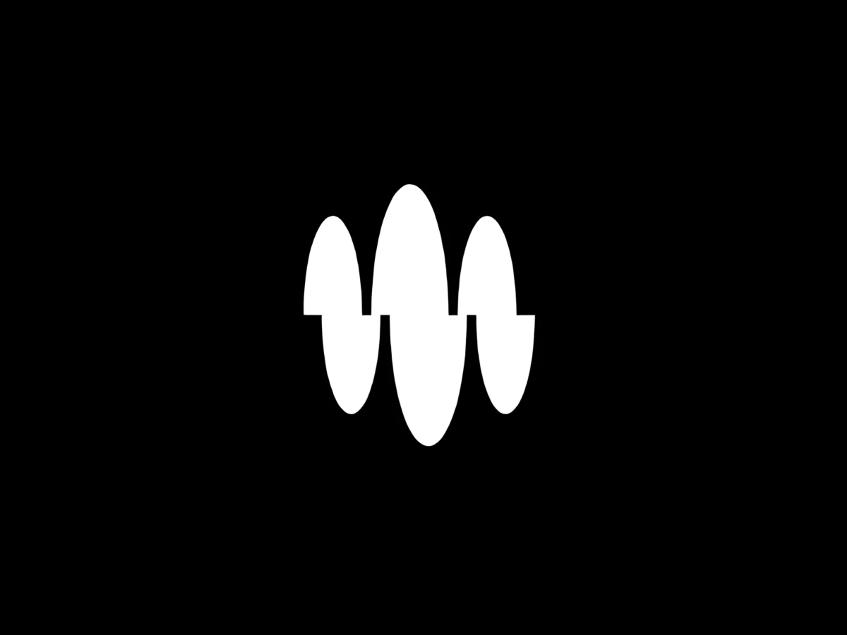
The icon packs a short sound wave into a rounded square, with black oval shapes that rise and shift along a thin center line. Each oval sits slightly offset from the one beside it, so the mark looks like a voice caught mid-sentence.
Next to the icon, “Momentum” sits in a light, sharp-edged serif that reads more like a magazine masthead than a typical app name. A strict palette of black and soft gray keeps the focus on the shape of the wave.
The same wave moves onto screens, where white ovals swell across a black smartwatch face like a live voice note. On merch, the icon and wordmark shrink to a small lockup on a black sweatshirt and still read clearly.