
Standout features:
- Soothing color story
- Cool design execution
- Edgy and avant-garde style
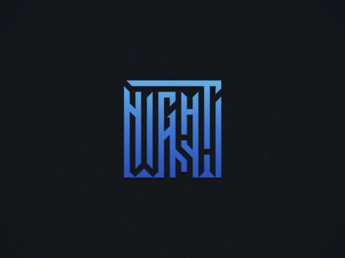
People love negative space logos because it gives a layer of coolness to the overall design. The etched design effect is perfect, especially for those who are into edgy aesthetics.
This design by Sergio Storm is an excellent example of how negative space logos can be relaxed without even trying.
The designers used a stunning shade of blue to represent the brand's edgy and hip personality, effectively catering to its target audience. It exudes iciness without being too cold -- an ideal design aesthetic.
Overall, this is an excellent logo. The brand wanted an effortless avant-garde design, and the agency delivered!
Get a chance to become the next Design Award winner.
SUBMIT YOUR DESIGN