- Agency: Noetic Brands
- Client: Seshaasai
- Category: Logo Design — Finance
- Location: Toronto, Canada
- Project Brief: Create a technology logo design for Seshaasai that integrates a dandelion-inspired concept with customized typography and a fresh, culturally informed color palette.
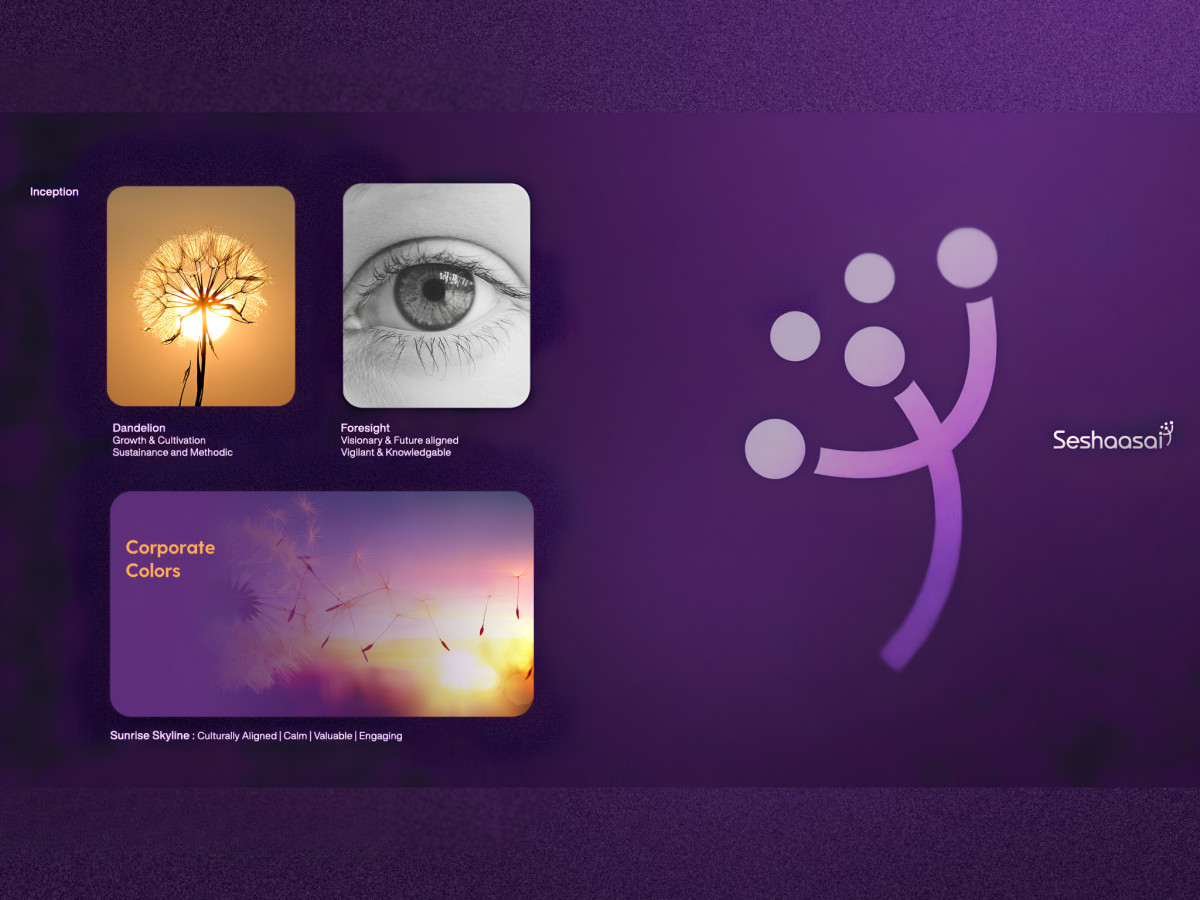
A fintech logo leans on the same shorthand, a swoosh, a circuit node, an abstract globe. Noetic Brands took Seshaasai somewhere warmer and built the mark on a dandelion, a metaphor for a company whose many product offshoots spread from one root.
The concept turns a fragile plant into a fit for RFID and card manufacturing. A dandelion carries proliferation, resilience, and dispersal, so a delicate image ends up matching a hardware and payments firm better than any circuit would.
The brandmark reads as a single traveling floret in motion. Seed-tipped strokes lift off a curved stem and read as forward momentum, so the symbol captures growth and dynamic energy rather than a static logo.
The 300 florets stand in for the company's product spread. One dandelion holds hundreds of seeds the way Seshaasai holds RFID, smart cards, and tax tech under one name, so the mark makes a sprawling portfolio legible.
The dandelion lives inside the wordmark, not beside it. The symbol rises off the end of a custom lowercase "Seshaasai," so the name and the mark read as one unit rather than a logo bolted onto a font.
Color comes from Flame Orange and Rajah, the hues of a rising sun. The palette signals new beginnings and, through Agni, fire that burns away darkness into knowledge, so warmth carries real cultural meaning rather than decoration.
A purple accent blends the sage and the hero. It pairs the calm of technology with the passion of people, so the identity holds stability and courage in one color story.
The identity scales from a card chip to a transit billboard. The mark rides payment cards, station posters, and stationery in solid color or knocked out on deep purple, so it stays legible small and commanding large.
The architecture runs monolithic, with sub-brands under one parent. Niche products inherit the parent's equity through a shared visual language, so a 1,200-person company with a wide catalog still reads as one brand.
The underlying brand shape borrows mitosis, the way a cell divides. Growth by replication ties the whole visual language back to the dandelion idea, so the logic holds from mark to pattern to page.
The smart move was picking a living thing over a circuit. Seshaasai now owns a mark that says growth and spread in one glance, which is rarer in fintech than another blue swoosh.