- Agency: AUGE Design
- Client: Meurisse
- Category: Packaging Design — Chocolate
- Location: Milan, Italy
- Project Brief: Create packaging for Meurisse chocolates that celebrates the brand’s heritage and spirit of exploration.
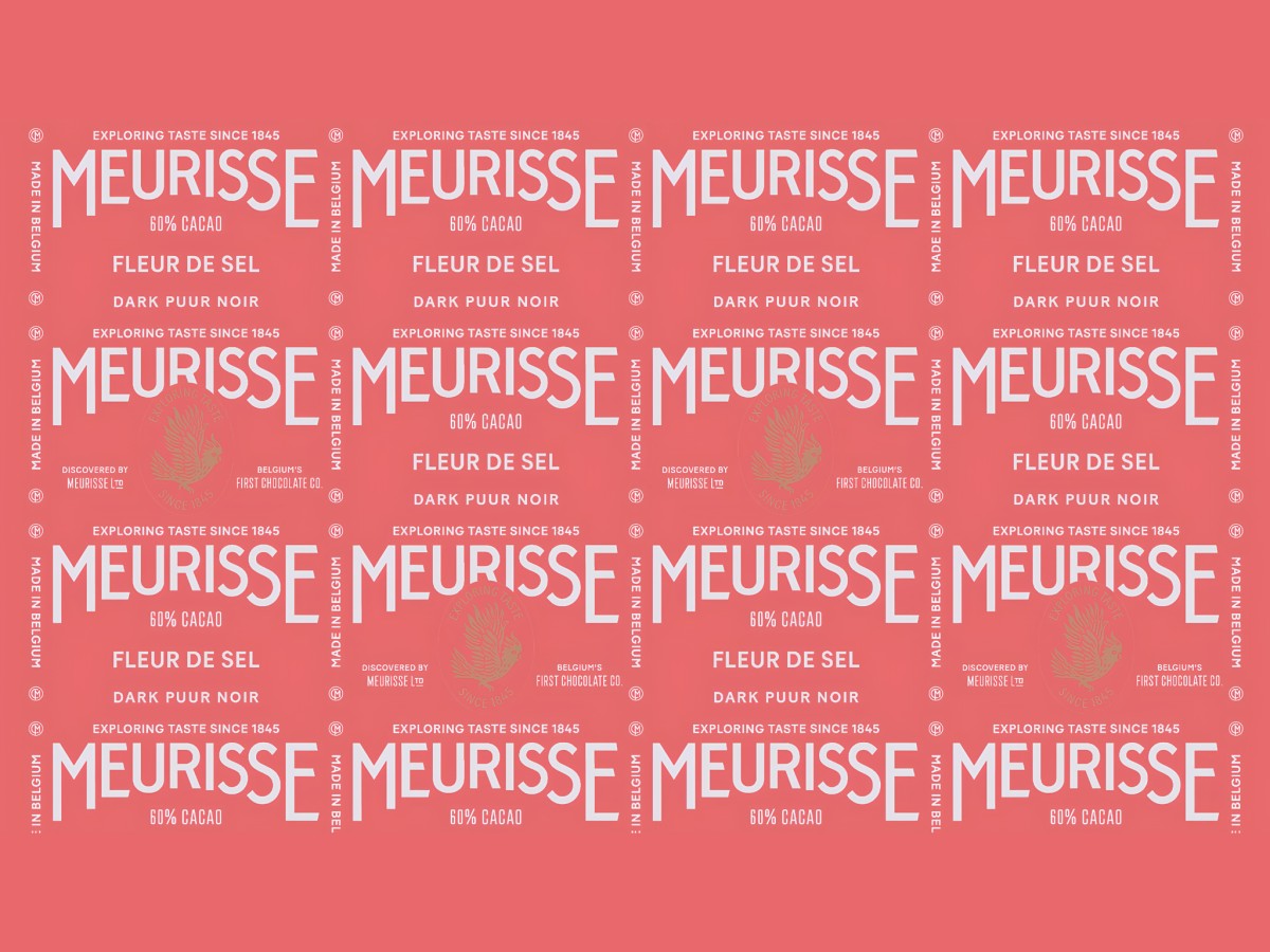
Chocolate packaging for a choclatier founded in 1845 fits a long history onto a wrapper you glance at for a few seconds in the aisle. Meurisse, Belgium’s first chocolate company, keeps its familiar arched logo and frame and turns them into a travel story told bar by bar.
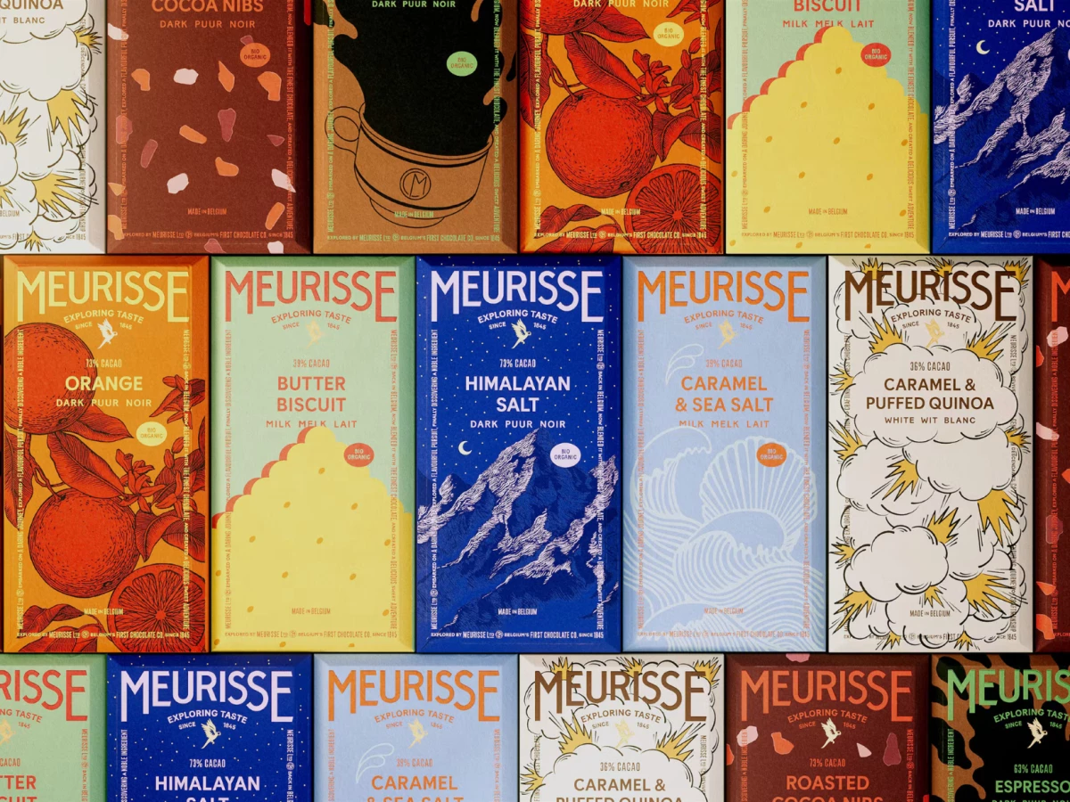
The arched wordmark now climbs in stair-stepped tiers, so the tall, condensed capitals read like the title card of an adventure film. Printed in cream, coral, or lilac depending on the flavor, it anchors the top of every bar.
Inside the frame, each flavor gets its own postcard scene, from engraved oranges on tangerine to snowy Himalayan peaks under a starry cobalt sky. Caramel and sea salt gets curling waves on powder blue, and butter biscuit gets a scalloped yellow cookie on mint.
Chocolate spread jars seal their navy lids with a strip of colored tape over the restored CM monogram, much like a parcel ready to ship. The parrot emblem and trilingual “dark, puur, noir” labels keep the Belgian roots in plain view.