- Agency: Land
- Client: Paco Jones
- Category: Packaging Design — Food and Beverage Packaging
- Location: Austin, Texas, United States
- Project Brief: Design bold condiment packaging that celebrates Mexican and American influences through expressive typography, vibrant branding, and a distinctive shelf presence.
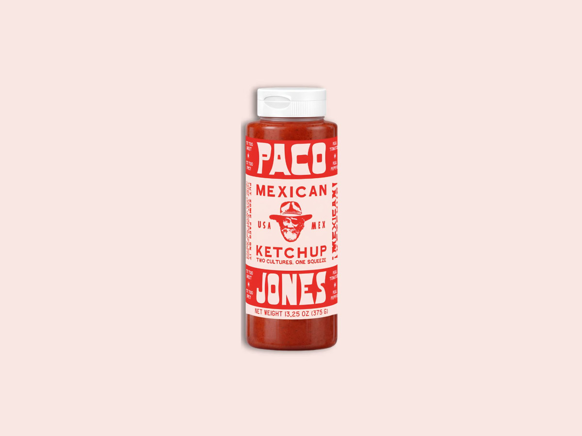
Condiment packaging lives or dies on the shelf, where a bottle has a half-second to say what it is and who it is for. Paco Jones answers with loud display type and a squeeze-bottle format that reads clearly from arm's length.
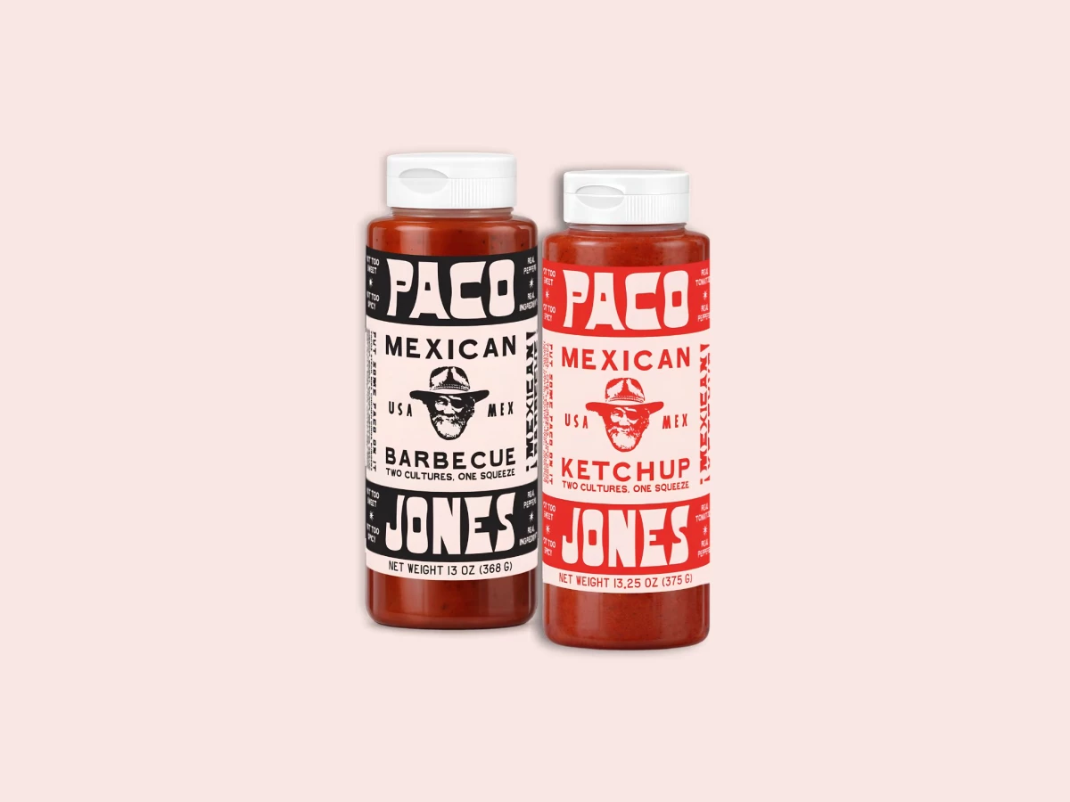
The typography carries the whole system. Chunky rounded letterforms stack PACO over JONES in bands top and bottom, framing a woodcut-style portrait and the "USA MEX" tagline that states the two-cultures premise without a paragraph of copy.
Color does the sorting work across the line. Barbecue runs black on cream and ketchup runs red on cream, so the two flavors stay siblings while a shopper tells them apart in an instant.
The margins earn their keep too. In a food and beverage aisle crowded with legacy labels, vertical callouts like "Put some Paco on it," "Not too sweet," and "Real tomatoes" wrap the sides, giving the label a hand-printed, market-stall energy that suits the brand's playful voice.