- Designer: Mo Kalache
- Client: Dar Beirut
- Category: Print Design — Restaurant Menu
- Location: Barcelona, Spain
- Project Brief: Create print design for Dar Beirut’s menu that translates Beirut’s heritage and social rituals into a contemporary hospitality experience through typography and composition.
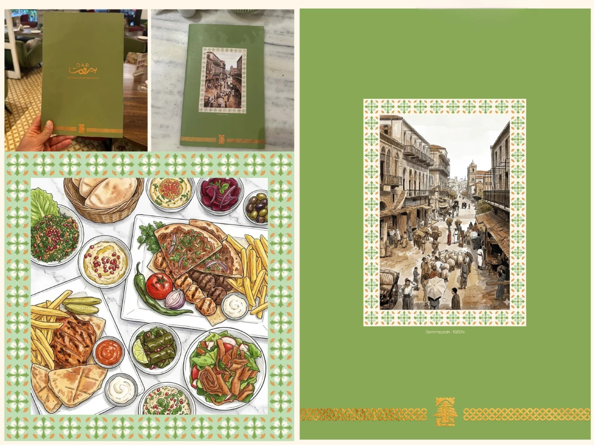
Restaurant menu design that carries a century of history has to feel lived-in rather than staged. Mo Kalache builds Dar Beirut around its Gemmayzeh roots, wrapping the menu in sepia street scenes, Levantine tile borders, and hand-drawn dishes that tie the food to the neighborhood.
The heritage imagery anchors every spread. A 1920s Gemmayzeh street illustration on the cover and vintage car scenes inside frame the menu as a piece of Beirut's story, not a fresh concept dropped in.
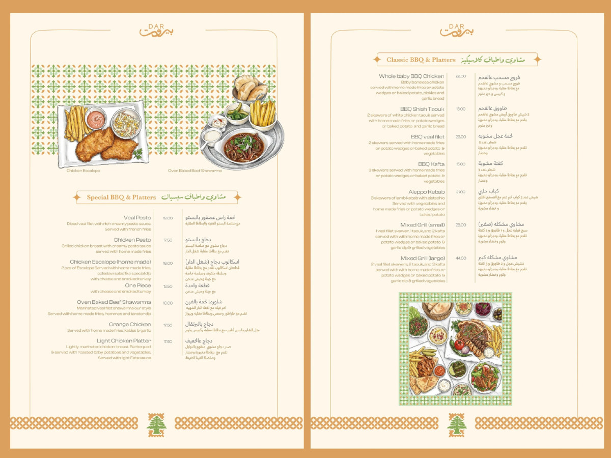
The tile patterns build the visual system. Green-and-orange geometric borders echo Levantine floor tiles and run across covers, photo frames, and page edges, giving the whole set a consistent regional signature.
The bilingual type keeps it authentic and legible. Arabic and English sit side by side in warm gold and green, so the menu reads to both audiences while the cedar mark and script logo hold the Lebanese identity.
The food illustrations do the appetite work. Watercolor mezze spreads, grilled platters, and piled desserts replace photography, matching the hand-crafted, social tone of gathering around a Beirut table.