- Agency: Ana Couto
- Client: Desbrava
- Category: Print Design — Travel
- Location: Rio de Janeiro, Brazil
- Project Brief: Create print design for Desbrava that promotes Brazil’s tourism ecosystem through compass-inspired graphics, national colors, and an engaging identity rooted in exploration and discovery.
Travel print built to sell a whole country has to feel as alive as the place itself. Ana Couto gives Desbrava an identity that pours Brazil’s own color, wildlife, and people straight into the letters of its name.
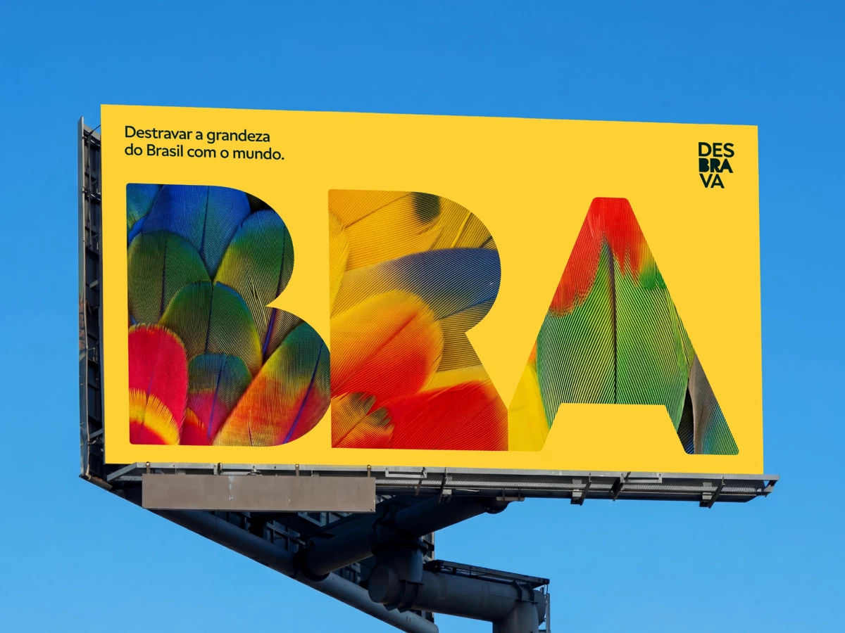
The cutout letterforms turn the country’s name into a window. Because each letter frames a photo instead of a flat color, you read “Brazil” and see its macaws, beaches, artisans, and rivers at the same time, so the brand promises variety before a single line of copy does.
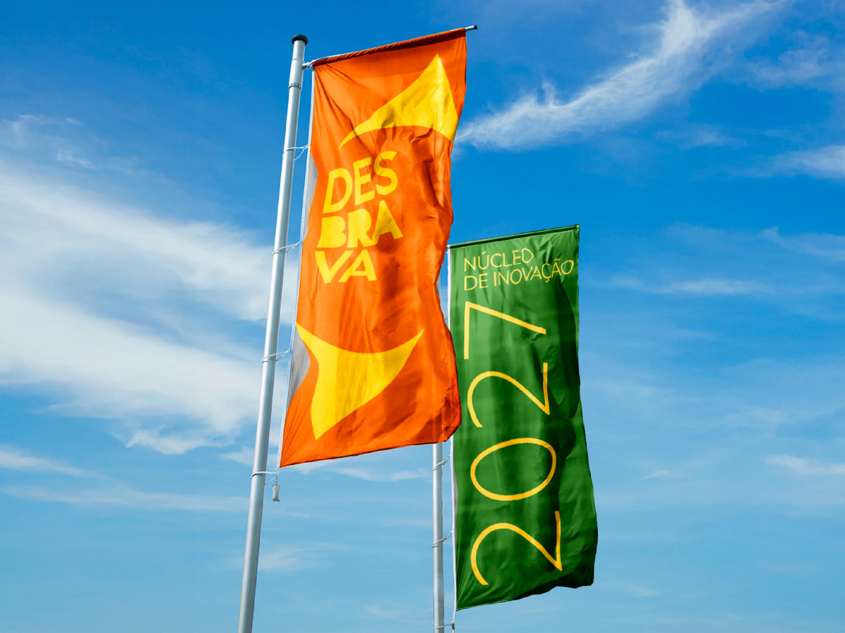
The palette makes it warm and instantly Brazilian. Pulling the cheerful yellows, oranges, and greens from the national “Brazil” identity keeps the whole system feeling human and inviting, which matters when the goal is to make travelers want to experience the place, not just visit it.
The compass-and-lens mark gives all that energy a center. Built from the circle and rhombus of the flag, it frames Desbrava as a guide through the many sides of the country, so the loud, joyful visuals still ladder up to one clear idea: a platform that helps the world navigate Brazil.