- Agency: Wiedemann Lampe
- Client: Gunnersbury Park & Museum
- Category: Print Design — Arts & Recreation
- Location: London, United Kingdom
- Project Brief: Design a print identity and wayfinding system that celebrates Gunnersbury Park & Museum's heritage, strengthens community engagement, and creates a cohesive visual experience for visitors across the historic estate.
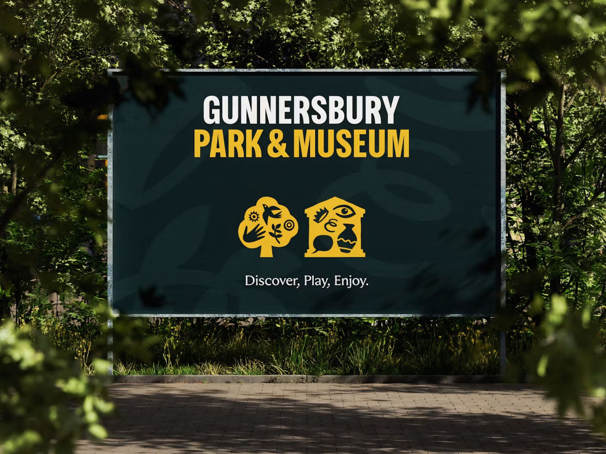
A park and museum has to speak to picnickers and history buffs at once, which makes the recreation print a balancing act from the start. Gunnersbury Park & Museum solves that split with a modular icon language that mixes and matches for either mood.
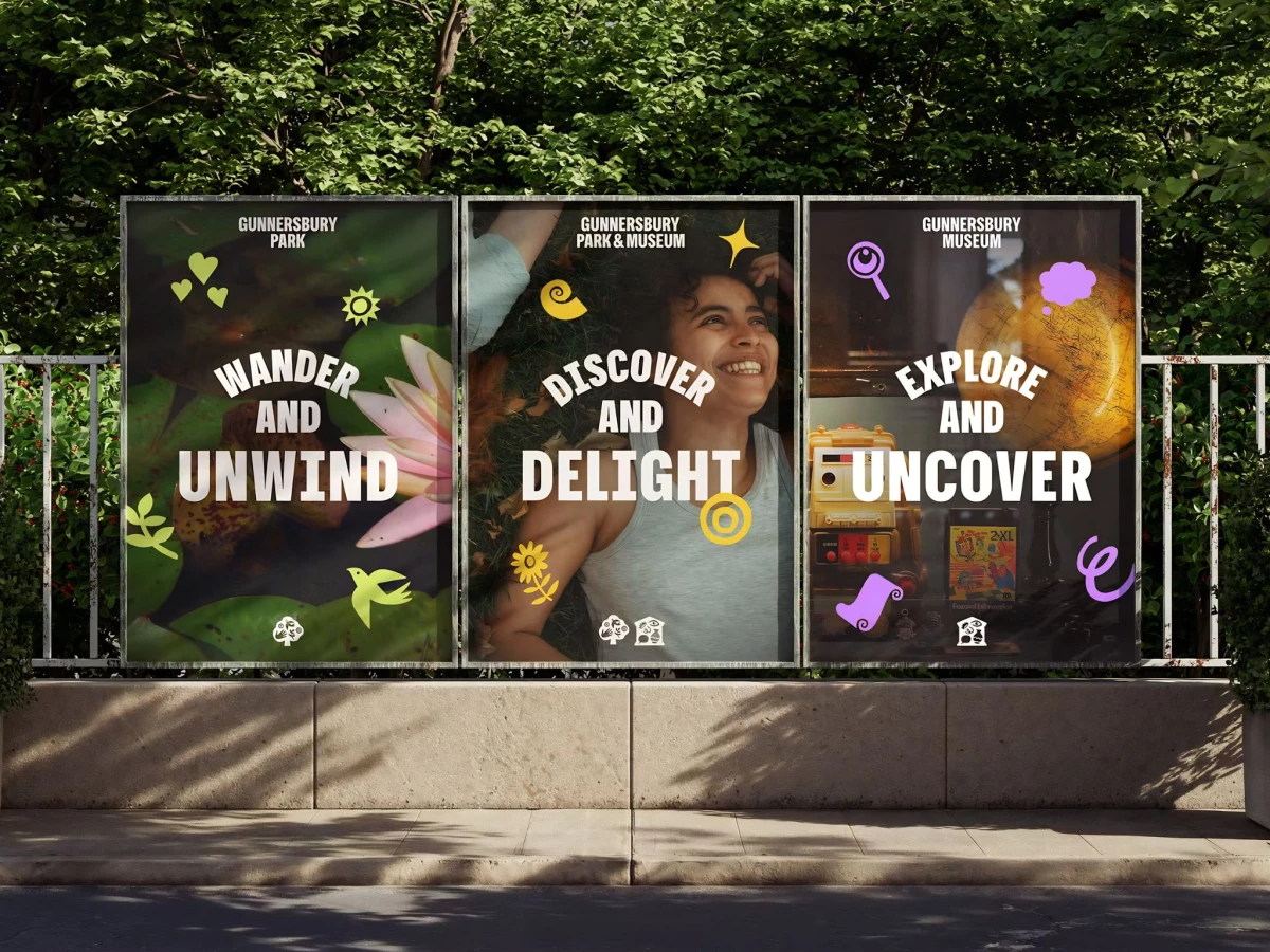
The system runs on a bold set of cut-paper symbols: swallows, suns, hearts, magnifying glasses, and scrolls. Each pairs to a purpose, greens and nature marks for the park, purples and eye-and-lens marks for the museum, so the identity flexes without breaking apart.
The two logo icons carry the whole split, a hand-and-nature emblem for the park and a pediment-and-artifact emblem for the museum. Locking them side by side lets the combined brand read as one place with two offers.
Wiedemann Lampe kept the type loud and arched over full-bleed photography and flat color fields alike, from "Wander and Unwind" to "Explore and Uncover." That range is what carries the identity across posters, banners, and wayfinding while keeping a 100-year-old estate feeling open rather than stuffy.