- Agency: TouchZen
- Client: JetBay
- Category: Website Design — Travel
- Location: Irvine, California, United States
- Project Brief: Redesign JetBay’s travel website to make private aviation more approachable through transparent pricing, real-time availability, intuitive booking flows, and a premium digital experience.
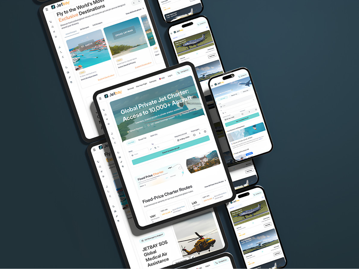
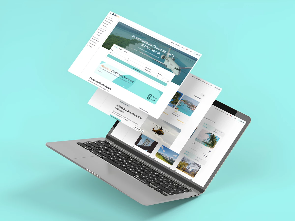
Private aviation has long sold travel through secrecy, hiding prices behind a contact us button that treats a quote like a velvet rope. TouchZen rebuilt JetBay on the opposite bet and put real routes, dates, and fares in front of the user before anyone asks them to call.
The homepage opens on a live search bar instead of a sales pitch. One-way, round-trip, and multi-city tabs sit over From, To, date, and passenger fields, so a flyer prices a trip in the first screen rather than hunting for a way in.
The fixed-price section turns the category's biggest secret into a grid of real fares. Cards show VNY to LAS from USD 13,800 on a light jet with a passenger cap and a Book Now link, so the number competitors withhold sits in plain view.
Empty legs get their own reduced-rate row with alerts. A flyer who does not see their route can subscribe for matching last-minute deals, which turns a dead-end search into a reason to come back.
Curated travel arrives as escapes sorted by trip type. Island, ski, and golf tabs open named destinations like Nassau, St. Barts, and Grand Cayman, so a leisure flyer browses by mood instead of airport code.
Frequent flyers get three jet-card tiers at 10, 25, and 50 hours. Each tier names its ideal user and its trade, from occasional flying to priority booking, so a buyer self-selects without a sales call.
JetBay SOS sits up front as a 24/7 medical evacuation service. The block pairs rapid-response air ambulance with the same booking platform, which stretches the brand past leisure into an urgent use case.
The services explain themselves in plain language where the choice happens. Short cards define business, leisure, medical, and pet charter at the point of decision, so a first-timer learns the options instead of digging through an FAQ.
Trust signals carry real safety memberships and press logos. WYVERN, NBAA, and ASBAA marks sit near coverage from Business Times and Business Insider, so a cautious flyer sees third-party proof before booking.
A proof band stacks hard numbers over a world map. More than 10,000 clients, 190 countries flown, and access to 10,000+ aircraft across 1,000+ operators give scale a flyer can weigh in seconds.
The platform runs one flow across web and app, with a currency switcher for a global audience. A flyer who starts on the site and finishes in the iOS app keeps the same booking path and look throughout.
The palette leans on teal and white with a warm accent. Cool tones and open space read premium while the accent marks fares and actions, so the design signals luxury without the old darkness-equals-exclusivity trick.
Transparency is the whole move. JetBay now looks premium while showing its prices, which opens the brand to a wider audience without cheapening it for the clients it already had.