- Agency: Pear
- Category: Website Design — Digital Agency
- Location: Oslo, Norway
- Project Brief: Design a digital agency website that communicates Pear's performance-driven partnership model through bold typography, streamlined navigation, and clear messaging.
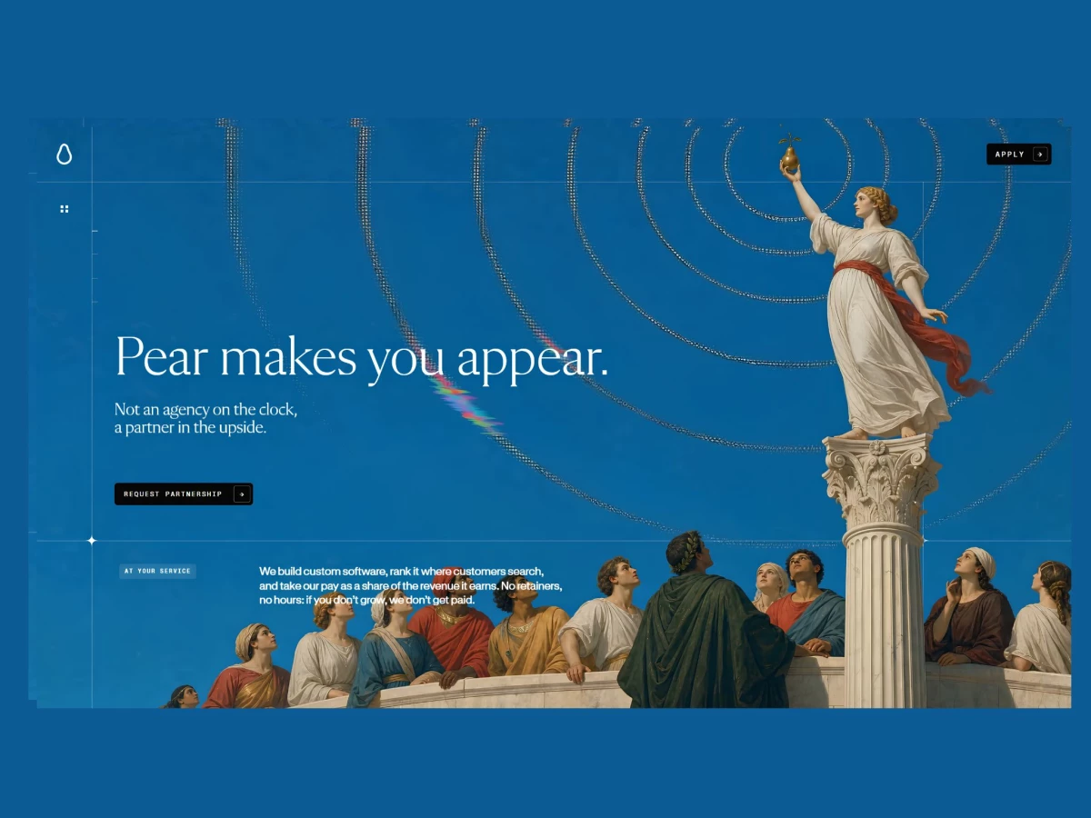
A digital agency website usually opens with a case-study grid and a pitch about the team. Pear opens with its pricing model instead, stating "no retainers, no hours: if you don't grow, we don't get paid" before it shows a single project.
The whole site sells one idea: the risk sits with the agency, not the client. The hero line "not an agency on the clock, a partner in the upside" frames Pear as a revenue-share partner rather than a vendor billing time, so a founder reads the business terms before the aesthetics, which is the order that actually decides a deal.
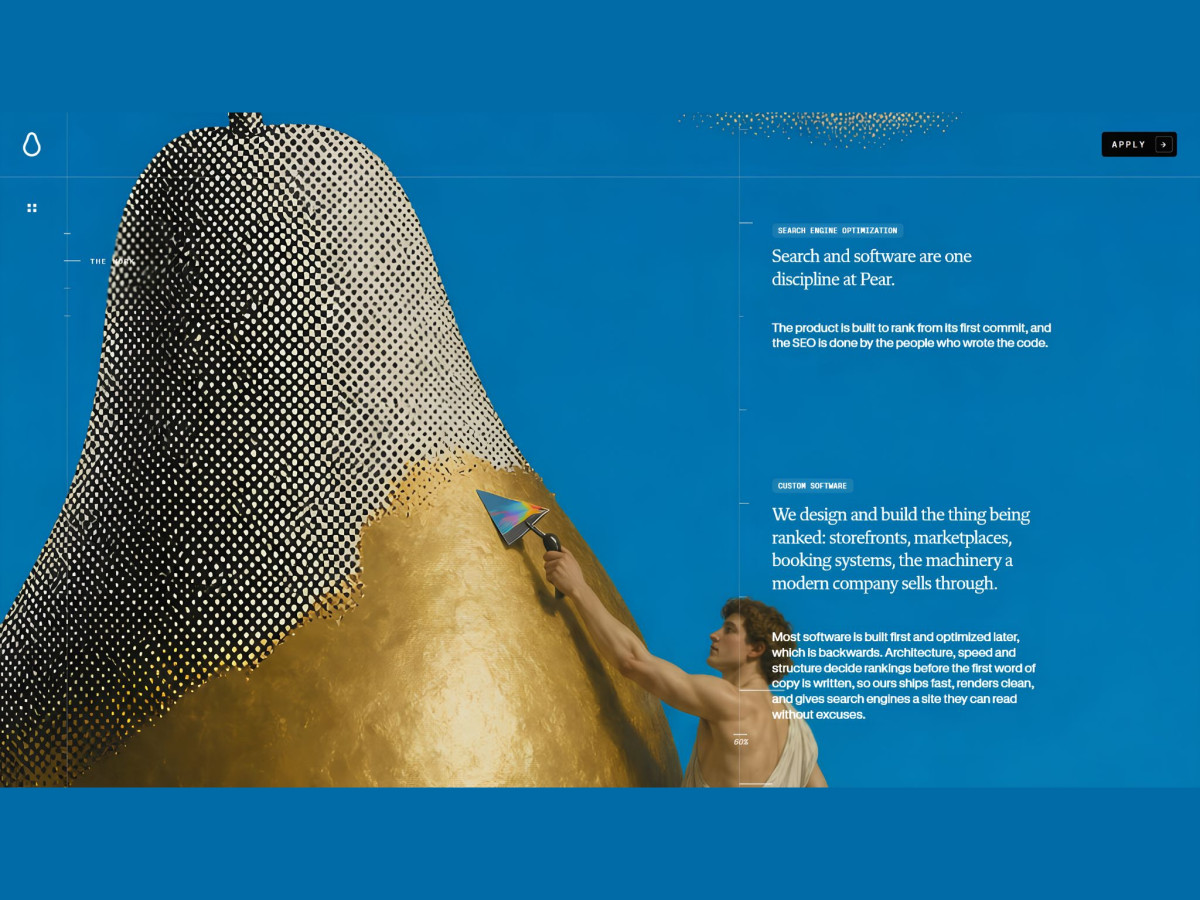
The Renaissance-painting treatment does real work beyond looking good. Classical figures water and prune a pear tree, then gild a giant pear with a rainbow-tipped trowel, turning the abstract promise of growing revenue into something a visitor can picture while the copy explains the mechanics.
The FAQ answers the objection a revenue-share model always raises. The question "What share of the revenue do you take?" gets a direct answer: it applies only to growth above your existing baseline, never to revenue you already had. Putting that in plain sight is what makes the model read as trustworthy rather than risky.
Navigation strips down to match. A single "Apply" button holds the corner at every scroll depth, with "Request Partnership" as the one in-page action, so the journey stays linear and the sparse, lightweight build keeps it fast on any device.