
- Agency: Visual Nexa
- Client: Apis Orient
- Category: Logo Design — Professional Services
- Location: Not specified
- Project Brief: Create a logo and visual identity for Apis Orient that communicates clarity, confidence, and progress through a symbolic bee, diamond, directional elements, and a flexible system of typography, colors, and patterns.
A professional services logo for a consulting firm can say a lot with one smart symbol, especially when the firm’s whole pitch is clear direction. The identity for Apis Orient draws its mark from a bee and a diamond, then cuts both into sharp, arrow-like angles.
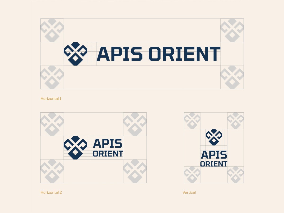
Look at the mark straight on and you’ll see a bee’s face, with hooked wings on either side and a larger diamond body below. Those hooks also read as arrows turning inward, which ties back to the firm’s promise of finding a clear path.
The wordmark sets the name in heavy capitals with clipped, eight-sided corners that match the angles in the mark. The name itself pulls double duty, since apis is Latin for bee and orient means finding your bearings.
Deep navy and honey gold lead the palette, with soft cream for contrast. On a gold background, the name splits into navy “Apis” and cream “Orient,” and stacked versions fit narrower spaces like social icons and business cards.