- Agency: For Different
- Client: Benifex
- Category: Logo Design — Professional Services
- Location: Oxfordshire, United Kingdom
- Project Brief: Develop a human-centered brand identity that reflects Benifex's role in supporting people through life's defining moments while creating a cohesive visual system for consistent global communication.
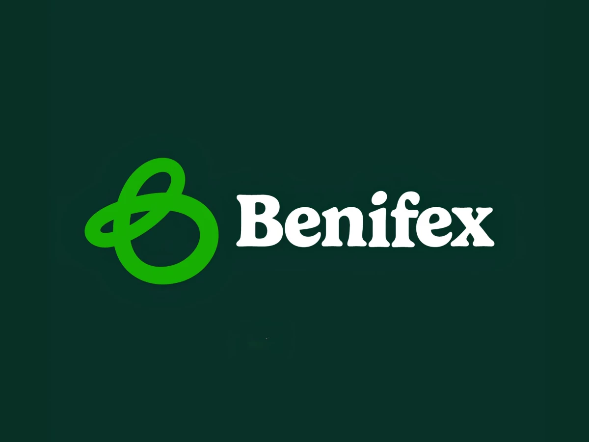
A professional services logo can easily read as cold, but Benifex hand-drew its way around that trap. The mark begins as a looping, ribbon-like "B" made by hand, then digitized, so the final symbol keeps the warmth of a gesture rather than the stiffness of a corporate glyph.
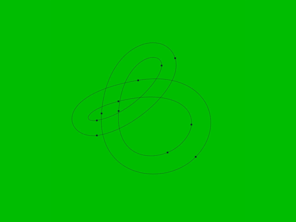
The curve construction shows the care behind it. The vector view exposes a single continuous line looping through a set of anchor points, proving the tangled "B" holds real geometric logic under its casual, human feel.
The color and type choices reinforce that warmth. A bright green mark sits against deep forest green, paired with a rounded, almost retro serif wordmark that softens a category usually built on rigid sans-serif type.
The system holds up across contexts, which matters for a global brand. The mark works as illuminated exterior signage and shrinks cleanly into an app icon beside Finder and Messages, staying recognizable whether it is lighting a wall or sitting in a phone dock.