- Agency: Kave Brands
- Client: Buz-Co
- Category: Logo Design — Automotive
- Location: San Diego, California, United States
- Project Brief: Develop a modern automotive logo that reflects Buz-Co's promise of connecting buyers and sellers through a precise, trustworthy, and movement-inspired identity centered on reliability and performance.
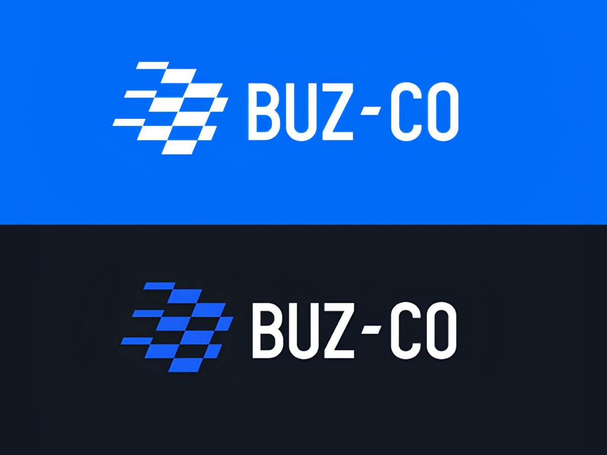
An automotive industry logo has to signal speed without resorting to italic swooshes. Buz-Co gets there with a tilted checkered grid. The mark fuses a racing flag with the letter "B," so the finish-line reference and the brand initial read as one shape rather than two ideas stacked together.
The construction gives the tilt its credibility. Built on a strict mathematical grid, the staggered squares lean sideways at a fixed angle that reads as acceleration, and the loose trailing blocks suggest motion blur without adding a literal effect.
The wordmark carries the same logic. Custom-drafted letters with heavy stems pair with a hyphen slanted to match the icon exactly, giving "BUZ-CO" an industrial weight that holds up at signage scale.
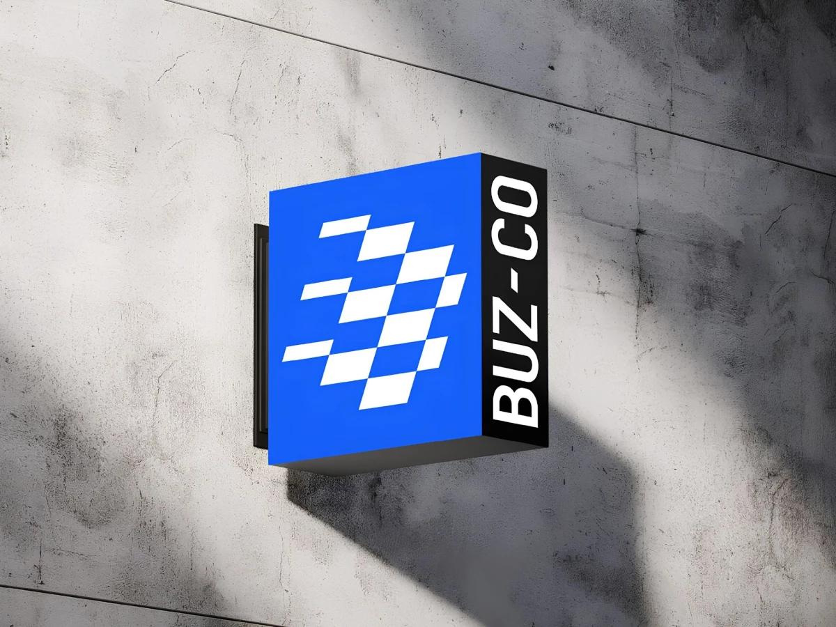
The system flexes across surfaces without losing itself. White on electric blue, blue on black, or lit up as a projecting shopfront sign, the mark stays legible and keeps its aggressive angle whether it is on a booth wall or a phone screen.