- Agency: Firmalt
- Client: Daucor
- Category: Logo Design — Professional Services
- Location: Monterrey, Mexico
- Project Brief: Create a logo design for Daucor that communicates its “Built Right” philosophy through geometric forms, bold typography, and a structured visual system.
Professional services logo work in construction rarely gets to be this sculptural. Firmalt builds the Daucor mark from geometric blocks, turning the initial into a modular unit that stacks and interlocks like the buildings the company puts up.
The construction is the concept. Quartered circles and squared segments assemble into a "D" that reads as both letterform and cast concrete component, cut apart on the grid to show how the pieces fit.
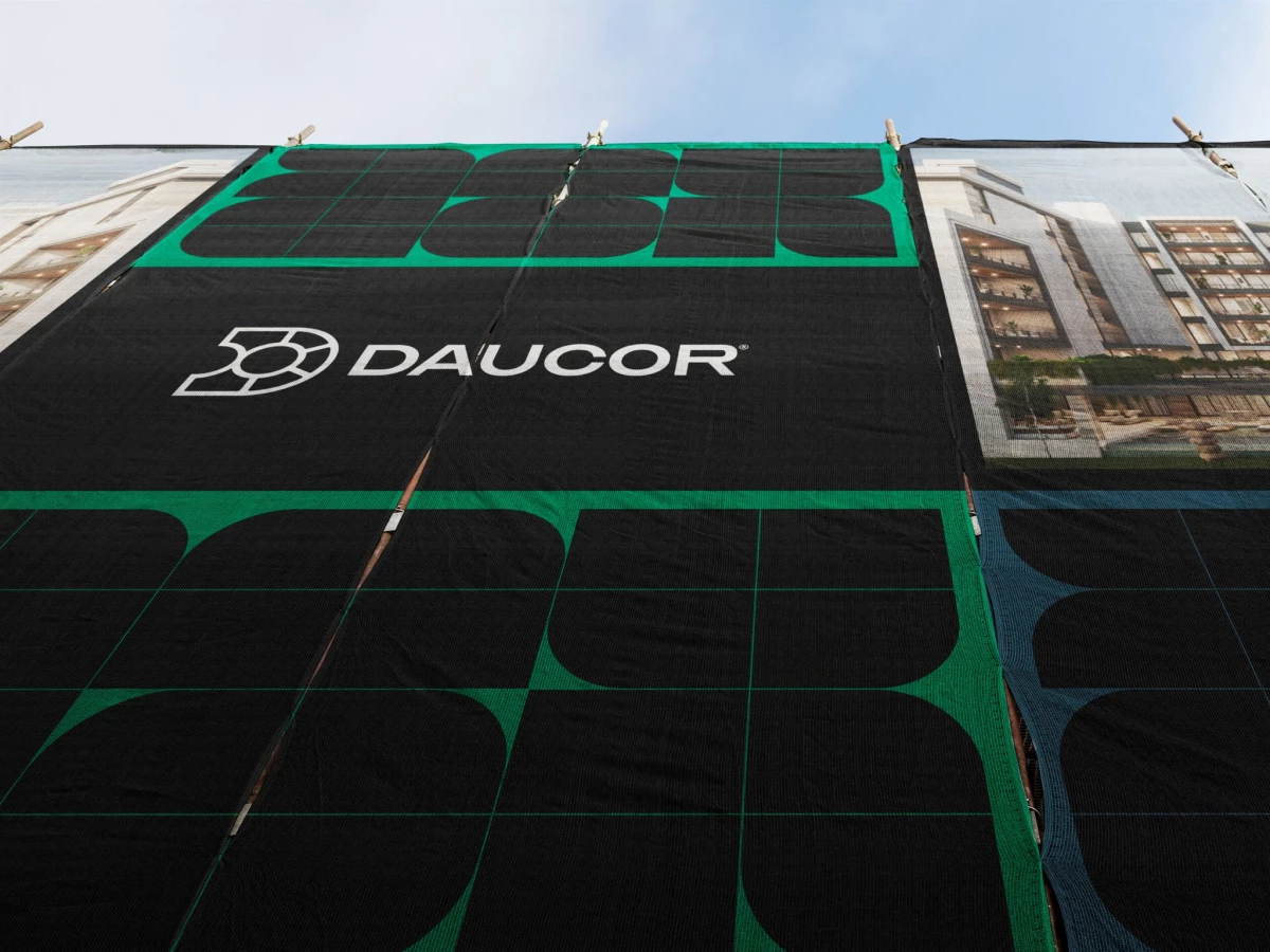
The system extends cleanly onto the building itself. Scaffold netting scales the block pattern into a facade wrap in black and green, so the identity behaves like architecture rather than a logo pasted on top.
The palette gives the system room to breathe. Dark blue, crimson, harvest gold, and emerald green sit against stone gray, a spec-sheet range wide enough to code projects or phases without losing the core black-and-green anchor.