
- Agency: JetStyle
- Client: House of Horani
- Category: Logo Design — Fashion & Beauty
- Location: Kraków, Poland
- Project Brief: Design a premium logo that reflects House of Horani's heritage, elegance, and minimalist philosophy through custom typography crafted for versatile brand applications.
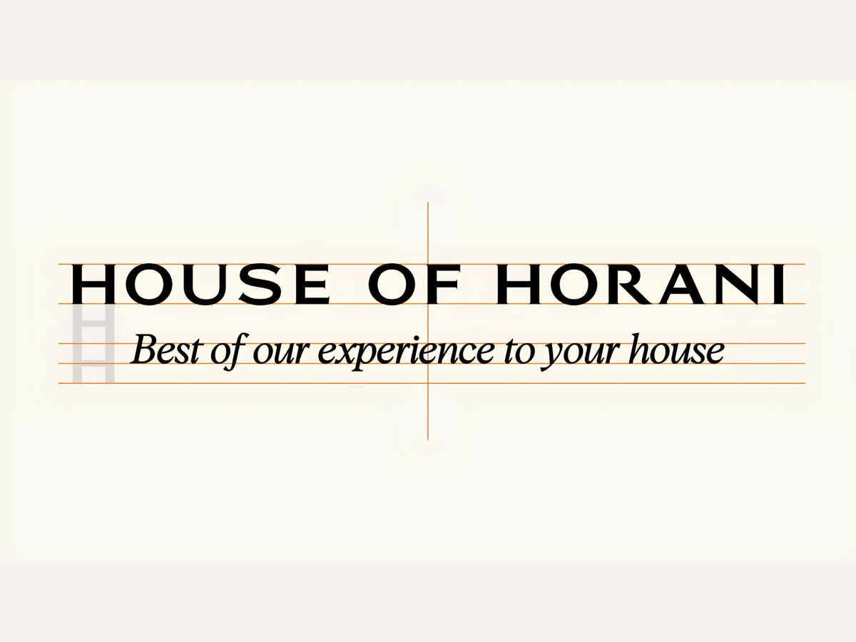
A fashion and beauty logo works best when the luxury goes unspoken. House of Horani's wordmark pulls that off with custom hand-drawn lettering, no ornament, no gold foil tricks, just letterforms confident enough to carry a premium brand.
The brief came loaded with feeling rather than specifics. The brand wanted the logo to feel like a spa moment in the shower, to stay light, elegant, and unmistakably premium, with an old money aesthetic and a "Formulated in France" pedigree underneath it all. Turning that emotional wishlist into letterforms was the actual design problem.
The exploration earned the final answer. JetStyle analyzed the luxury shelf from Dior to Chanel, then worked through Arabic calligraphic themes drawn from the name's Iranian roots, Art Nouveau and Art Deco directions, and monogram systems before committing to custom type. The rejected routes matter, since each round narrowed the brand's character.
The wordmark also had to survive a very unglamorous test: fitting a long name on a tiny bottle. Every letter was drawn from scratch with that constraint in mind, and the long serifs and roomy letterspacing keep their composure whether the mark sits on a 15 ml dropper or an Instagram avatar. Across the full amber product line, it reads clearly and stays premium at every size.
The tagline lockup got its own design pass. "Best of our experience to your house" sits in a contrasting italic beneath the capitals, and the pairing was tested on black, gray, and white grounds so the system works wherever the brand shows up.
The mark now anchors everything from packaging to Instagram, with JetStyle staying on for creative supervision as the brand rolls out. A logo brief that started as emotion ends as a system, which is what premium identity work looks like when it's done right.
Client Testimonial
The client's verdict says as much about the process as the final mark:
"We came to JetStyle with a pretty emotional idea — we wanted a logo that would feel luxurious, rooted in tradition, but also light and modern. The team instantly got what we meant. They helped us turn all those abstract feelings into something elegant and alive.
We especially loved the process — weekly calls, clear updates, no stress. It always felt like we were building the brand together, not just approving someone else's work."
— Marina Horani | Co-founder & Creative Director, House of Horani