- Agency: Branduo Studio
- Client: Neutron
- Category: Logo Design — Technology
- Location: Los Angeles, California, United States
- Project Brief: Create a logo and visual identity for Neutron that represents its role in simplifying complex information workflows through a particle-inspired concept, balanced visual elements, and a clear, cohesive brand system.
Technology logos for productivity software can get as busy as the inboxes their products promise to tame. Digital intelligence brand Neutron, built to organize scattered information workflows, takes its cue from the neutron at the center of an atom.
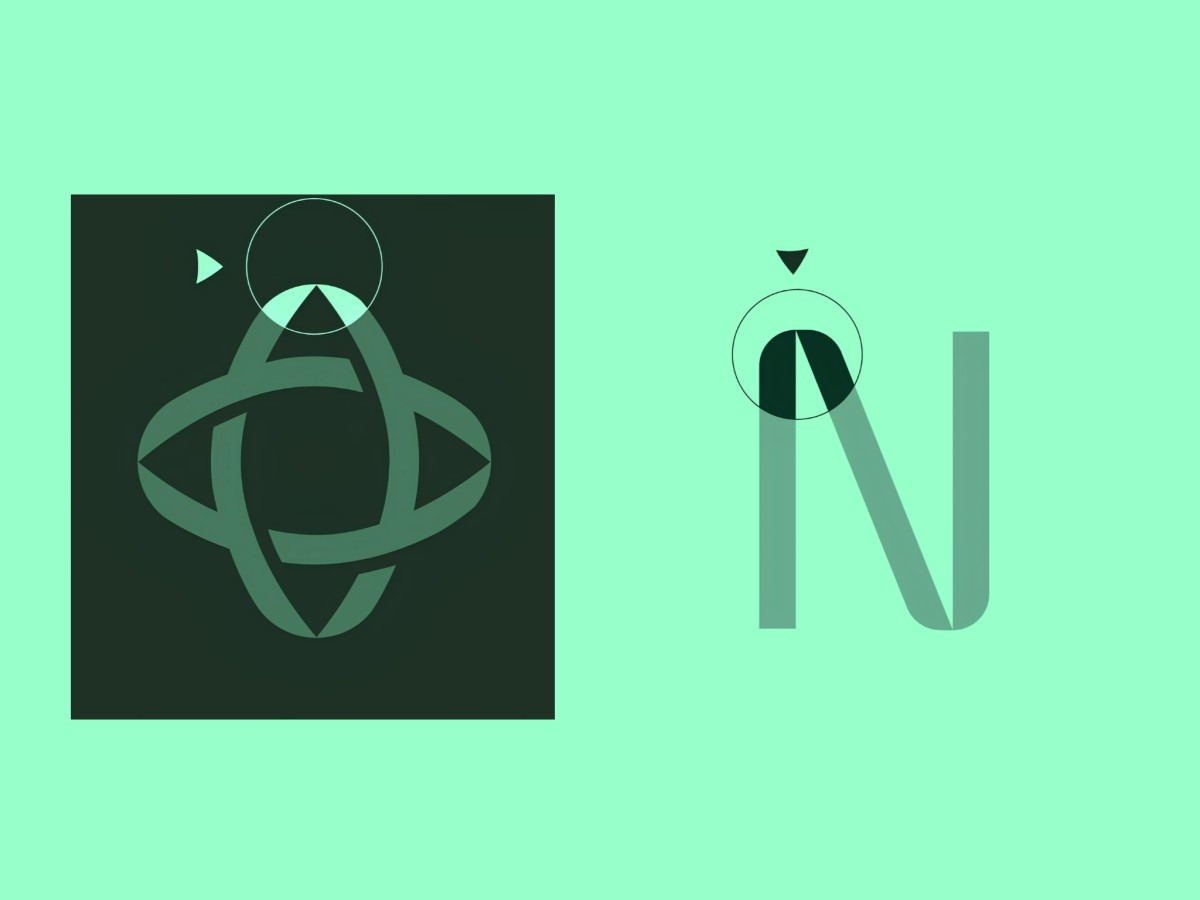
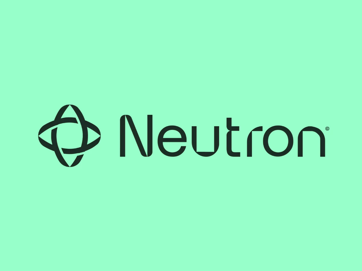
Two pointed ovals cross at right angles and weave over and under each other, much like orbits around a core. Small gaps where the bands overlap let you trace each loop through the knot, which suits a product that links loose pieces into one system.
The Neutron wordmark uses a rounded geometric sans-serif with a few sharp cuts, such as the N’s diagonal that meets its stems at a fine point. Flat terminals on the u, t, and n repeat the clean breaks inside the symbol.
Deep forest green, close to black, sits on soft mint, a quiet pairing for a tool meant to help people focus. On a keynote screen, the mark floats inside glowing teal field lines beside a monospace headline that reads “Built to hold everything together.”