- Agency: Zamora Design
- Client: pēq
- Category: Logo Design — Professional Services
- Location: San Francisco, California, United States
- Project Brief: Create a logo design system that positions pēq as an industry standard through evolved lockups, accessible typography, distinctive color, and a scalable visual language.
Adtech branding blurs together fast, and the professional services logo is where it starts: interchangeable geometric wordmarks in the same blue-to-purple wash. pēq handed Zamora Design something with more character already,a lowercase wordmark with a macron over the "e" and a standalone circular symbol that doubles as a magnifying glass, and the redesign built the whole identity out of that symbol instead of around it.
The redesign treats the mark as the engine of the identity, not its ornament. Zamora pulled the visual language out of the magnifying glass itself, so the logo generates the look instead of merely sitting inside it.
The approach was evolution over reinvention, keeping the recognition the company had already earned. The bootstrapped mark stayed intact at its core, and the work grew it up rather than trading a known symbol for a clean slate.
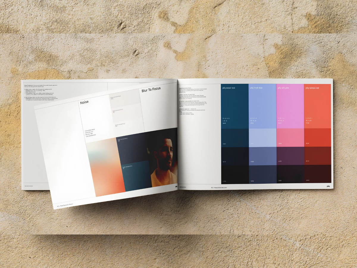
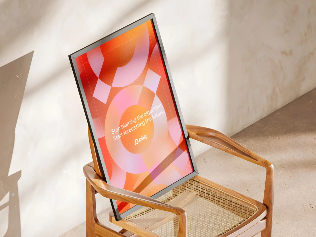
The glassmorphism reads straight out of the lens at the center of the mark. Frosted panels and layered translucency turn the magnifying glass into a picture of transparency, letting a measurement brand look like the thing it sells.
Orange stays the mark's loudest signal in a blue category. Zamora dropped the old secondary colors and rebuilt around cool neutrals, so the primary the logo already owned leads every application and pulls pēq clear of the blue-to-purple crowd.
The lockups hold from favicon to billboard. One set of rules keeps the mark legible at thumbnail size and commanding on a transit wall, the range a logo needs before a brand can behave like a standard.
Typography backs the mark under an accessibility requirement set as a starting constraint. Zamora chose Trebuchet, a face the British Dyslexia Association recommends for its open letterforms and spacing, then contrast-tested every pairing against the wordmark.
The system-font choice also keeps the logo rendering correctly everywhere. Each partner and agency reproduces the lockup with no license to buy and no fallback to break, so the mark stays intact off the design team's screen.
Merch and out-of-home prove the mark travels without thinning out. A gradient tote, an embroidered cap, event badges, and subway posters all carry the same logo cleanly, evidence the symbol anchors more than a homepage.
Zamora leaves pēq with a brand that behaves like the category standard before the market fully agrees it is one. The market tends to catch up to whoever looks the part first.