- Agency: Wolf Pixel
- Client: SpareCharge
- Category: Logo Design — Automotive
- Location: Sheridan, Wyoming, United States
- Project Brief: Create an automotive logo that represents shared charging through a flexible mark combining drivers, charger owners, energy flow, and two-way connection.
A two-sided marketplace asks its automotive logo to hold two users at once, the one with power to spare and the one who needs it. SpareCharge, an EV charger-sharing brand built by Wolf Pixel, answers with a mark that reads as two figures passing energy through a gap between them.
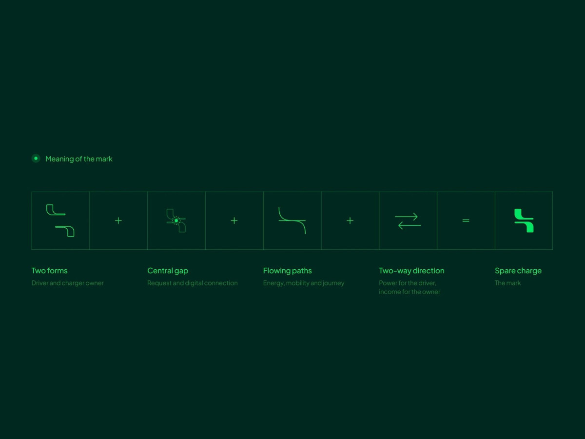
The symbol stacks two rounded forms with a notch cut at the center, standing in for driver and charger owner meeting at a request. Flip the eye and the same curves trace an S with a two-way flow, so the letter and the handoff live in one glyph.
Lime green on dark green sets the palette, electric enough to signal charging without going neon. A single typeface, Plus Jakarta Sans, runs the whole system, leaning on weight and scale for hierarchy so a data-heavy app screen stays calm.
The construction is tight, built on a visible circle grid that keeps the curves even at any size. The catch is category legibility, since the mark nails the two-sided story but reads more fintech or messaging than EV until the wordmark and the green do the explaining.