
- Agency: Reliquia Studio
- Client: The Cookies
- Category: Logo Design — Professional Services
- Location: Buenos Aires, Argentina
- Project Brief: Create a refreshed logo and visual identity for The Cookies that reflects the agency’s creative personality through three interconnected shapes representing its founders, expressive typography, vibrant colors, and a flexible brand system.
Professional services agencies that build websites for other brands get one shot to prove their own taste through the logo. This identity for The Cookies reworks an older cookie-inspired mark into something bold and playful.
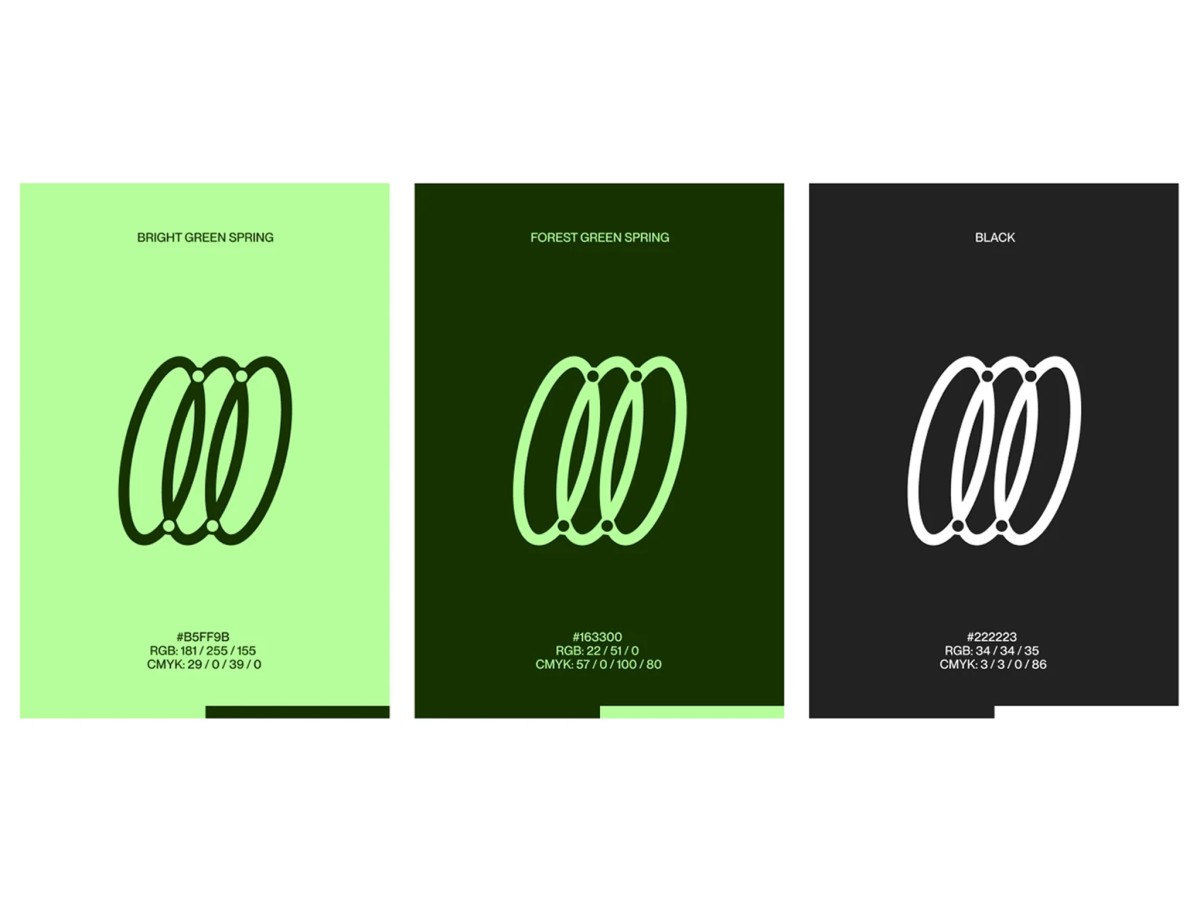
The new mark links three slanted ovals in a thick, rounded stroke, one for each of the agency’s founders. Four small dots sit where the loops overlap at the top and bottom, like rivets holding the partnership together.
The palette pairs Bright Green Spring, a pale lime, with Forest Green Spring, a deep moss shade, plus a soft charcoal black. Each color takes a turn as the background, so the mark flips between dark lines on lime and mint or white lines on darker panels.
The slant of the ovals reads as forward motion, and the mark stays crisp at sign scale on a square panel hung from a brick storefront. Expressive typography and a flexible visual system then carry those loops across the agency’s wider brand.