- Agency: Artı Stüdyo
- Client: wecircle
- Category: Logo Design — Real Estate
- Location: Istanbul, Turkey
- Project Brief: Create a logo and visual identity for wecircle that expresses shared living and community through four geometric forms, a custom logotype, and a nature-inspired color palette.
A good real estate logo should make you picture yourself living there before you ever see the land. Artı Stüdyo designed the identity for wecircle, a 600,000-square-meter community in Muğla, Türkiye, where 1,000 neighbors will share homes, grow food, and build a life together.
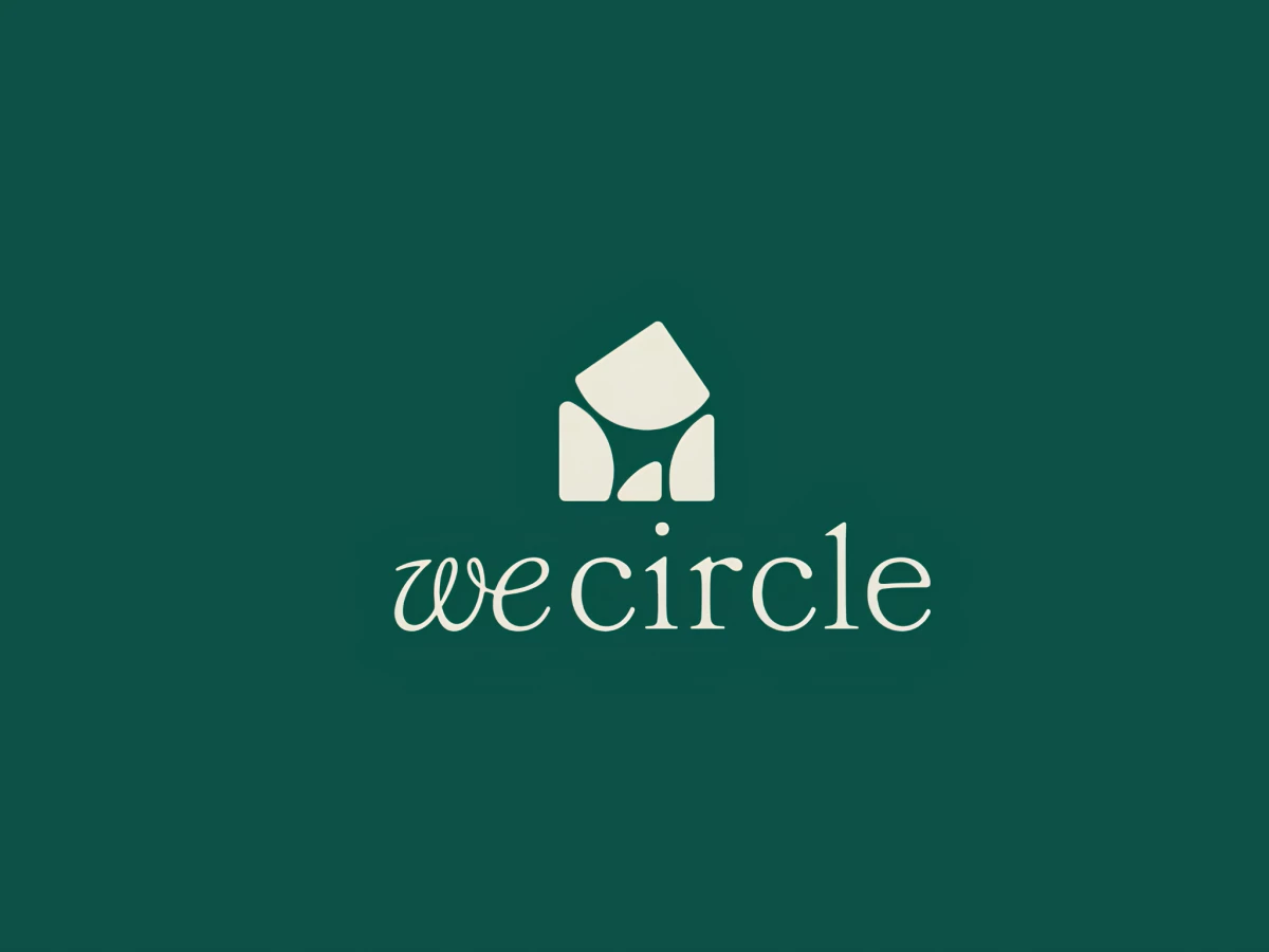
The symbol consists of four simple shapes, one for each of the community’s values: the land, how it’s run, people’s well-being, and the neighbors themselves. Put them together and you get a little house with a circle hidden in its middle, which is a nice way to say everyone has a seat at the table.
The name mixes two styles, with a loose, handwritten “we” running into a calm serif “circle.” It reads like a friendly note more than a sales pitch, and that suits a project built around people.
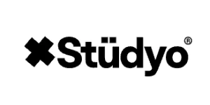
The colors come straight from the landscape: forest green, soft cream, and the warm terracotta of local clay. You’ll see them on street banners that point the way to the amphitheater and boutique hotel, and on a simple cream cap with the name stitched in green.