- Agency: Deutsch
- Client: Keurig Dr Pepper
- Category: Packaging Design — Beverage
- Location: New York City, New York, United States
- Project Brief: Redesign 7UP beverage packaging with a lime-forward visual identity, vertical logo, and simplified layout to refresh the brand across its product range.
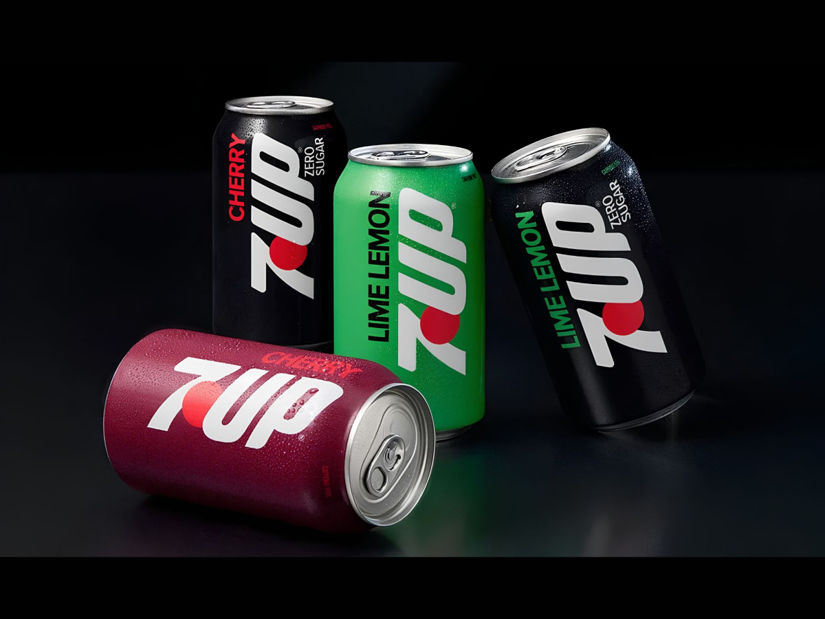
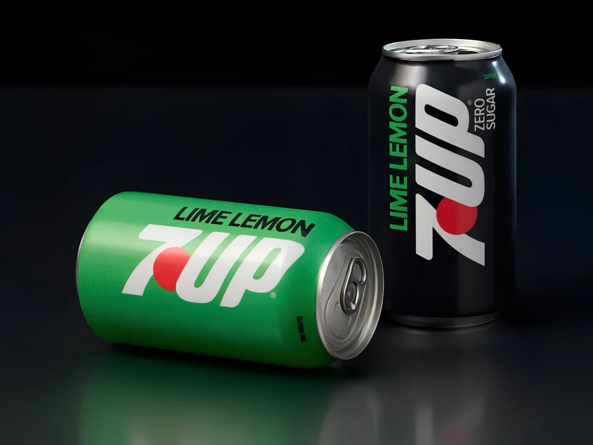
Lemon-lime beverage packaging blurs into one wall of green. The 7UP redesign breaks out by promoting "Lime" above "Lemon" on the front, flagging the new lime-forward formula before a shopper reads any fine print.
The face strips down to a vertical logo and a clean field of flavor color. That restraint clears the old clutter and lets the flavor cue carry the shelf, where a younger buyer picks a can in about a second.
The system holds across the full lineup. 7UP Regular, Zero Sugar, Cherry, and Cherry Zero Sugar each carry the same structure on their own color base, so a shopper finds the right variant fast and the set reads as one family in the cooler.
Deutsch framed this as the brand's biggest evolution in more than 15 years. The refresh carries into a Flip the Sip campaign across social, cultural moments, and in-store experiences, turning the packaging into the anchor of a launch built to win younger drinkers back to the category.