- Agency: Heavy
- Client: Barsk
- Category: Packaging Design — Pet Food
- Location: Guadalajara, Mexico
- Project Brief: Create packaging design for Barsk that balances pharmaceutical-grade positioning with an energetic pet-focused identity through bold colors and 1970s-inspired illustrations.
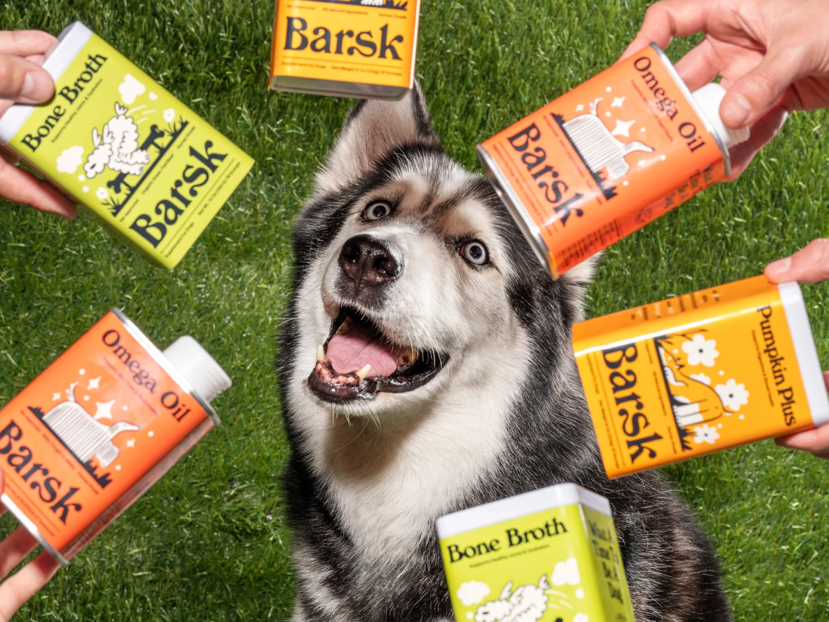
Pet food packaging that borrows a pharmaceutical look risks feeling cold on the shelf. Heavy sidesteps that for Barsk with a warm 70s visual system built on saturated color and playful thumbnail illustrations.
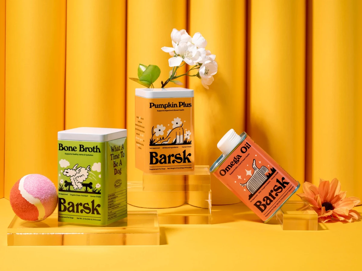
Each product owns its own color across the range for instant recognition. Bone Broth runs lime green, Pumpkin Plus and Omega Oil split warm orange and coral, and the shared black chunky wordmark holds the lineup together.
The illustration style carries the brand's whole personality in a single mark. Cross-hatched dogs, floating daisies, and a bouncing sheep sit in flat black line work that reads as retro storybook rather than clinical supplement label.
The unboxing extends the system past the tins themselves. The mailer's "Bone-Appétit!" flap, the "What A Time To Be A Dog" print, and the interior dog scene turn a supplement delivery into something worth opening slowly.