- Agency: TAVERN
- Client: Cannes Royale
- Category: Packaging Design — Spirit
- Location: New York City, New York, United States
- Project Brief: Create packaging for Cannes Royale’s canned Kir Royale cocktail that captures the spirit of the French Riviera through distinctive regional references, refined graphics, and a compact 222 mL format.
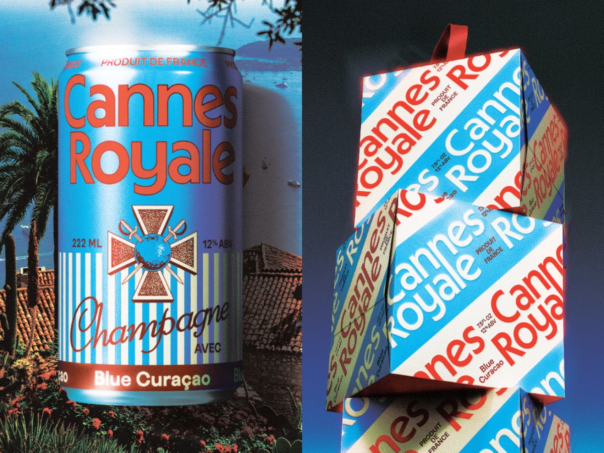
A canned cocktail can play with a pun in its spirits packaging, and Cannes Royale does just that all the way down to the name. Built as a modern take on the Kir Royale, the line mixes Champagne with French fruit liqueurs in a small can that made its debut at the Cannes festival.
The can holds 222 mL, close to a 180 mL spritz pour plus a bit extra because you’re on vacation. It’s short and easy to hold in one hand, which makes sense for a drink handed out at parties.
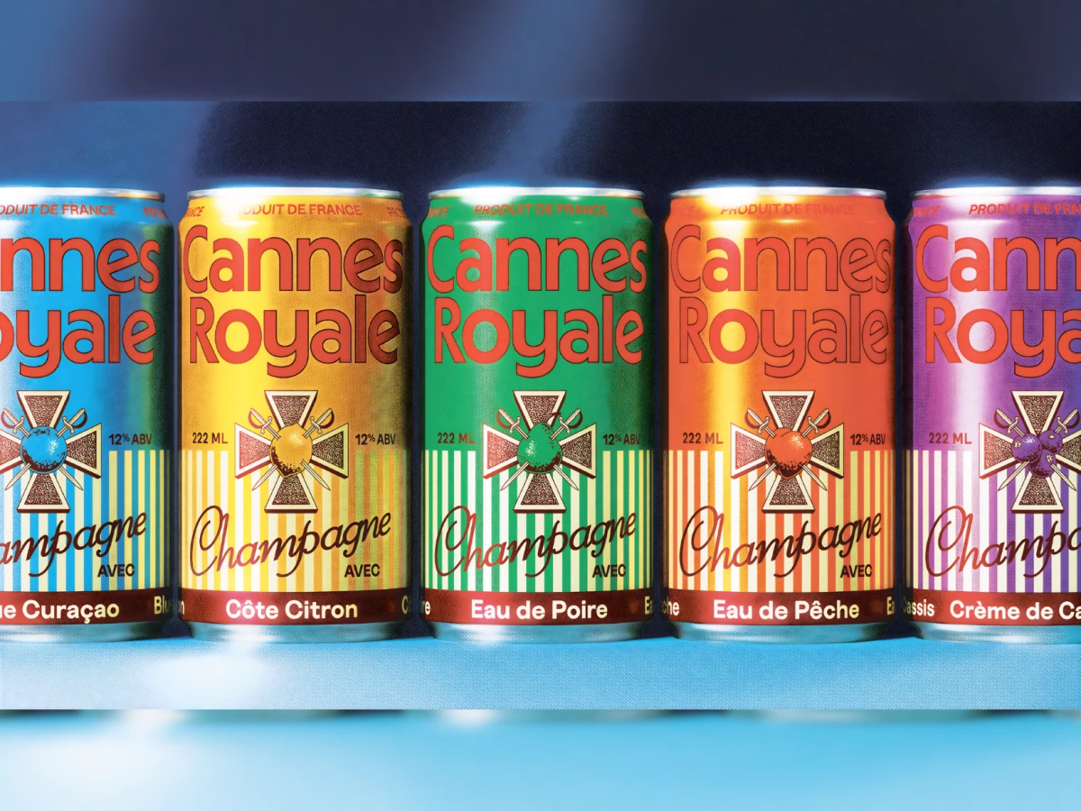
Each flavor gets its own loud color, with sky blue for Blue Curaçao and sunny yellow for Côte Citron. The big red-orange name sits on top, over beach-cabana stripes and a loopy brown “Champagne” script.
If you take a closer look, you'll see a cross adorned with two swords, referencing the war hero, priest Félix Kir, who the drink is named after, represented on the French Croix de Guerre medal. The boxes are arranged in diagonally blue and white stripes, and they all display the name, making a pile of these boxes seem like a giant beach towel.