Team Behind the Design
- Designer: Raphaël Kuczynski
- Agency: de vog
- Client: Cicatryl (ACM)
- Category: Packaging Design — Pharmaceutical
- Location: France
- Project Brief: Redesign the Cicatryl product range with a unified visual system that makes five distinct product lines instantly distinguishable on shelf while keeping the brand legible across French and Arabic markets.
Pharmaceutical packaging earns trust by looking serious. Cicatryl earns it by being easy to find.
Raphaël Kuczynski's solution keeps both: a range that reads clearly as medical, then uses color to do the differentiation work most pharmaceutical lines leave to fine print.
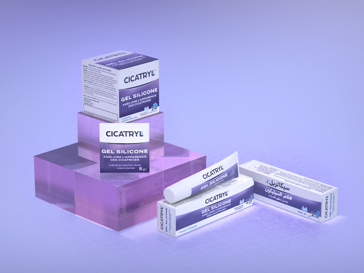
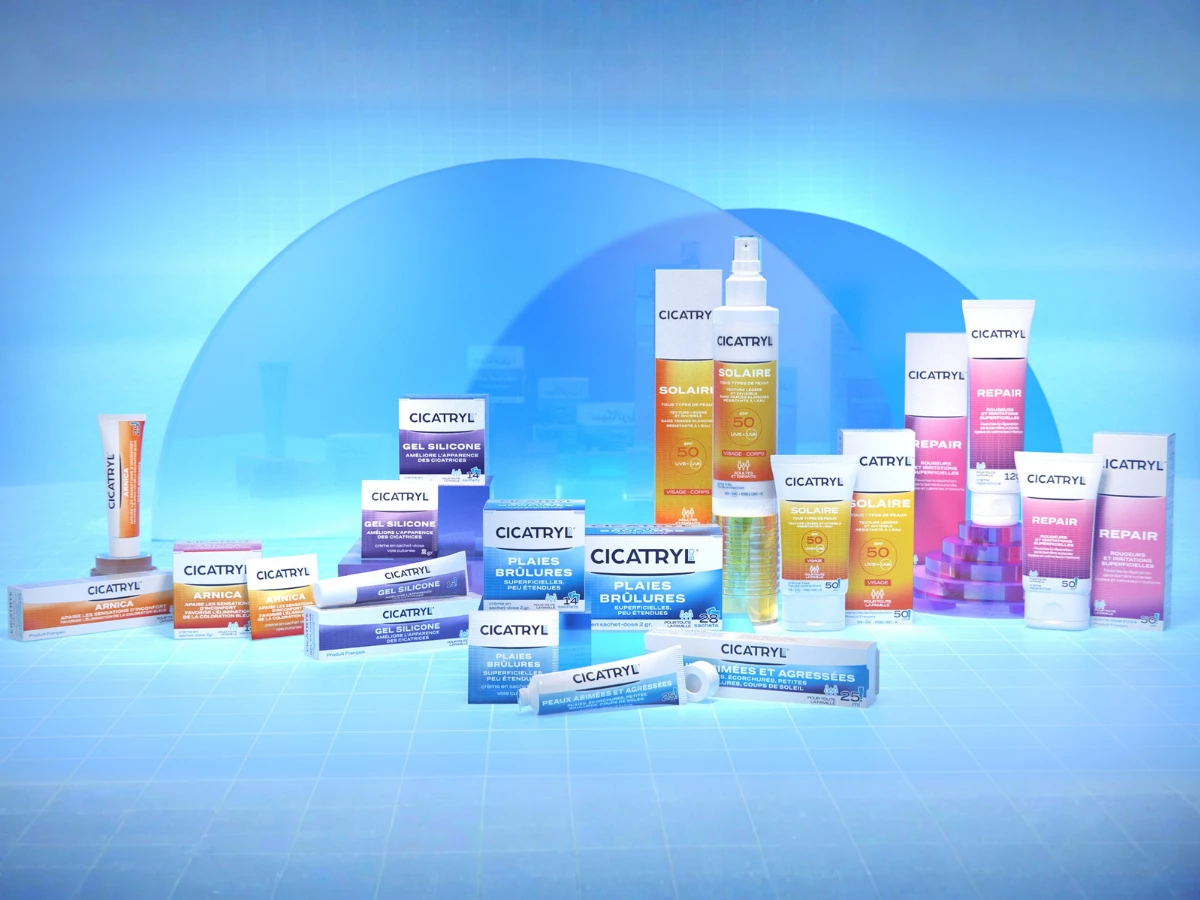
The system is built on a consistent two-zone layout. Every pack leads with the CICATRYL wordmark in dark navy on white at the top: calm, clinical, authoritative. Below it, a bold gradient field announces the product line in color: warm orange-to-red for Arnica, sky blue for Plaies Brûlures, amber-to-gold for Solaire, lilac-to-violet for Gel Silicone, and hot pink-to-magenta for Repair.
The sub-brand names sit large on that field, sized to be read from a shelf rather than in hand. Each gradient is specific enough to own its territory on the range without drifting far enough from the parent palette to feel like a different brand.
The structure pays off at scale. Side by side in the hero shot, the five lines stack clearly without crowding. The white top zone holds the range together. The gradient field tells you which product you're looking at, sometimes without any reading required. That's the job of a good color system in pharmacy packaging: wayfinding without signage.
The gradients do more work than flat color here. The Solaire line's amber-to-gold actually looks like sunlight. The Repair line's hot pink reads as active and clinical at the same time — not quite cosmetic, not quite cold.
Finally, the bilingual execution. One SKU, two markets. Putting French on the front and Arabic on the reverse looks simple and obvious in hindsight. It never is.
The same color zone, type hierarchy, and layout grid hold on both sides, so the Arabic panel reads as a designed face of the pack rather than translated text dropped onto the back as an afterthought. That's more than a design win. It's a print run that doesn't have to split by market.
Kuczynski designed each product to feel like its color was chosen for a reason, not just picked to look different from the one next to it. For a wound-care brand, that balance matters. Too pretty and people don't trust it. Too clinical and nobody picks it up.