
- Agency: AAOO Studio
- Client: Hong-Sik Fragrance
- Category: Packaging Design — Fashion & Beauty
- Location: Tainan, Taiwan
- Project Brief: Create packaging design that turns fragrance into a modern heirloom through continuous patterns, substantial materials, and refined box construction.
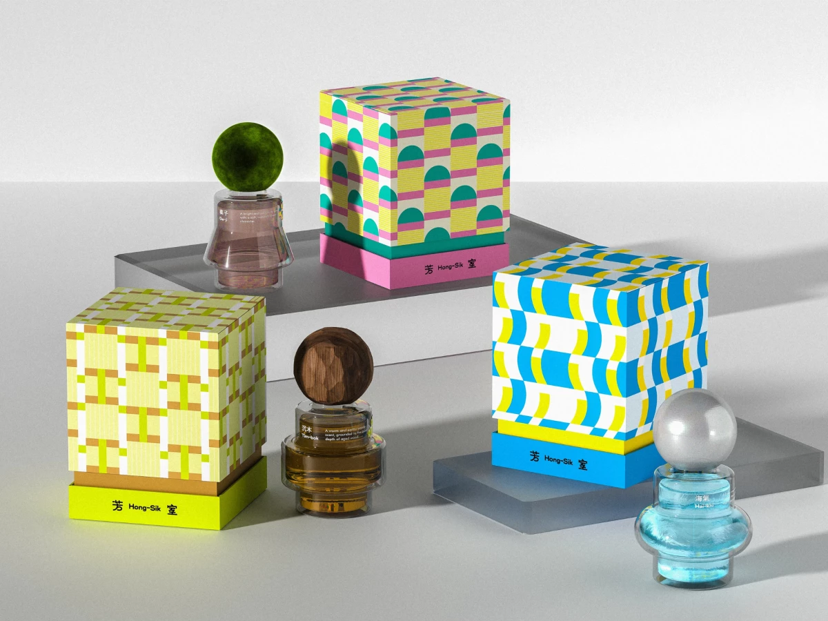
Luxury packaging that connects scent to memory works best when the visual system carries the feeling. AAOO Studio builds Hong-Sik around continuous geometric patterns that stand in for the three fragrance families, letting color and shape speak where text usually would.
Each scent gets its own pattern and palette. Fruity runs pink and teal arches, woody works olive and brown checks, and marine rolls in blue and yellow waves, so the three boxes read as a family while staying distinct.
The repeating motifs carry the concept. Patterns extend edge to edge with no break, echoing the way memory accumulates and overlaps rather than sitting in single frames.
The bilingual mark ties the roots together. 「芳室」 flanks the romanized "Hong-Sik" in clean type, so the Tainan herbal-shop heritage and the homesick wordplay both sit right on the front.
The double-layer box builds the heirloom feel. A deep color base lifts each patterned lid, and the substantial rigid construction gives the set the weight of something meant to be kept and passed down.