- Agency: If Only Creative
- Client: La Reina’s
- Category: Packaging Design — Food & Beverage
- Location: San Anselmo, California, United States
- Project Brief: Create packaging design for La Reina’s rolled tortilla chips that honors its 1958 heritage through a revived checkerboard pattern and contemporary presentation.
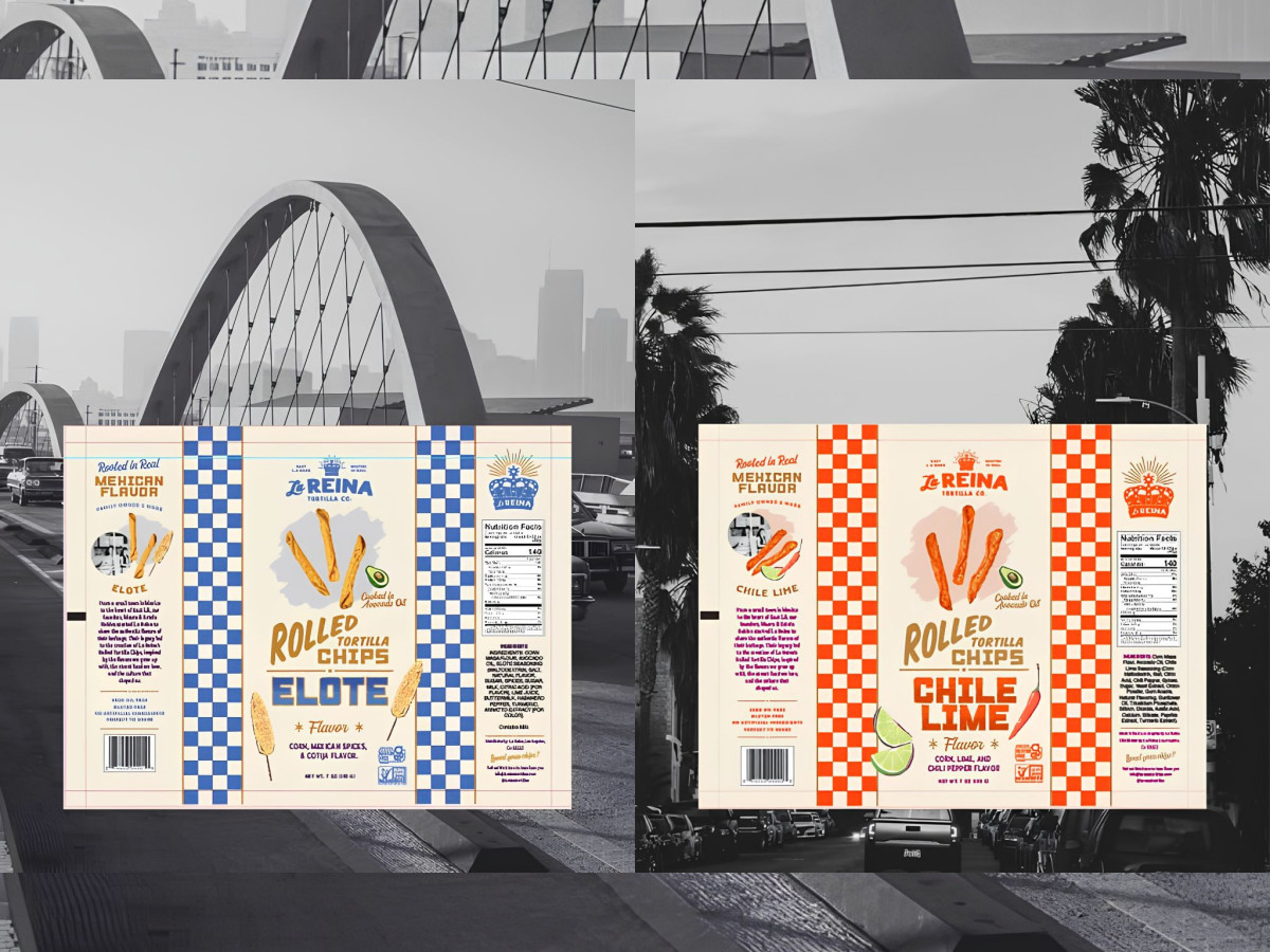
Food packaging that inherits a 70-year-old asset has to decide what to touch and what to leave alone. If Only Creative builds La Reina's rolled tortilla chip bags around the blue-and-white checkerboard border pulled straight from the brand's original 1958 trademark.
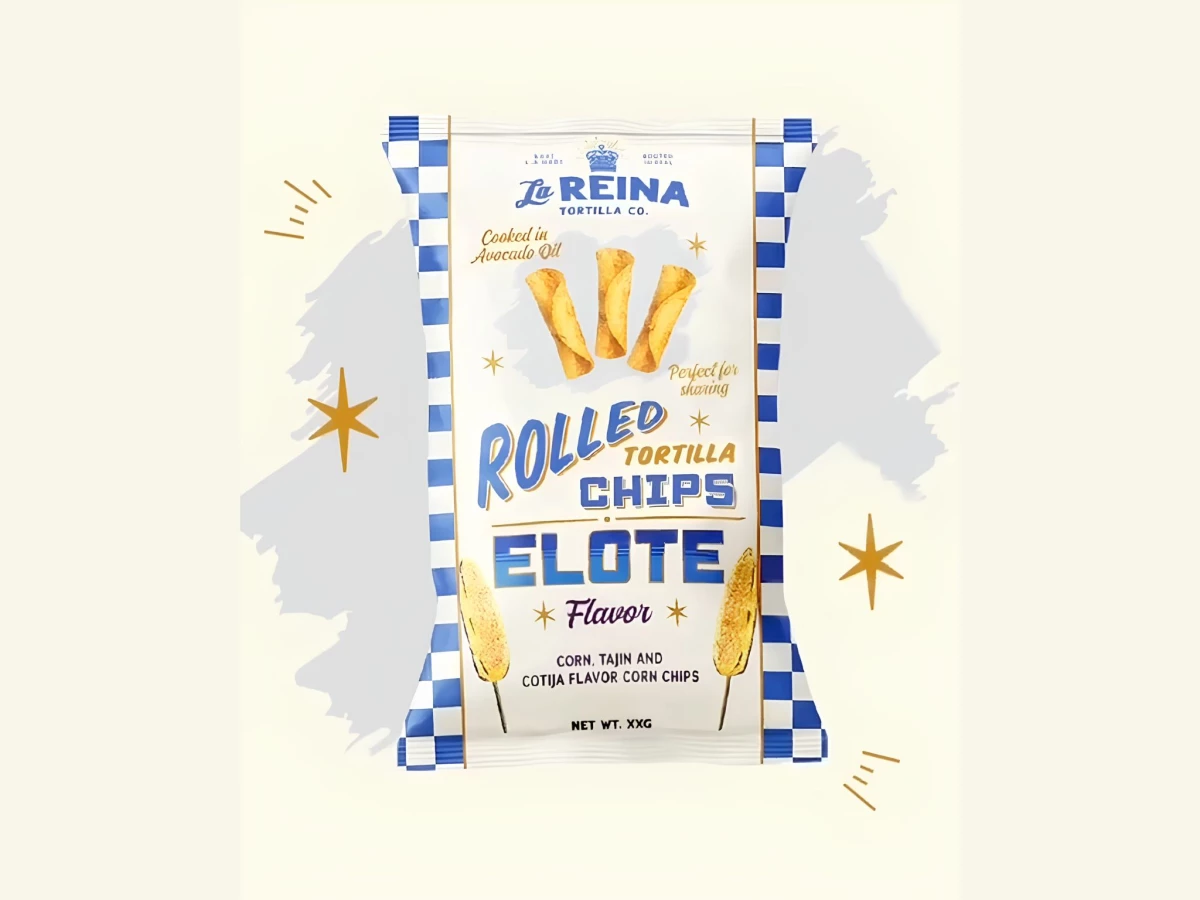
That old detail leads the whole system. The checkerboard frames each bag with the crowned queen mark up top, so the packaging feels handed down instead of dreamed up in a studio.
Color does the flavor sorting. Elote goes blue, chile lime goes red, and the rest stays put, so the two bags look like family while still splitting apart on the shelf.
The type mixes eras on purpose. Hand-drawn script, fat block flavor names, and little gold stars borrow from old storefront signage and taqueria menus, which ties the East LA roots to the snack without spelling it out.
The front panel earns its keep. Photography of the chips, the avocado-oil and gluten-free notes, and the elote-on-a-stick art stack in tiers you read top to bottom, so brand, format, and flavor all land in one glance.