- Agency: The Woork
- Client: Moodly
- Category: Packaging Design — Health & Wellness
- Location: Madrid, Spain
- Project Brief: Design health and wellness packaging that communicates Moodly's CBD and nootropics product range through a scalable visual identity using geometric forms, color psychology, and adaptable branding across physical and digital touchpoints.
Health and wellness packaging leans on soft neutrals and calm serifs to read as trustworthy. Moodly bets the other way, building its whole system on a modular geometric alphabet where each shape stands for a mood.
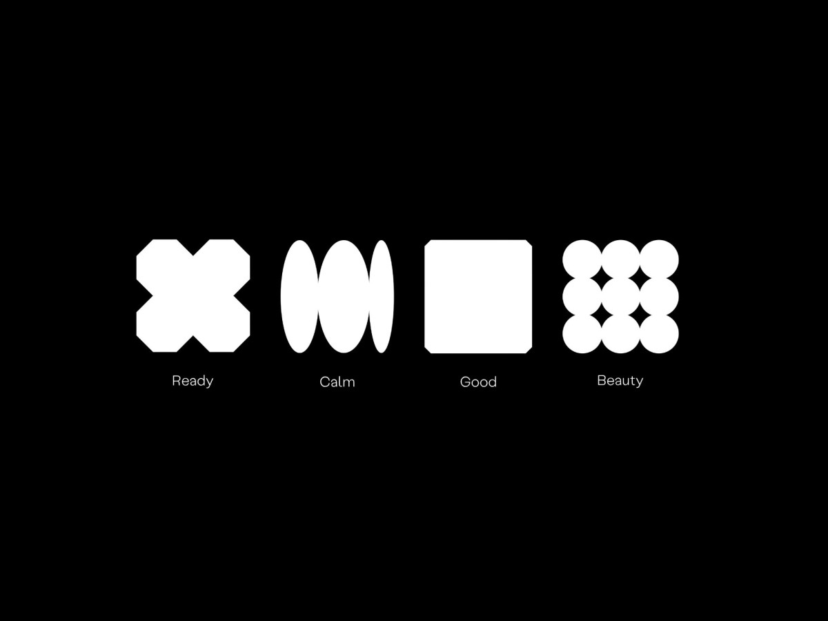
The core idea turns feelings into a visual language. Four bold glyphs, Ready as a chunky X, Calm as stacked ovals, Good as a solid square, and Beauty as clustered circles, give each product line its own symbol before a word is read.
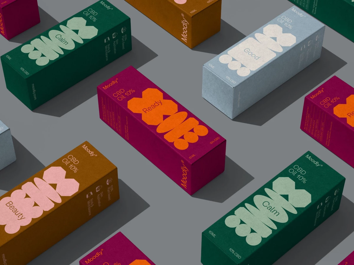
Color reinforces the read through basic psychology. Deep green codes Calm, magenta and orange push Ready toward energy, and a pale blue keeps Good settled, so the palette tells you the mood the product is tuned for.
The Woork let the shapes recombine and scale across box faces, from a full stacked pattern to a single symbol, so the range coheres while each variant stays distinct. That flexible geometry carries from packaging to app to web, which is what lets a wellness line feel expressive rather than clinical.