- Agency: The Creative Pack
- Client: San Francisco Bay Coffee
- Category: Packaging Design — Coffee
- Location: Manhattan Beach, California, United States
- Project Brief: Design a scalable coffee packaging system that unifies more than 100 SKUs through bold branding, blend-specific color coding, premium finishes, and storytelling that highlights the company's sustainability and community-first mission.
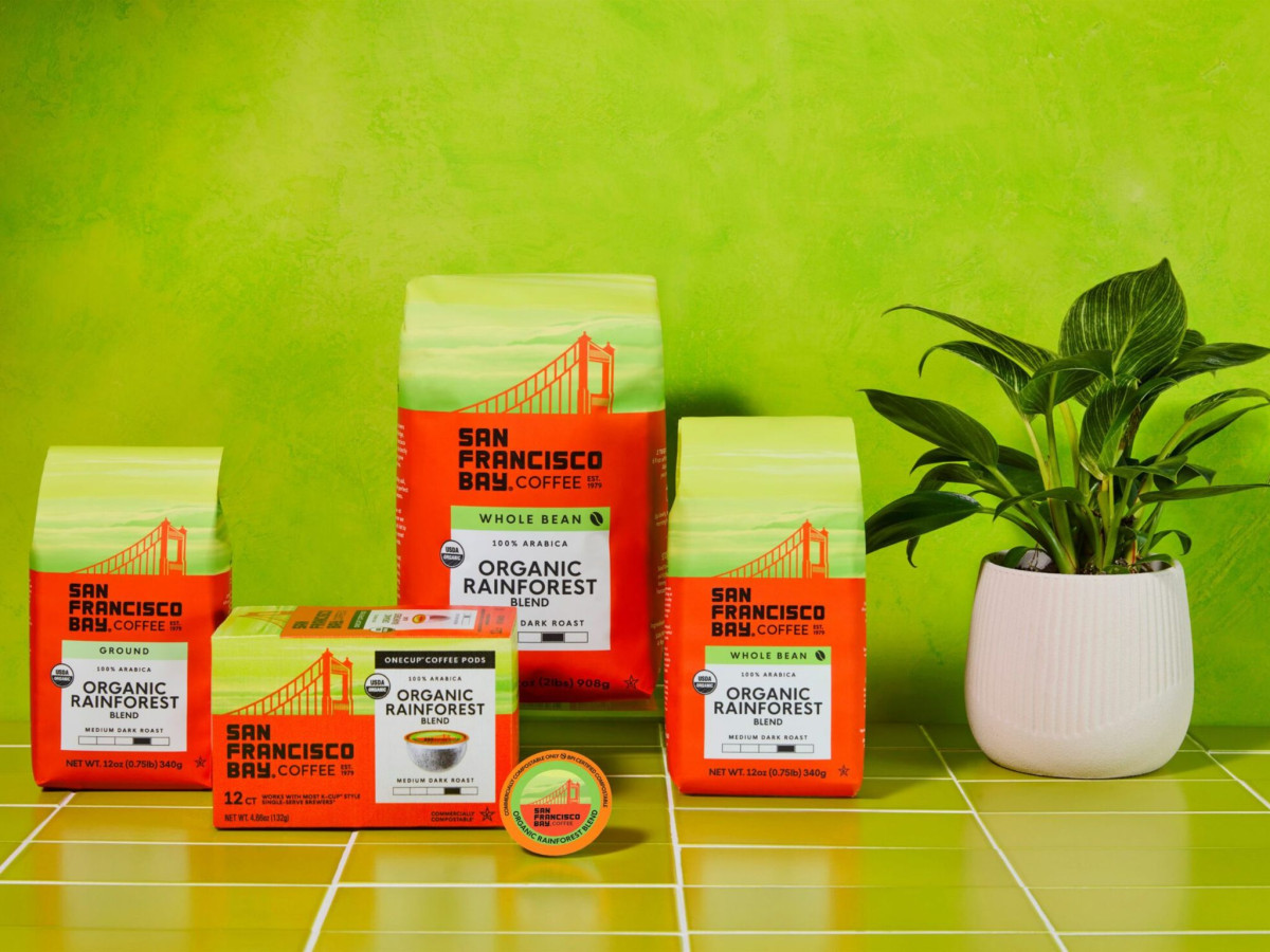
Redesigning a coffee packaging system across 100-plus SKUs means the shelf has to stay recognizable whether you are holding a pod box or a two-pound bag. San Francisco Bay Coffee keeps that anchor simple, putting the red bridge and the name dead center on every pack.
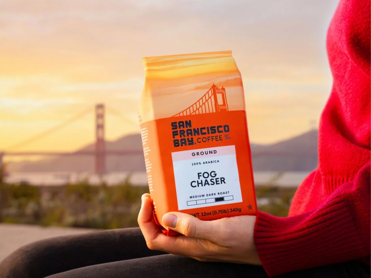
The bridge sits on a fixed horizon line that repeats across the whole range. That consistency is what lets a customer spot the brand from down the aisle, no matter which format or roast they are reaching for.
Color does the sorting. A system of twelve blends rotates behind the skyline, each rendered in a soft San Francisco fog gradient, so a shopper learns to read the roast by its color before reading a single word.
The build adds a reason to pick it up, with spot gloss varnish raised over a matte bag. The Creative Pack also handed at least half the on-pack space to the farmer-partnership and sourcing story, which turns packaging real estate into the part of the pitch earlier versions kept burying.