- Agency: Stout Design
- Client: Sun Cruiser
- Category: Packaging Design — Spirit
- Location: San Francisco, California, United States
- Project Brief: Create packaging design for Sun Cruiser that captures sunny days on the water through bold color blocking, maritime-inspired illustrations, and an easygoing visual identity.
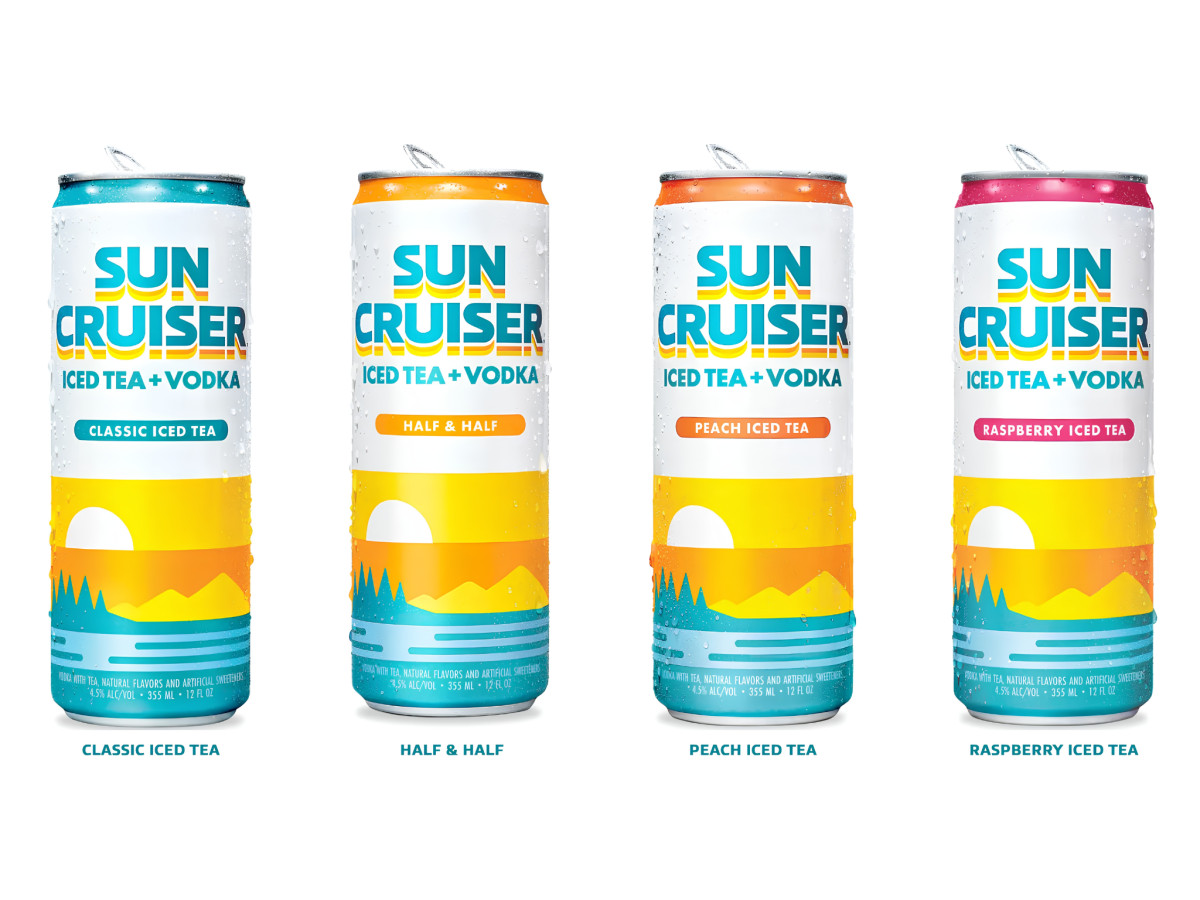
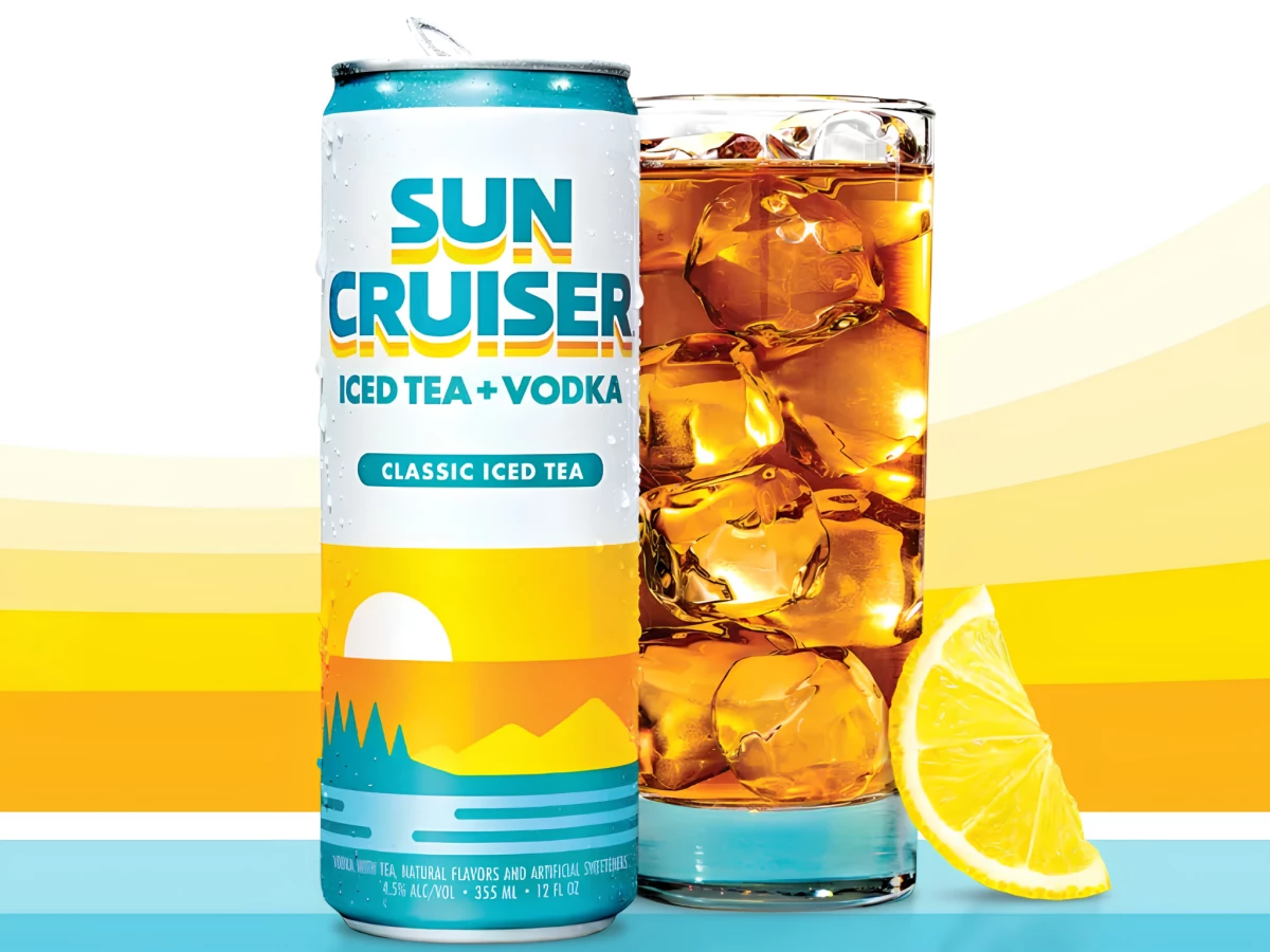
Spirit packaging should sell a feeling before a flavor. Stout Design gives Sun Cruiser a warm, on-the-water look built on a half-sun horizon, layered lake-and-pine scenery, and bold color blocking down each can.
The sunset illustration repeats across the lineup as the brand's anchor. A white sun drops behind amber mountains, pines, and rippled water, so every can reads as the same lazy summer afternoon.
The color-coded tops and flavor pills keep a wide range easy to shop. Teal for Classic Iced Tea, orange for Peach, pink for Raspberry, and a parallel lemonade set carry the same sunset scene under swapped palettes.
The clean sans logotype and crisp "Iced Tea + Vodka" line hold it all together. Stacked blue "Sun Cruiser" type with a sunrise-striped underline sits over white space, so the maritime art stays front and center from shelf to cooler.