- Agency: TRÜF Creative
- Client: Thorn & Burrow Wines
- Category: Packaging Design — Wine
- Location: Santa Monica, California, United States
- Project Brief: Design distinctive wine packaging that reflects Thorn & Burrow's unconventional blends through expressive labels and cohesive brand details across every bottle.
Wine packaging for a natural wine label lives or dies on standing out in a crowded shelf. Thorn & Burrow Wines leans fully into art over convention, treating each bottle as a canvas rather than a spec sheet.
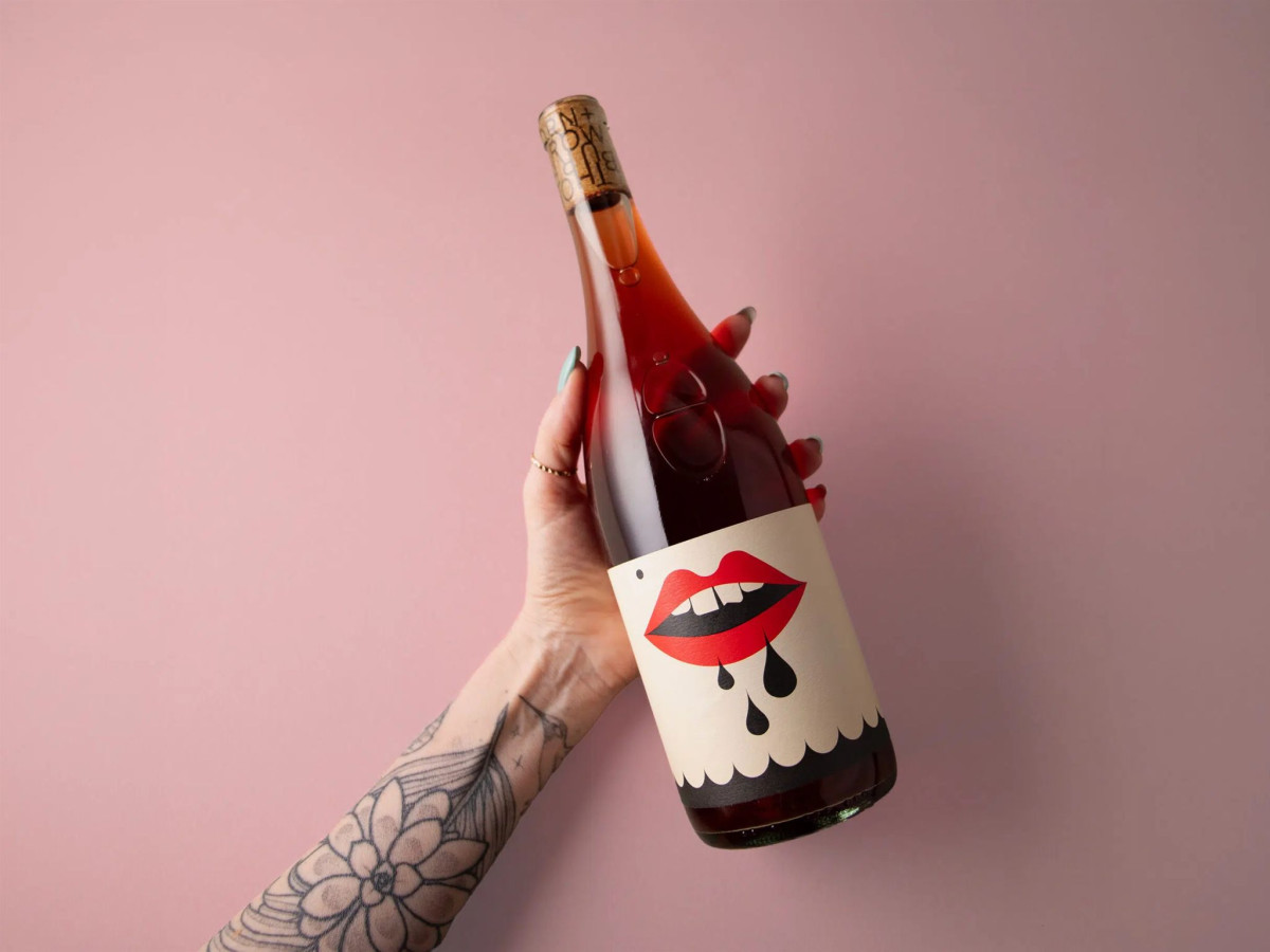
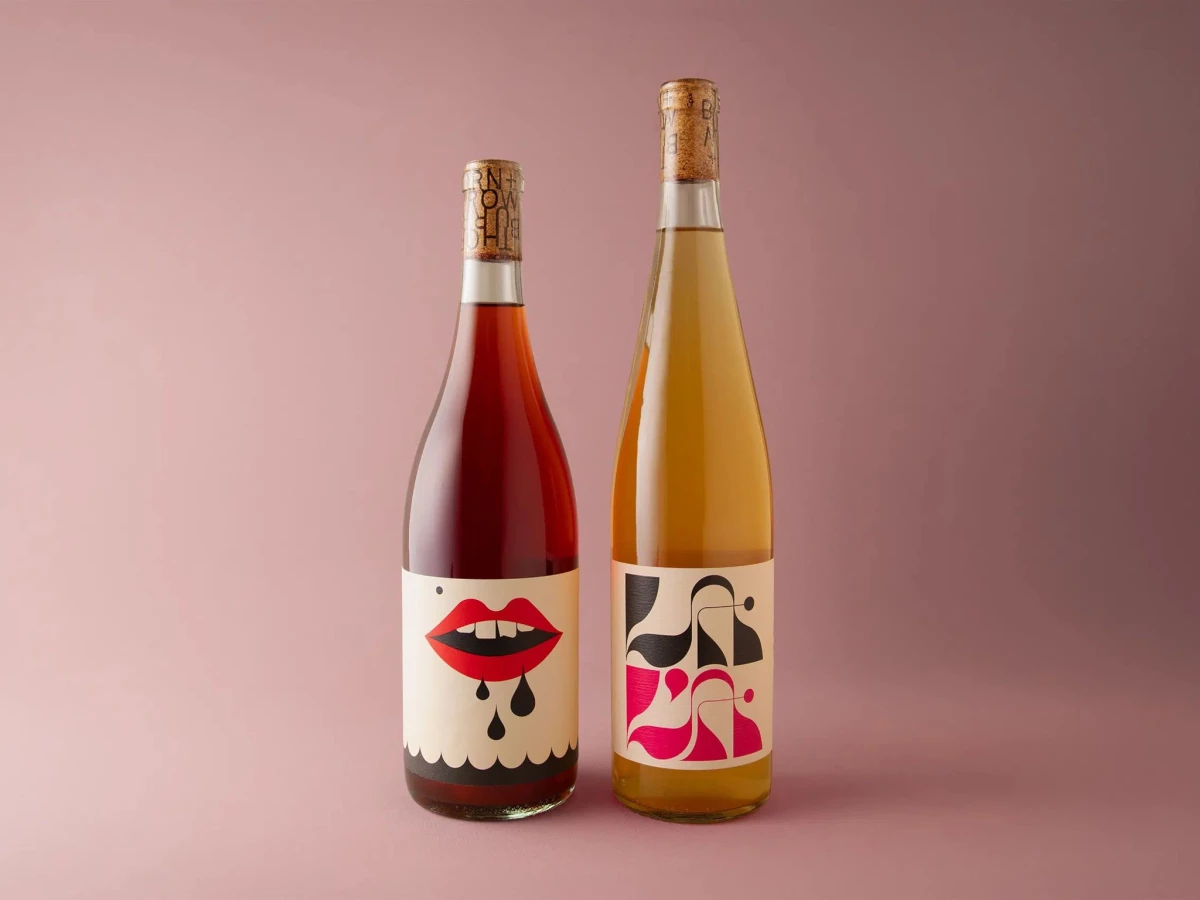
The illustration carries the personality. A dripping red-lipped mouth on the chilled red and abstract cutout shapes on the skin-contact white read as playful and a little irreverent, matching a maker of one-off, unconventional blends.
Restraint keeps the boldness premium. A warm cream label ground, a tight red-and-black palette, and generous negative space stop the graphics from tipping into novelty.
The branded cork is the sharp detail. THORN + BURROW wraps the cork in typography set to stay legible no matter how it turns, extending the identity to the one part most labels ignore.