- Agency: Saint Urbain
- Client: CERCA Dating
- Category: Print Design — Technology
- Location: New York City, New York, United States
- Project Brief: Create a print identity for CERCA Dating that communicates trust and intentional connection through bold typography, restrained layouts, and warm photography and illustration, extending the brand across outdoor advertising and real-world experiences.
A billboard that reads “Fewer matches. Better connections.” sums up what technology print design can say for a dating app built on mutual friends. CERCA, rebranded by Saint Urbain, swaps the category’s anonymous swipe culture for a bold, confident look made for city walls.
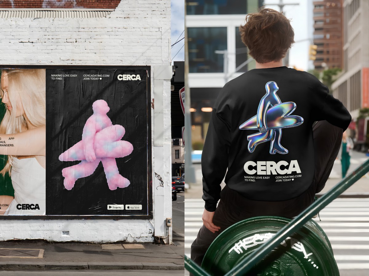
A heavy, wide grotesque wordmark fills entire billboards in white on black, so you can read it from across the street. Small all-caps copy for the tagline and URL tucks into the corners, and the open space around it feels sure of itself.
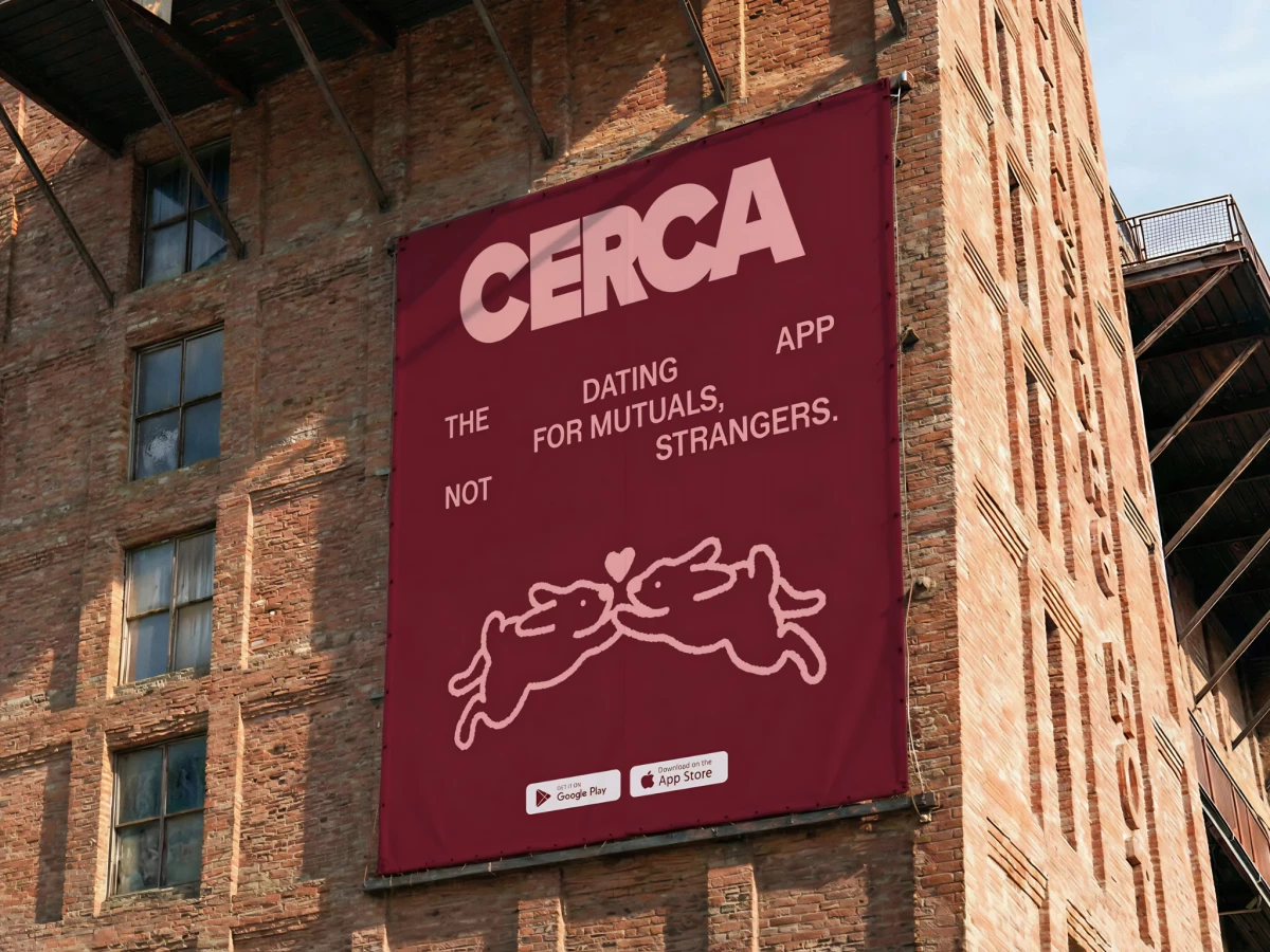
The headline “The dating app for mutuals, not strangers” breaks into loose, staggered lines across the poster. That uneven rhythm slows you down just long enough to take in the whole idea.
Hand-drawn line art brings in the human side, from two bunnies leaping toward a heart on a burgundy banner to a pair of smiling peas in a pod. Photos of stacked hands and a fuzzy pink 3D figure carry that warmth onto billboards and wheatpaste posters.