- Agency: RainCastle Communications, Inc.
- Client: Belmar Pharma Solutions
- Category: Website Design — Medical & Pharmacy
- Location: Needham, Massachusetts, United States
- Project Brief: Redesign Belmar Pharma Solutions' website to simplify complex medical information through intuitive navigation, patient-focused UX, and a modern, search-optimized digital experience.
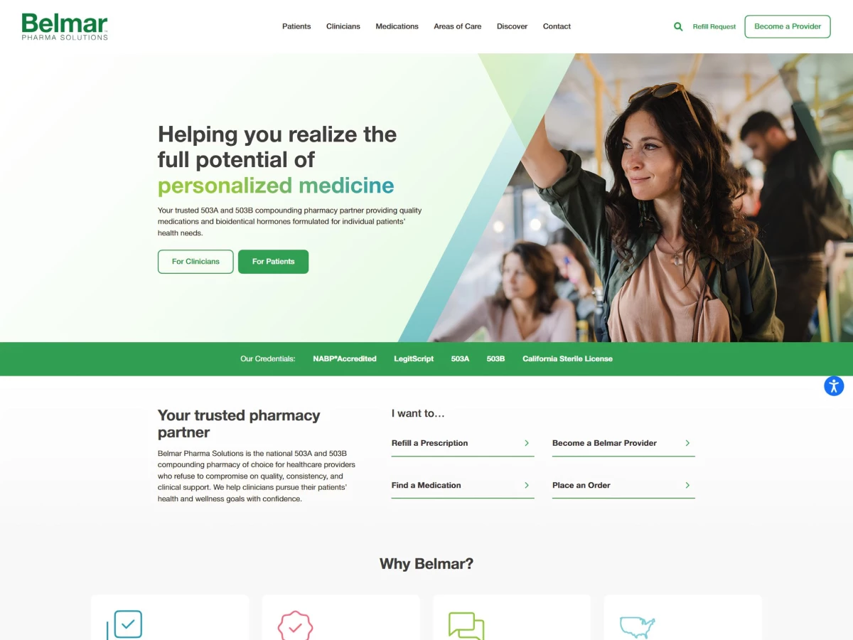
A medical and pharmacy website carries a trust burden most sites never face. The Belmar Pharma Solutions redesign settles that question first, putting NABP accreditation, LegitScript, 503A, 503B, and a California Sterile License in a strip you see before you scroll.
Clinicians and patients want opposite things from the same homepage, and pharmacies lose people in that gap every day. A "For Clinicians" and "For Patients" split hands each visitor a path built for the job they came to do, so a prescriber goes straight to the portal, clinical resources, and provider signup, and a patient never wanders into workflow written for a doctor.
Nobody visits a pharmacy site to look around. They come with one thing to do. The "I want to..." block puts the four most common jobs a tap from the homepage: refill a prescription, find a medication, become a provider, and place an order, which gets returning patients in and out fast and takes the routine calls off the phone.
RainCastle built the medication and condition pages around the questions people actually ask, pulled from real customer service calls instead of guesswork.
A page like Low Dose Naltrexone opens with a straight "What is..." answer and a row of seven dosage-form icons for capsule, cream, Fast SL, gel, oral tablet, suspension, and troche, so a patient sizing up a compounded therapy gets the safety and format answers before reaching for the phone, and a clinician gets enough to make the call.
That same answer-first setup is exactly what an AI assistant grabs when someone asks it about LDN, so the page catches that demand before the click ever happens.
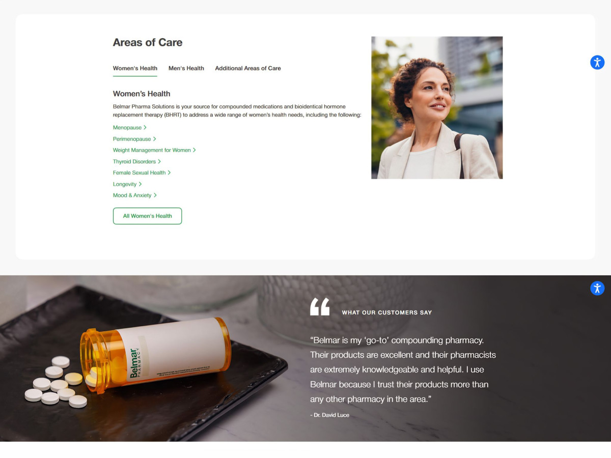
A compounding catalog runs deep enough to swallow people whole, so the design makes it easy to stay found. Tabbed Areas of Care and breadcrumb trails like "Areas of Care / Women's Health / Menopause / HRT" let a visitor dig into one specific therapy and climb right back out, none of the dead ends that send people hunting for the back button.
The build treats accessibility and plain language as part of the job, not a finishing touch. An accessibility control rides along on every page, and the technical pages get rewritten in words a normal person can follow, so someone with zero pharmacology background still understands what a hormone or a low-dose therapy actually does before deciding to order.
Client Testimonial
RainCastle Communications built the redesign on a combined SEO and AEO strategy, starting with an AI brand visibility audit, keyword research, and a deep listen through real customer service calls to learn what patients and providers keep asking.
That research shaped a new site map, detailed wireframes, a fresh visual identity, and full front-end and back-end development, and the team ran QA against a fixed launch date.
As the client put it, "They made us feel like their only client; we were never pushed or deprioritized because of other clients."