- Agency: Starfish
- Client: Vyleesi
- Category: Website Design — Medical & Pharmacy
- Location: New York, New York
- Project Brief: Reframe the brand and consumer website for an FDA-approved, as-needed treatment for hypoactive sexual desire disorder (HSDD) in premenopausal women, so it feels warm and personal while carrying full regulatory content.
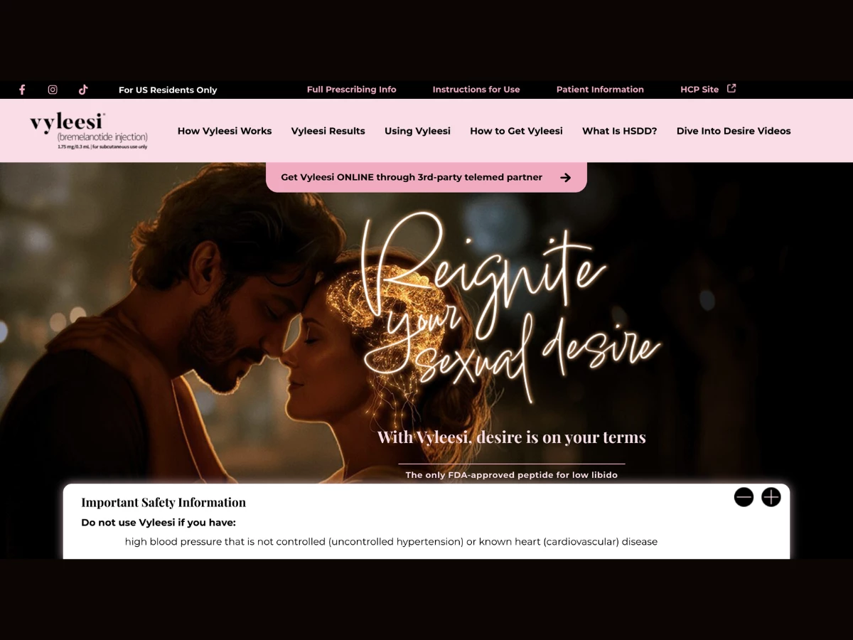
A medical and pharmacy website about low desire can lose its audience the moment it sounds like a pamphlet. Starfish rebuilt Vyleesi’s site around a glowing neon script that reads “Reignite” and the promise that desire happens on your terms.
Vyleesi entered the market behind a competitor that owned the conversation. Many women saw it as a one-time try, so the brand needed a voice that invites an ongoing choice.
The hero sets that tone with warm, cinematic photography of a couple. The neon “Reignite” script glows over the image, above the line “With Vyleesi, desire is on your terms.”
Deep black and soft blush pinks carry the palette. Butler serif headlines pair with a handwritten accent script and clean sans-serif body copy.
The navigation follows the questions patients ask. Links cover how Vyleesi works, results, how to use it, how to get it, and what HSDD is.
From there, the homepage walks through how Vyleesi acts in the brain and four icon-led benefits. Trial results appear as large serif figures of 164% and 75%, framed in a bordered card with full footnotes.
A step-by-step autoinjector guide uses product imagery to make first use less daunting. Side effects, an HSDD self-check, and the “Dive Into Desire” expert video series follow.
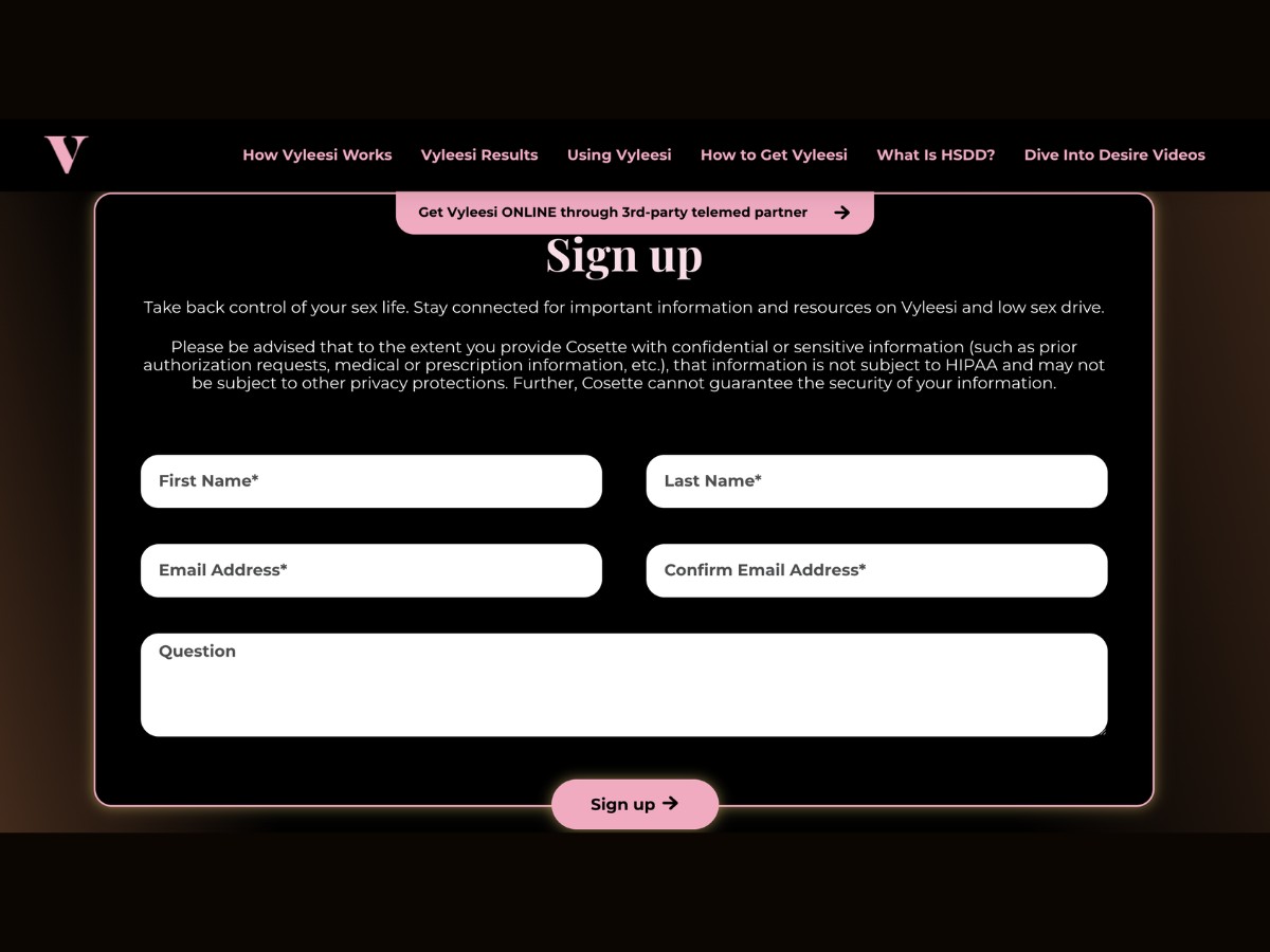
Getting a prescription stays simple. A pink pill button links straight to a telemedicine partner, and a utility bar keeps prescribing information and instructions for use one click away.
Regulatory content stays in view the whole time. A persistent Important Safety Information panel expands and collapses with plus and minus controls, and the layout reflows cleanly on phones.
Results & Impact
Vyleesi now speaks to women about feeling like themselves again. The brand has a more emotional, confident voice, while the medical information stays clear and easy to find.
- Warm brand voice: Neon script, cinematic photography, and blush tones replace a clinical tone
- Patient-first navigation: Menu labels mirror the real questions women ask about treatment
- Clear path to treatment: A telemedicine button takes visitors straight to a prescription
- Compliant by design: Safety information, prescribing details, and footnotes stay visible throughout