- Agency: Toormix
- Client: Barrufet Seafood
- Category: Logo Design — Food & Beverage
- Location: Barcelona, Spain
- Project Brief: Create a scalable logo and brand identity that unifies Barrufet Seafood's fresh and frozen product divisions while supporting international growth through a cohesive, modular visual system.
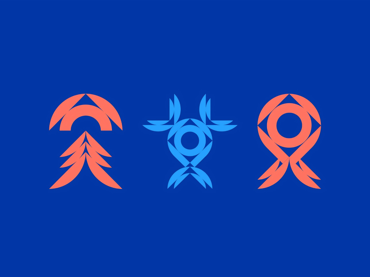
A seafood house that runs three brands needs a food logo that holds all of them together. Barrufet Seafood does it with one geometric fish mark that rebuilds itself for each division.
The mark reads as a fish head-on, split from a curved tail form into a diamond eye and a circular body. That modular construction lets Toormix rotate and recolor the same geometry per division without breaking the family resemblance.
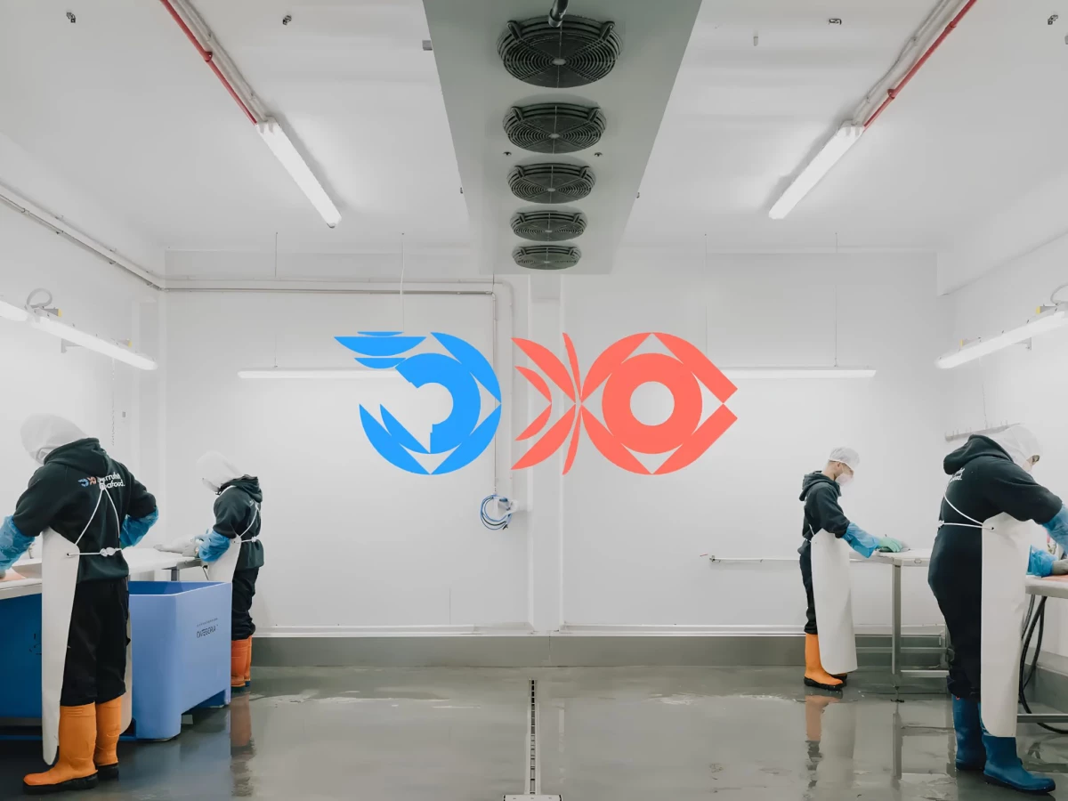
Color does the sorting across the system. Deep corporate blue anchors the Barrufet Seafood parent, a cooler blue marks BarruFrost for frozen, and a salmon orange flags BarruFresh for fresh produce.
The split blue-and-orange lockup states the parent brand's whole pitch in one glyph, fresh and frozen under a single house. Toormix kept the wordmark clean and rounded against that mark, so the identity scales from a business card to a Mercabarna facility wall and still reads as one operation.