


-account-photo_listing.jpg)
-account-photo_listing.jpg)


Our Jury has worked with Prada, Nike, Chanel, Google, and Apple.
Best Food & Beverage Logo Designs of 2026
View the Top Food & Beverage Logo Designs Below
Best Logo Designs
4,200+ Submitted Designs- Advertising
- Agriculture
- AI
- Airline
- Alcohol
- App Company Logo
- Architecture
- Arts & Recreation
- Automotive
- Banking & Finance
- Beer
- Church
- Clothing Brand
- Coffee
- Content & News
- Distribution
- E-Commerce & Retail
- Education
- Engineering
- Entertainment
- eSports
- Farm
- Fashion & Beauty
- Food & Beverage
- Government
- Health & Wellness
- Hospitality
- Legal & Insurance
- Luxury
- Manufacturing
- Non-Profit
- Photography
- Professional Services
- Real Estate
- Restaurant
- Restuarants
- SEO Agencies
- Shoe Brand
- Small Business
- Software
- Sports & Leisure
- Startup
- Technology
- Travel
- Video Companies
- Weed/Cannabis
- Abstract
- Animated
- Artistic
- Bakery
- Black
- Black & Yellow
- Blue
- Bold Logo
- Brand
- British
- Business
- Circle
- Creative Name
- Dental Office
- Done by Freelancers
- Emblem
- Floral
- Geometric
- Glow
- Gradient
- Gym
- Icon
- Illustration
- Lettermark
- Logo symbols
- Makeup Brand
- Marathon
- Minimal
- Modern
- Monogram
- Multicolored
- Nature
- Negative Space
- Rebranding
- Red
- Redesign
- Simple
- Starting With the Letter S
- Successful
- Sunshine
- Trendy
- TV Channel
- Typography
- Unisex Salon
- Vintage
- Water
- Watercolor
- Wordmark
View Design
Red Bull
 Winner
★9.0/10
 AO 10.0
 BS 9.0
 KS 8.0
View Design
Balance
View Design
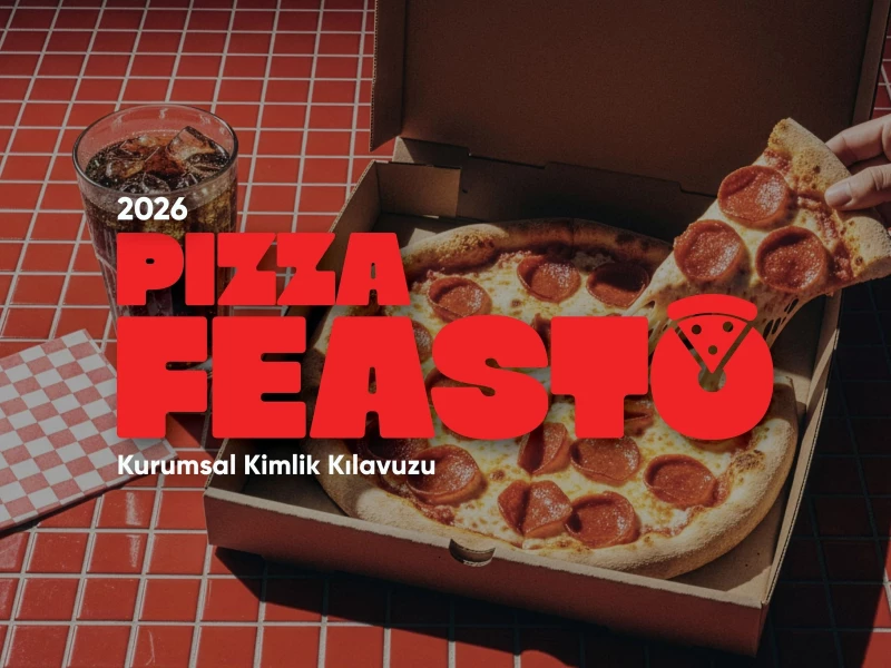
Pizza Feasto
View Design
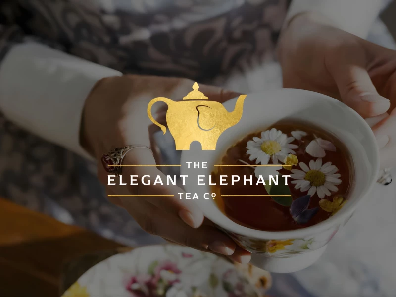
The Elegant Elephant Tea Co.
 Winner
★8.0/10
- AO 8.5
 SH 8.0
 BD 7.5
 LS 8.0
View Design
Omega Yeast
byKnoed
View Design
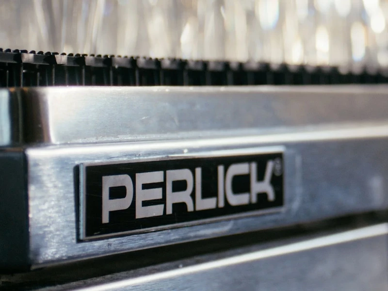
Perlick
View Design
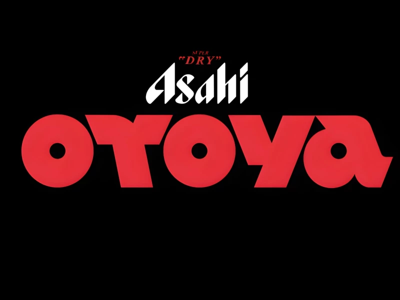
Asahi Otoya
View Design
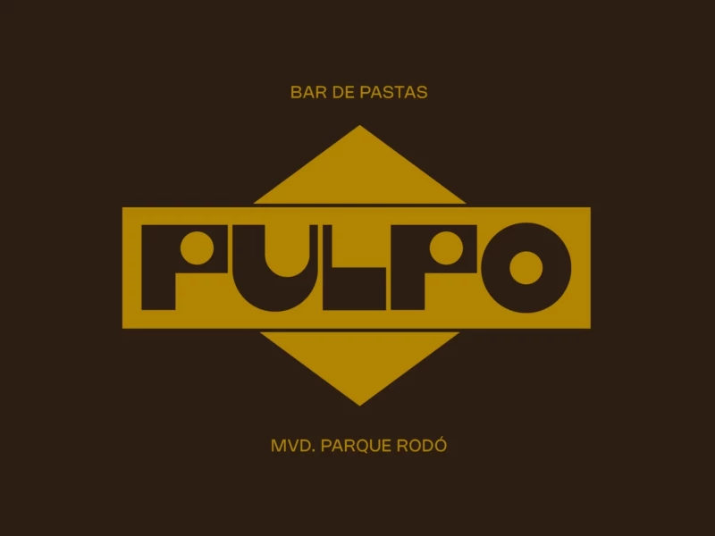
Pulpo
byPolar
View Design
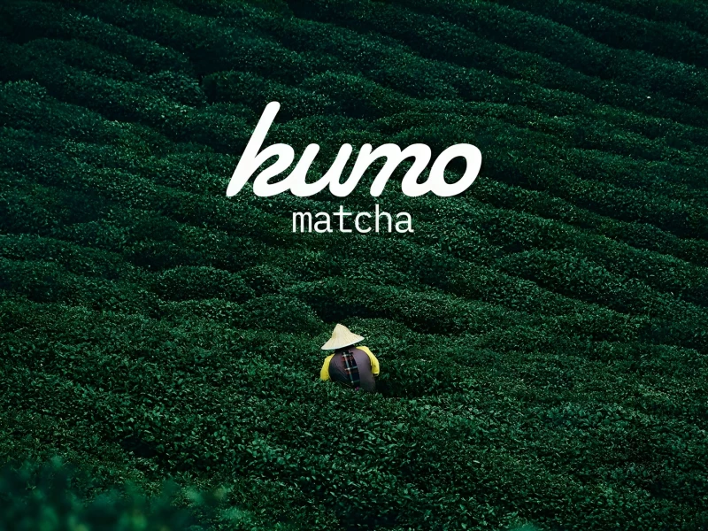
Kumo
Get Connected
With The Right Agency Partner
& Receive Proposals For FREE
View Design
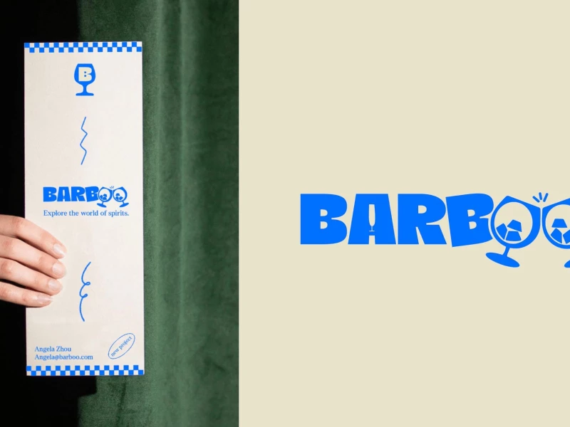
Barboo
View Design
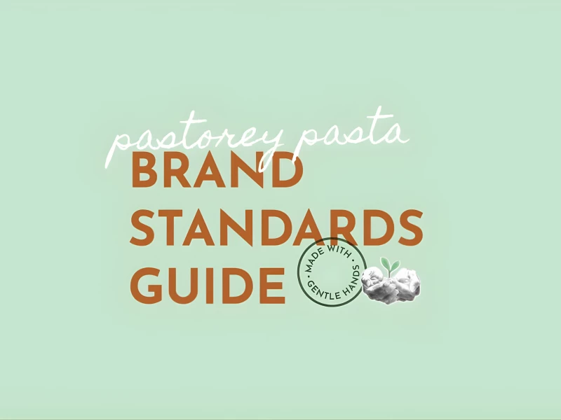
Pastorey Pasta
-preview-webp.webp)
View Design
McDonald's
View Design
Walmart Logo
View Design
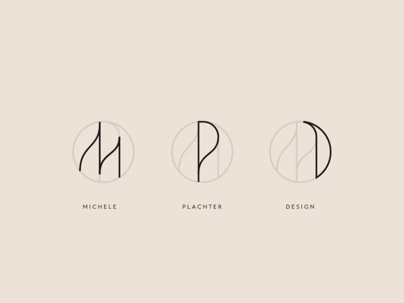
Michele Plachter Design
View Design
Italiano
byUBlac
View Design
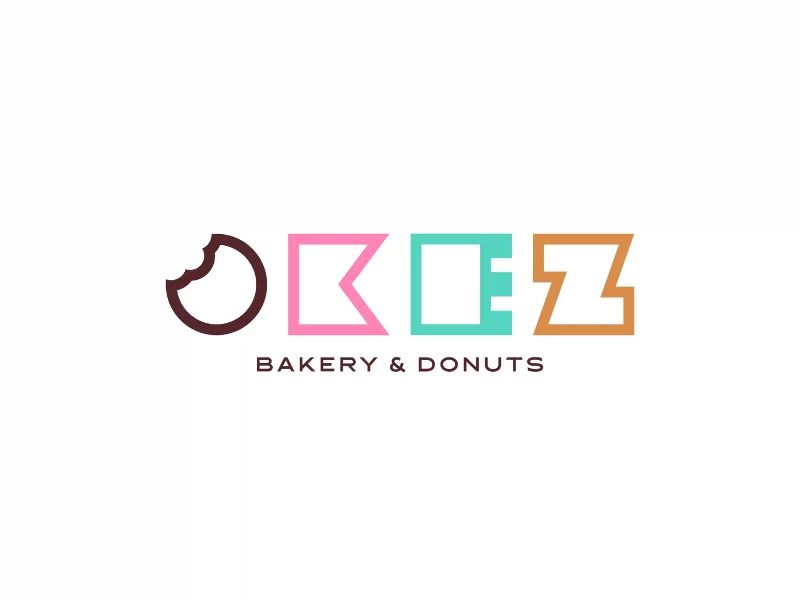
Okez
View Design
Postmates
Ready to elevate your designs?