
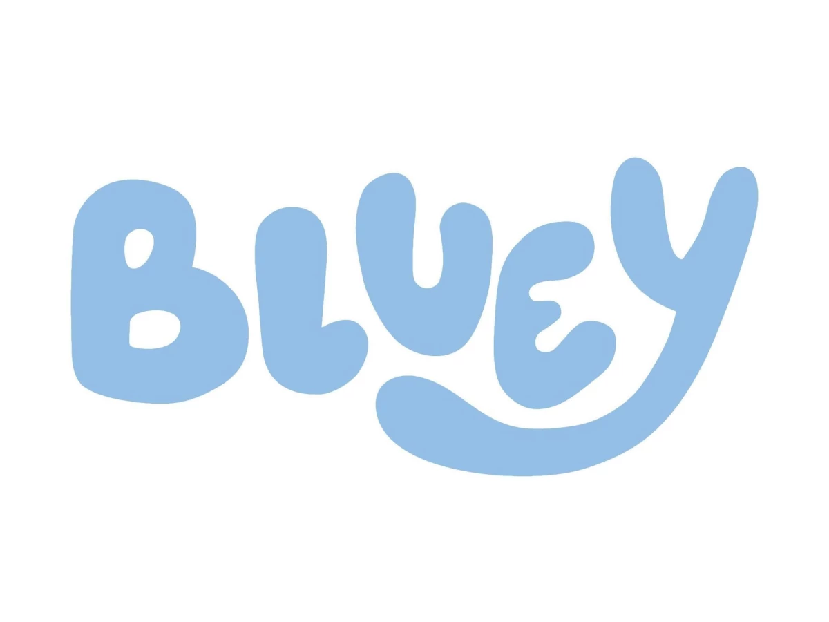

The Bluey logo looks like a kid drew it. That is the most deliberate thing about it.
In 2016, Bluey's first logo looked like a kid scrawled it. Shaky edges, letters at random heights, no two strokes the same weight. So the team fixed it. They lined the letters up and smoothed the edges. Then they did the strange part. They put the mess back in, on purpose.
Key Points:
- The Bluey logo is a custom wordmark in rounded blue letters set at deliberately uneven angles, with the y's leg swinging out beneath the word.
- Ludo Studio built the mark on Hello Headline, a paid commercial typeface from the foundry DearType, then modified the letters.
- Two earlier pilot versions exist, including a 2017 one used in a single pilot episode that never aired.
- Free "Bluey font" downloads are fan-made lookalikes licensed for personal use only, and the name and characters belong to Ludo Studio and BBC Studios.
- The wobble is engineered rather than naive, and that engineering is what makes the logo worth taking seriously.
What Is the Bluey Logo?
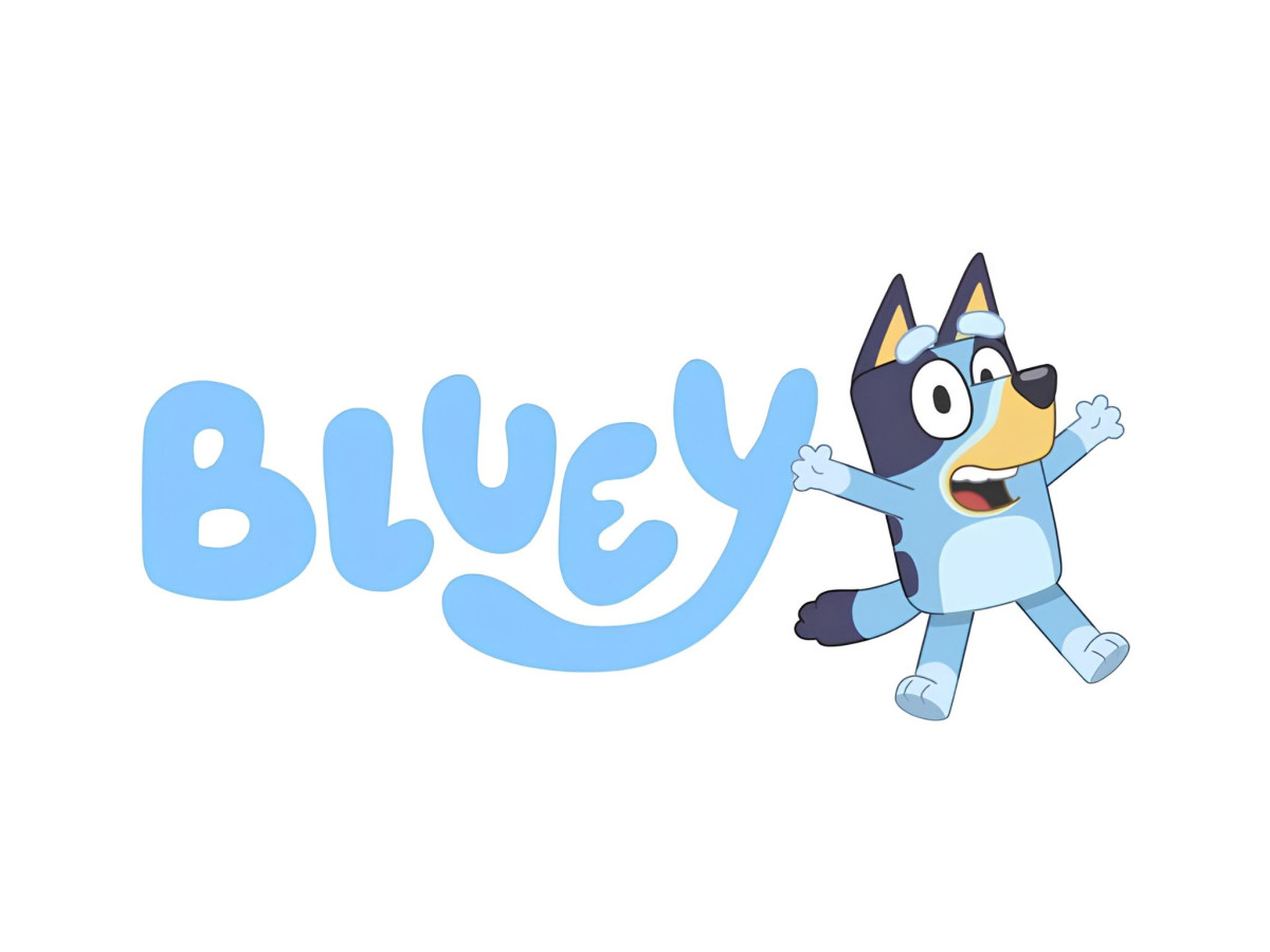
The Bluey logo is a custom-lettered wordmark rather than a picture of the dog. It spells "Bluey" in five rounded blue letters, each tipped at a slightly different angle so the word looks tossed onto the screen rather than set in a straight line.
The verdict up front: this is one of the best-engineered casual wordmarks on television, and almost nobody notices the engineering, which is the point.
The last letter does the signature work.
The y's leg drops below the baseline, hooks to the left, and runs back underneath the word, passing beneath the e, the u, and part of the l before it tapers off.
That single stroke turns the bottom edge of the logo into a shallow swoosh and pulls the whole silhouette down and to the left. Cover the y's tail with your thumb and the mark goes flat and ordinary.
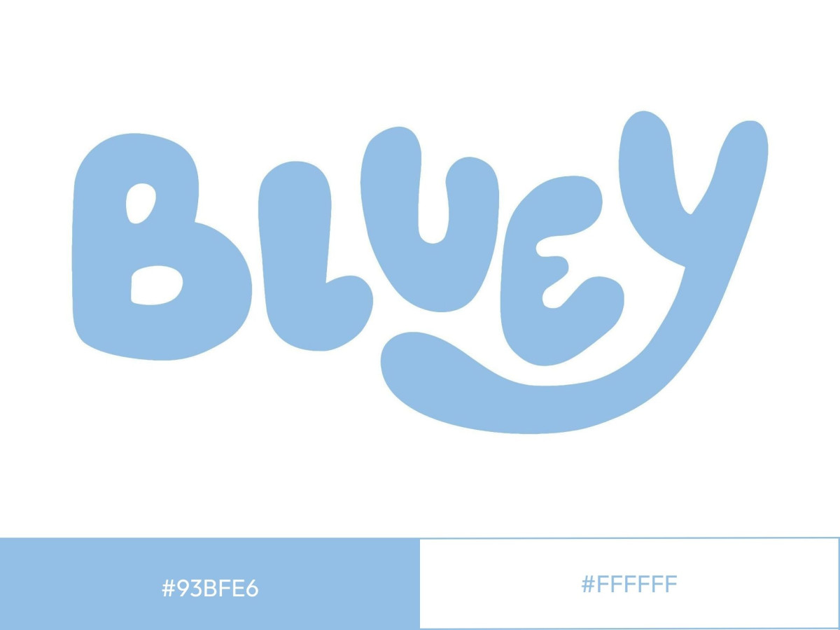
The color is one blue in two tones. A bright face blue sits on top, and a darker blue drops behind it as a hard shadow, which gives the flat letters a slight lift off the screen.
Ludo Studio and BBC Studios publish no official public hex for the wordmark, so the swatch lists approximate values only.
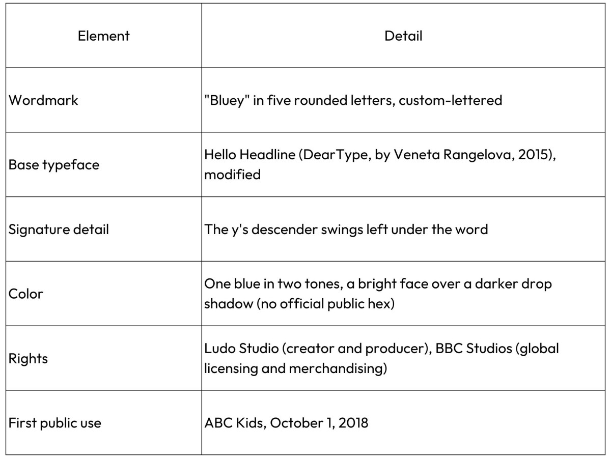
Bluey Logo at a Glance
What Font Is the Bluey Logo?
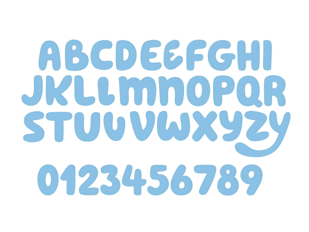
The Bluey logo is built on Hello Headline, a commercial typeface designed by Veneta Rangelova and published by the foundry DearType.
Ludo Studio custom-lettered the wordmark from that base, which is why the subtitle type in the series and on the official site matches while the main logo does not quite.
Fonts In Use documents that Hello Headline first appeared in the unaired 2017 pilot, then returned in modified form for the broadcast logo.
You will see a second name attached to this logo online: Magic Sound by Imagex. That one is a fan-made replica, not the real thing.
It lives only on free-download sites that label it themselves as a lookalike built to mimic the show's lettering, and it carries a personal-use-only license. The tell is simple. The genuine article traces to a working foundry with a paid catalog. The impostor traces to aggregator pages that exist to farm the search term. When two sources disagree and one of them is selling you a free download of a trademarked brand's font, trust the other one.
The licensing reality matters if you are making anything to sell, and this is where most Bluey font pages leave parents stranded. Here is the straight version.
- Hello Headline is a paid font. A single desktop style runs $29 on MyFonts. The desktop license covers commercial graphic design, including logos, invitations, and printed goods, but it does not permit modifying the font files, and the foundry terms can restrict use in resold products, so read the specific EULA before you sell.
- The free demo does not count. The Fontspring demo is installable for testing and comping only. It strips out extended characters and cannot legally appear in any finished project, personal or commercial.
- The free "Bluey fonts" are personal use only. Magic Sound and the other replicas are licensed for personal projects, which means they are not cleared for items you sell on Etsy or anywhere else.
- The font is the smaller problem. The name "Bluey" and the characters are the intellectual property of Ludo Studio, with BBC Studios holding global merchandising and licensing rights. A legal font does not buy you the right to sell Bluey-branded party goods. That still requires permission from the rights holders.
If you are making invitations for your own kid's party, a licensed font and a home printer keep you clear. The moment money changes hands, the trademark line is the one that catches people, not the typeface.
Why Does the Bluey Logo Look Hand-Drawn?
The hand-drawn look comes from three specific changes to Hello Headline, and all three are choices rather than accidents.
- Set the two side by side and most of the letter is untouched.
- The stroke weight is the same heavy, even line.
- The terminals keep the same soft round ends.
The counters, the holes inside the b and the e, stay open and round, and the x-height stays tall. Ludo Studio kept the bones of the typeface.
What changed is position, not shape. Each letter is rotated a few degrees off the baseline, some tipped left and some right, so no letter sits square. The spacing was opened up and made uneven, so the gaps between letters no longer match.
And the y's descender was pulled out into the long left-swinging tail that anchors the whole word. Rotation, spacing, and one custom swash. That is the entire trick.
That trick has to survive two very different sizes, and it does. Blown up on a lunchbox or stitched into a backpack, the heavy uniform strokes hold because there are no thin lines to break or drop out in embroidery.
Shrunk to a streaming tile on a phone, the tall x-height and open counters keep the word readable at a glance. The y's tail is the first detail to simplify at tiny sizes, and the mark still works without it, which is a sign the core was drawn to reduce cleanly.
What Did the Bluey Logo Look Like Before?
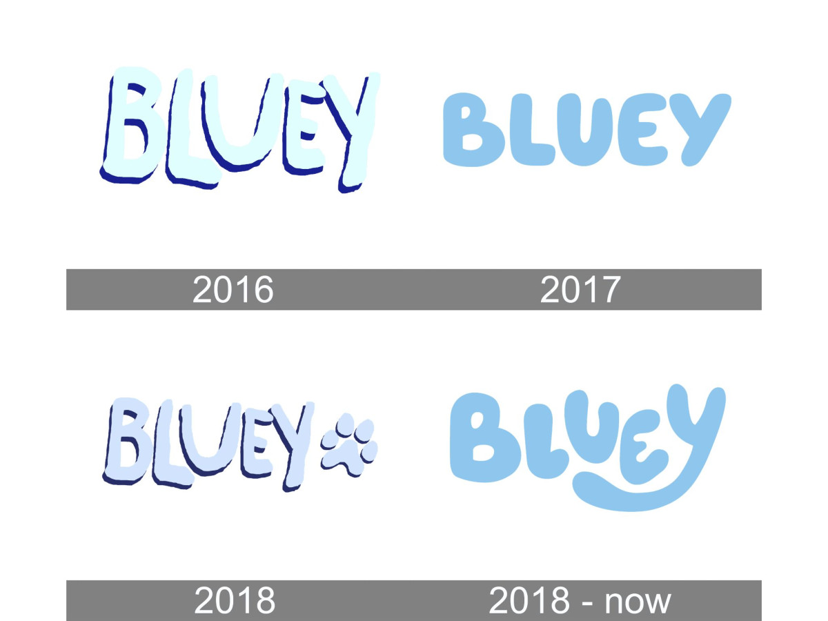
Two pilot logos came before the one you know, and together they prove the wobble was engineered.
Both are hard to find, because neither pilot was ever broadcast. An anonymous source leaked them in February 2023, as the Bluey wiki records.
The 2016 pilot came first, made at Joe Brumm's own Studio Joho before Ludo Studio took over. Its logo is the genuinely rough one.
The letters wobble with jagged, shaky edges, sit at mismatched heights, and carry uneven stroke weights, the look of a mark drawn quickly in a basic editor and never corrected. This is the sloppiness people assume the final logo has. It does not.
The 2017 pilot, produced by Ludo for the Asian Animation Summit and used in a single episode that never aired, shows the correction.
The team set the name cleanly in Hello Headline, aligned the letters to a shared baseline, smoothed the edges, and evened the stroke weights, and added a small pawprint beside the word, per the logo history on Logopedia.
The result is tidy and legible. It is also a little flat, because tidy is not the same as alive.
The broadcast logo in 2018 is the third step, and it is where the engineering shows. It reached the public when the show premiered on ABC Kids on October 1, 2018.
Ludo took that clean, aligned Hello Headline setting and deliberately reintroduced disorder: the letters back to odd angles, the spacing opened and uneven, the y's tail extended into its swash.
Each move was a decision made against a corrected baseline. None of it was a mistake left uncorrected. The before-and-after is the evidence. They knew exactly how to make it neat, and they chose not to.
Does Designing for Children Mean Designing Badly?
Rounded letters, tilted angles, and a hand-drawn wobble are now a default logo trend for preschool brands, and a lot of that work skips the step Bluey did not.
The lazy version takes a rounded font off the shelf, tips the letters at random, and ships it. The considered version corrects the type first, learns where the eye trips, and then reapplies irregularity on purpose, the kind of correction pass a good branding agency builds in.
The difference between the two is that pass, and you can usually see whether it happened.
Bluey sits on the engineered end, and it is not alone there. Nickelodeon's orange splat is another mark that looks careless and is anything but, a flexible shape held to strict rules across decades of use.
The off-the-shelf end is easy to find too. A brand like Cocomelon uses the standard rounded-bubble treatment straight, with none of the corrective tension that gives Bluey its bounce, and it works fine for what it needs to do.
Neither approach is wrong. One is just doing far more engineering than it admits.
That is the real answer to the question. Designing for children does not mean designing badly. It means the badness has to be faked well, and faking it well is harder than drawing it straight.
Bluey is the case study because the pilots let you watch the fakery get built. You can browse plenty of strong marks in any logo design gallery, but few of them come with the receipts.
Verdict
The Bluey logo earns its place by hiding its own craft. A parent making a party banner sees a happy scribble.
A designer who pulls up the pilots sees a team that cleaned up a mess, studied it, and rebuilt the mess on purpose with rotation, spacing, and a single swinging tail. Both readings are correct, and the gap between them is the whole achievement.
It is easy to underrate work that is built to look effortless, and this is a piece of professional logo design dressed up as an accident. The wobble is not a lack of skill. It is skill spent on looking like it was never there.
Bluey learned to draw neatly, then unlearned it one letter at a time.
Our team ranks agencies worldwide to help you find a qualified partner. Visit our Agency Directory for the Top Logo Design Companies as well as:

_846a41f353f1-preview.jpg)
_bde85937451c-preview.jpg)