
Every logo is built to be noticed. The CapCut logo got exactly what every logo wants, and now people pay money to make it disappear.
It rides in the corner of millions of clips in your feed, dropped there by the app that trimmed them. Look at what people actually ask about the mark and a pattern shows up fast. Almost nobody types "what is that symbol." A steady stream types "how to remove CapCut logo." The mark pulls about 72,000 searches a month worldwide, 20,000 of them in the United States according to Ahrefs in August 2026, and the query that shadows it most closely asks for its own deletion.
That is the trouble with winning on distribution. It puts your mark in front of everyone without ever making them care what it is. A logo this visible that provokes this little curiosity is a genuine design problem, and this piece treats it as one.
What Is the CapCut Logo?
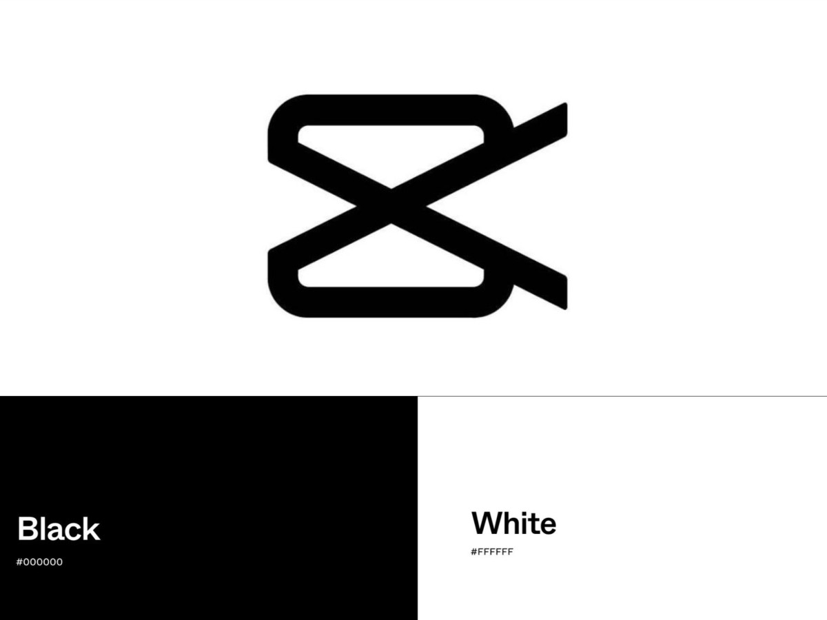
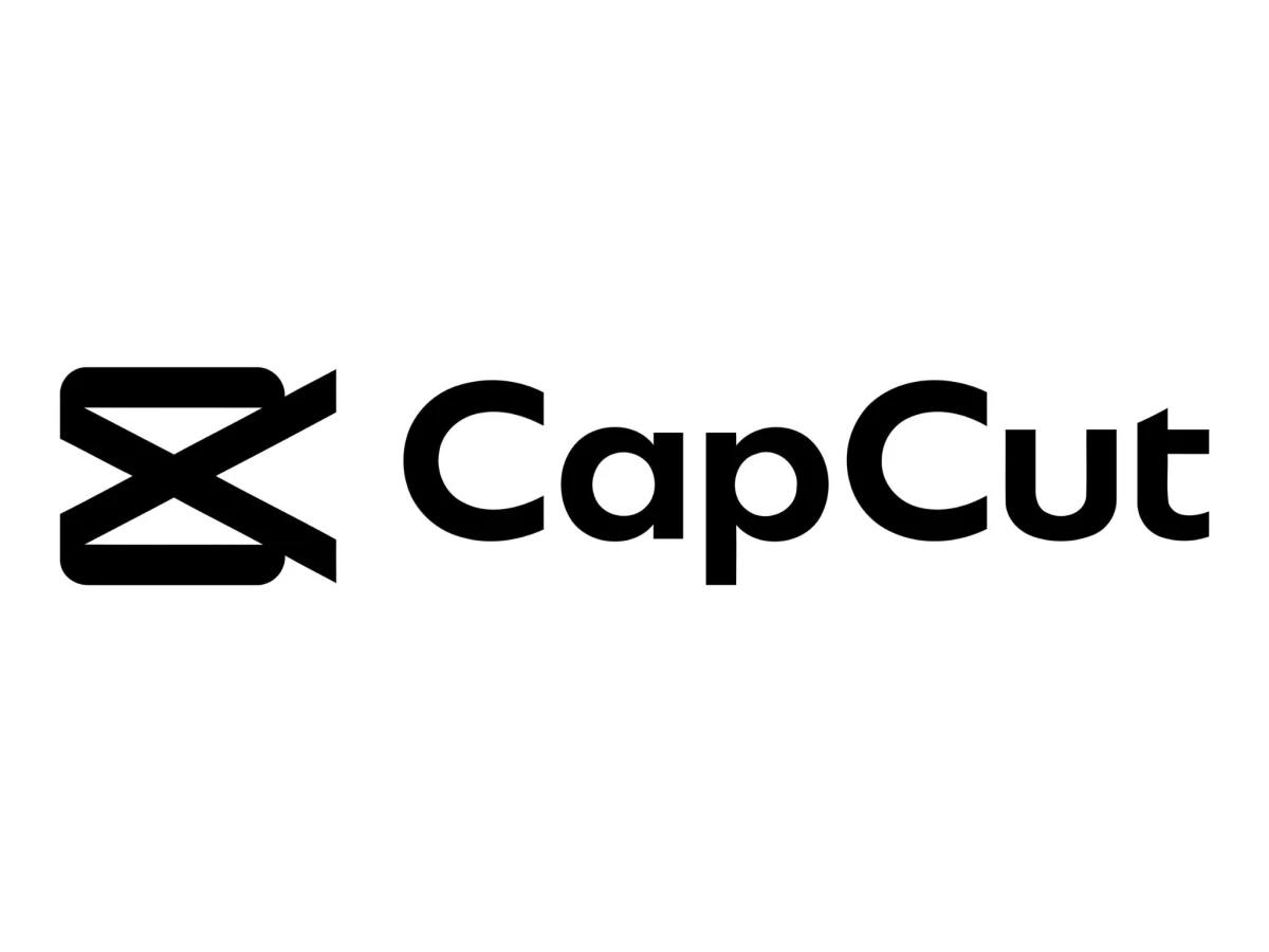
The CapCut logo is a combination mark: an angular white symbol sitting on a black rounded-square app tile, paired with a custom geometric wordmark. It uses two colors and nothing else, black and white, with no gradient and no accent hue. The verdict up front: this is a competent, legible mark that fails at the one task a logo exists to perform, which is telling you what the product is. The craft is fine. The communication is not.
CapCut confirms the icon's core function through repetition rather than through any single readable image. You see it, you learn to tie the shape to edited video, and the shape itself never has to mean anything. That strategy works when your parent company is ByteDance and your distribution channel is TikTok. It still amounts to a retreat from what logos are supposed to do.
Specs at a Glance
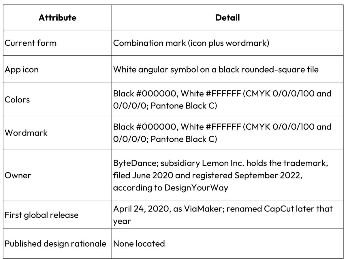
For readers who came for the asset rather than the critique: the CapCut logo PNG is the black-and-white app mark on a transparent ground, and no separate brand color exists beyond the two values above.
What Does the CapCut Logo Actually Depict?
No two sources describe the CapCut logo the same way, and that disagreement is the clearest evidence of the mark's failure to communicate. Design write-ups have called it a stylized video camera, a pair of scissors, two intertwined videotape ribbons forming an infinity loop, a film strip, and a plain letter "X." Those are not shades of one reading. They name five different objects, and people who study logos for a living back each one with equal confidence.
The interpretations are worth listing because their spread is the point. 1000logos traces the original icon to a horizontal video camera whose contours suggest scissors. DesignYourWay reads a camera-and-scissors hybrid, capture plus cut. Logos-world sees interwoven ribbons resolving into an infinity symbol. Other explainers land on a film strip or reel or a sliced letter "X." A mark you can honestly read as any of those is, in practice, none of them.
Look at the geometry directly and the confusion makes sense. The symbol stacks a few thick strokes, each one cut off at a sharp angle, around a diagonal crossing at the center. The counters, the open gaps between the strokes, carry most of the meaning, and they stay ambiguous by construction: the same negative space reads as a lens, a blade gap, or the crossing of two ribbons, depending on what you expect to find.
At full size on a marketing page the strokes stay distinct. Shrink the icon to roughly 60 pixels, where it actually lives on a phone home screen, and the internal cuts start to close. A dense angular blob survives at that size, and most people parse it as an "X" and stop thinking about it.
What About the Wordmark?
The current CapCut wordmark uses a custom geometric sans set in title case, and its one deliberate quirk is a shortened crossbar on the lowercase "t." The letters carry stable, even weight with sharpened tails on the vertical strokes, which gives the name a clean, engineered look. The wordmark does the communicating the icon cannot, because it spells the product name outright.
One detail circulating in older write-ups needs correcting before anyone repeats it. Several pieces describe "erased" or missing horizontal bars on the letter "A." That trait belongs to the previous all-caps ViaMaker wordmark, where both "A" characters dropped their crossbars, as 1000logos documents. The current mark sets the name in title case as "CapCut," so it contains no uppercase "A" at all, and the erased-crossbar description does not apply to today's logo. The live signature sits on the "t," not the "A."
What Does the CapCut Logo Mean?
CapCut publishes no official explanation of what its logo means, and that absence itself deserves stating plainly. Searches for "capcut logo meaning" turn up interpretation rather than documentation. The company has released no design rationale and no symbolism statement that I could locate, so every "meaning" you read online is a writer reverse-engineering intent from the shape.
Only a few claims hold up. The mark communicates "video editing app" through learned association and category context. You never have to decode the shape for that to work. Claims that the logo "symbolizes limitless creativity" or means "cutting and capture" are third-party readings, and honest coverage should label them as guesses rather than repeat them as fact.
The History, in One Section
The CapCut logo's history is short, and it explains the app's reach more than it explains the mark's design. The app began in China as Jianying. Shenzhen Lianmeng Technology built it, and ByteDance acquired it, reportedly for around $300 million in 2018 (the figure circulates widely but carries no official confirmation). The Chinese release landed in 2019. The international version launched as ViaMaker on April 24, 2020, then took the CapCut name later the same year, according to Econsultancy's account of its rise. A 2022 refinement thickened the icon's strokes and flattened the camera form. India banned the app in June 2020 alongside other China-linked software.
The distribution context matters more than any redraw. On Jan. 19, 2025, Apple and Google pulled CapCut from U.S. app stores to comply with the Protecting Americans from Foreign Adversary Controlled Applications Act, sweeping it up with TikTok and other ByteDance apps rather than targeting it alone, as Fast Company reported. Existing installs kept working, and the two companies restored the app to U.S. stores on Feb. 13, 2025, according to Variety. The mark that people scroll past every day briefly vanished from the two stores that distribute it, then came back within weeks.
Distribution Versus Meaning: The Real Argument
The CapCut logo works as a case study in distribution beating meaning, and the watermark is the mechanism. CapCut stamps its mark on exported clips by default, so the logo reaches audiences as a side effect. Nobody sought it out. It arrives bolted to content they wanted anyway. The app passed 200 million monthly active users by 2022 according to multiple accounts, and Forbes reported millions of U.S. users by 2024. Recognition at that scale comes from volume. Symbolism has nothing to do with it.
Two data points expose how thin the affection underneath runs. The first is the removal demand covered up top: the thing people most want from this logo is its absence. The second is quieter and stranger. "Blue capcut logo" pulls around 1,100 searches a month, and the intent is plain. Users recolor the icon themselves, swapping the default black for a blue that matches their home-screen theme. When people engage this mark creatively, they recolor it to taste. The form itself inspires no such attention. A logo strong enough to defend would not invite that.
Set CapCut against category peers and the gap shows. Editors that want an audience to understand them tend to use marks you can actually read.
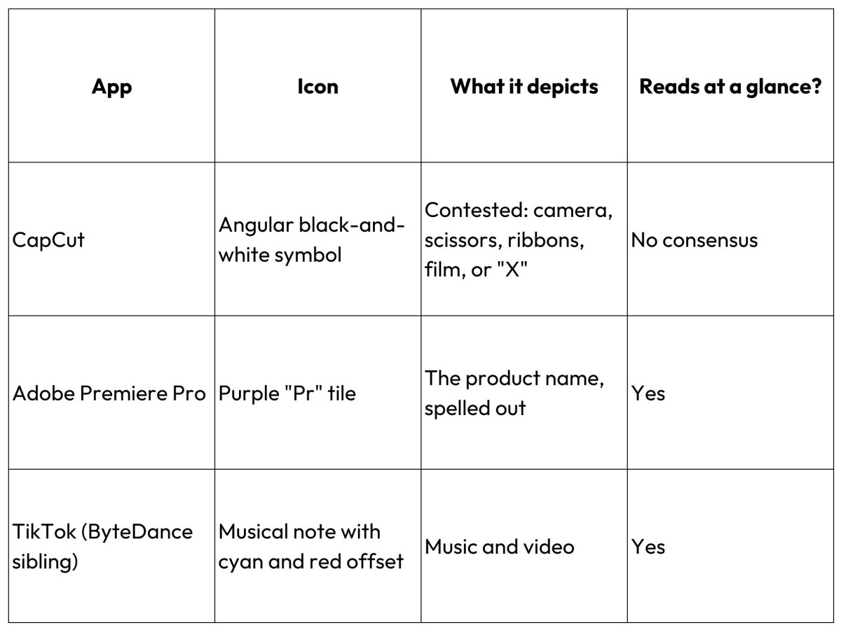
Premiere Pro tells you it is Premiere Pro. TikTok's note reads as sound and motion across every culture that has met it. CapCut sits inside the same corporate family as TikTok, and it opted out of that legibility and let distribution carry the load instead.
Verdict
The CapCut logo is not a failure of craft. Its own scale makes the real decision explicit: a mark can skip meaning entirely when the distribution behind it runs large enough. The strokes are clean and the wordmark is well drawn. The whole system reproduces perfectly at any size. None of that answers the question a stranger asks on first sight, which is "what is this," and CapCut has arranged its business so that nobody ever has to answer it.
That is the uncomfortable lesson for anyone designing a mark in 2026. Symbolism turns optional once reach is a given, and a default watermark on a billion clips guarantees reach. The CapCut logo proves you can win the whole feed and still lose the argument about what you are. Distribution bought the recognition. Meaning never made the budget.
Our team ranks agencies worldwide to help you find a qualified partner. Visit our Agency Directory for the Top Logo Design Companies as well as: