
Type the word "coffee" in most handwriting fonts and look at the two f's. They are identical. So are the two e's. Real handwriting never draws the same letter the same way twice, so the second you spot perfect twins, the illusion drops and the type looks stamped. A few fonts fix this on purpose. Most never try.
Key Points:
- Real handwriting never repeats a letter identically, so a font that stores one shape per letter looks stamped the moment a word doubles a letter.
- Contextual alternates fix the problem by swapping in different versions of the same letter automatically, and only some fonts include them.
- Caveat is the standout free face here, because Pablo Impallari built it with contextual alternates, while popular picks like Indie Flower and Permanent Marker carry none.
- Every font on Google Fonts is free for commercial, web, and app use under the SIL Open Font License, while many "free" DaFont faces are licensed for personal use only and cost money the moment a client or a product is attached.
- Alternates can sit switched off by default, so licensing a good font is not enough. You also have to turn the feature on in your software.
What Are Handwritten Fonts?
A handwritten font is a typeface drawn to look written by hand rather than typeset. The category runs from a fat marker scrawl to a fine-pen signature, and the whole point is that the letters read as human. That is also where most of them fail, because a font is a set of fixed drawings and a hand is not.
Comic Sans belongs in this story for one reason. Vincent Connare drew it in 1994 for the speech bubbles in a Microsoft program, it shipped on nearly every Windows machine, and it taught a generation what a casual font looks like.
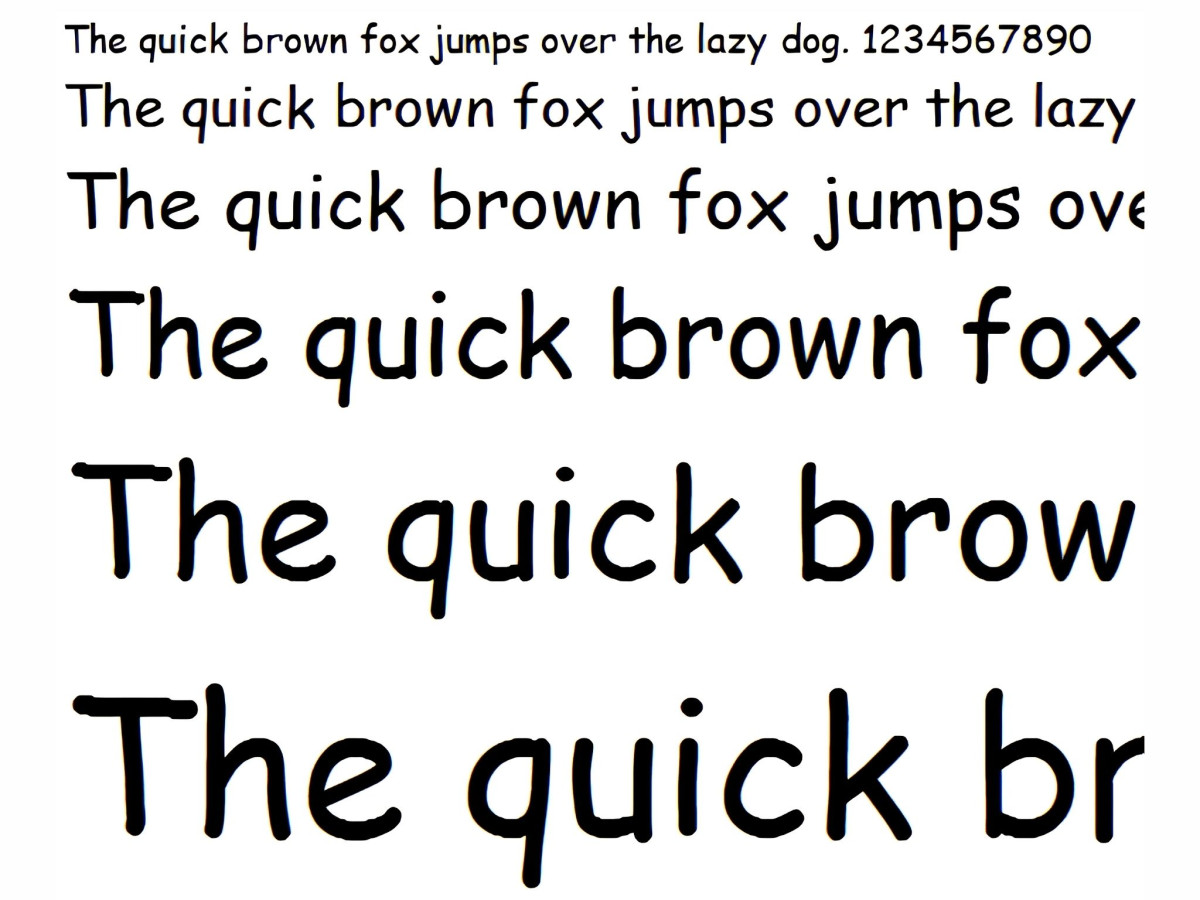
It also reuses one shape per letter, which is the exact flaw this guide is about. It is not the villain here, just the most famous example of the thing that makes handwriting fonts look fake.
Why Do Handwriting Fonts Look Fake?
Handwriting fonts look fake when the same letter shape shows up twice in a row. A font stores one drawing per letter by default, so "balloon" gives you two identical l's and two identical o's sitting side by side, and your eye reads that repetition as printed rather than written. The problem is worst on exactly the everyday words people set in these fonts: names, "hello," "letter," "coffee."
The fix is a feature called contextual alternates, tagged calt in the font file. A font with contextual alternates carries several versions of the same letter and swaps them automatically based on the letters around them, so the two o's in "balloon" come out slightly different and the word looks drawn. This is the single feature that separates a handwriting font that passes from one that reads like clip art. You can test any face in two minutes by setting three words: "letter," "coffee," and "balloon." If the doubled letters are twins, there are no working alternates.
Here is the trap that catches people who did everything right. Contextual alternates are often switched off by default, so you can license a good font, set your text, and still get identical twins because the software never turned the feature on. Where the switch lives depends on the tool.
- Adobe Illustrator: select your text, open the OpenType panel at Window > Type > OpenType, and click Contextual Alternates. Turn on Standard Ligatures while you are there. Illustrator ships with contextual alternates off by default, so this step is not optional. A greyed-out option means the font does not include the feature.
- Figma: select the text layer, open Type settings, click the Details tab, and enable Contextual alternates. Figma exposes a smaller set of OpenType features than Adobe, but this one is there.
- Canva: there is no toggle. Canva does not expose OpenType alternates at all, so the feature only works if the font is PUA-encoded, and even then you paste special glyphs in by hand rather than having them swap automatically. For real alternate support, use a desktop tool.
Are Handwritten Fonts Free to Use?
Some are fully free, and some are free in a way that will cost you money later. The difference is the license, and it is worth two minutes before you commit.
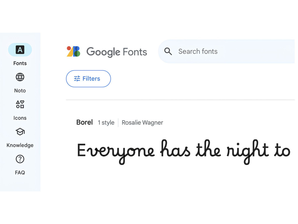
Every font hosted on Google Fonts ships under the SIL Open Font License, which allows commercial use, web embedding, and app embedding at no cost. That covers most of the faces below. When a Google Fonts face is the right fit, the licensing question is settled.
DaFont is where people get burned. A large share of its "free" fonts are free for personal use only, which means the moment a client, a product, or anything for sale is attached, you need a paid commercial license. The DaFont face "Author Handwriting" spells this out bluntly: free for personal use, a paid license required for any business use including logos and social posts, and a penalty of up to 100 times the license fee for unlicensed commercial work. Wildly popular signature faces like Brittany Signature carry the same personal-use-only limit under a "free" badge that most people never read past.
Two more traps are worth naming. Desktop, web, and app rights are often licensed separately, so a font you can legally put in a printed flyer may not be cleared to embed on your website. And "demo" versions are usually free personal-use downloads with a stripped character set, sold for real money in full form elsewhere. The rule that keeps you safe is simple: read the license at its source, the foundry page or the license file in the download, before the font goes anywhere near a paying job.
How Do You Identify a Handwritten Font From a Photo?
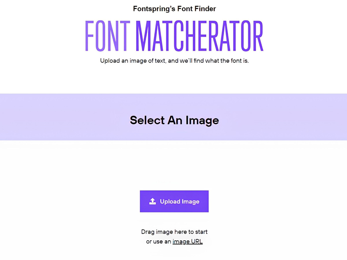
You upload the image to a font matcher, and for handwriting you lower your expectations. The three worth trying are WhatTheFont from MyFonts, Matcherator from Fontspring, and Adobe Capture, which turns a phone photo into a font suggestion inside Creative Cloud.
Handwriting is the hardest category for all of them, and the reason is the same feature this guide is built around. A good handwriting font changes its letters depending on their neighbors, so the same font produces a different-looking word in every sample, and the matcher has no stable shape to lock onto. Clean the image first, crop to a single clear word, and treat the result as a lead rather than an answer.
The 23 Handwritten Fonts, Compared
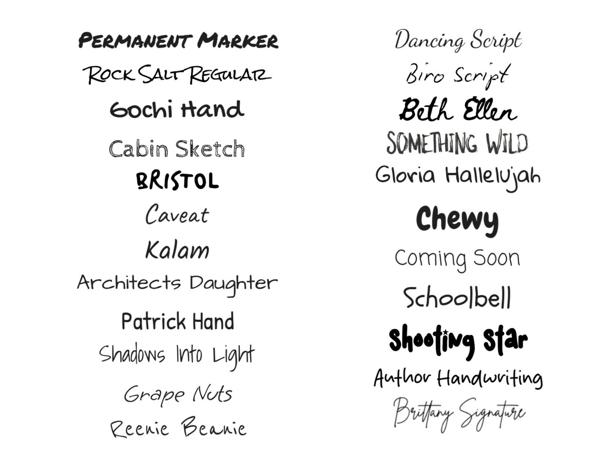
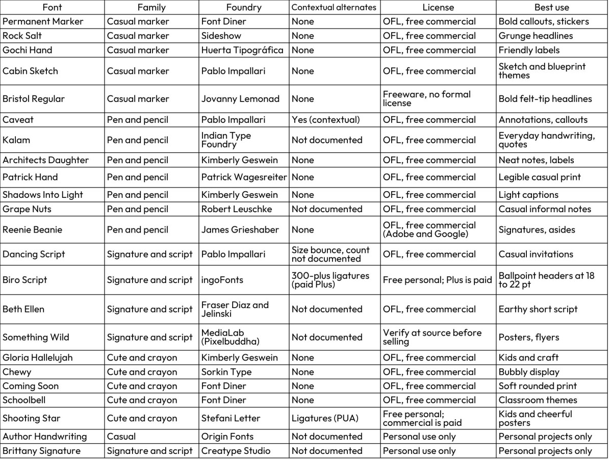
Every face below was checked at its source for license terms and for whether contextual alternates are documented. Where a foundry does not publish an alternate count, the table says so rather than guessing.
What Are the Best Casual Marker Fonts?
These are the fat felt-tip faces, built for a word or two at large size.
- Permanent Marker (Font Diner, OFL) is the default marker font, and it earns the spot with thick blunt strokes and a slight forward lean that reads like a Sharpie on a box. It carries no contextual alternates, so "coffee" shows twin f's and the lowercase can look like shouting. Keep it to a few words.
- Rock Salt (Sideshow, OFL) has dry-brush ragged edges and a jittery baseline that give it real grit. The default spacing runs tight, and the rough edges close up below roughly 16 pixels, so it needs room and size. No alternates here either.
- Gochi Hand (Huerta Tipográfica, OFL) is the gentlest of the markers, an even marker line with rounded ends and open letters that stay legible. It repeats its shapes, so a doubled letter gives it away, and it offers a single weight with no italic to lean on.
- Cabin Sketch (Pablo Impallari, OFL) draws each letter as a sketched double outline, which is a strong effect for blueprint and craft themes and a novelty everywhere else. The fine inner lines fill in and muddy at small sizes. Use it big or not at all.
- Bristol Regular (Jovanny Lemonad) turns a real artifact into a typeface, based on the felt-tip letter the artist Banksy sent to a Bristol school in 2016. The strokes are bold and blunt, closer to a protest-poster marker than a pen, which suits graphic layouts that want some edge. Two cautions come with it: there are no alternates, and Jovanny Lemonad ships it as freeware with no formal written license, so confirm commercial terms with the designer before you sell anything set in it.
What Are the Best Pen and Pencil Handwriting Fonts?
This family is the one to reach for when you want a real handwriting feel in running text, and it is where the alternates question matters most.
- Caveat (Pablo Impallari, OFL) is the face to beat among free options, because Impallari built it with working contextual alternates. Set "balloon" and the two o's come out slightly different, so the word looks written instead of stamped. Its quick ballpoint slant and open loops read as a fast note, and the only real limit is that the loops tighten at very small sizes.
- Kalam (Indian Type Foundry, OFL) has a fountain-pen quality, with a little stroke contrast and soft joins across three weights. Its per-letter variation is not documented, so long words can still show repeats, but the weight range gives you more control than most free handwriting faces.
- Architects Daughter (Kimberly Geswein, OFL) is the tidy drafting hand, an even monoline that leans toward uppercase and looks like a careful set of blueprint labels. It stores one shape per letter, so repeats are obvious, and it comes in a single weight.
- Patrick Hand (Patrick Wagesreiter, OFL) is an upright rounded print that stays readable at smaller sizes than most of this family, which makes it a safe pick for captions and short body text. It has no alternates and no italic. What you type is what you get, doubled letters and all.
- Shadows Into Light (Kimberly Geswein, OFL) is thin, fast, and light, a print-cursive hybrid that suits a delicate caption. The hairline strokes are its weakness, because they thin out and vanish in print and on screens below about 14 pixels, and it repeats its letters.
- Grape Nuts (Robert Leuschke, OFL) is a plain casual everyday hand, named after the breakfast cereal and built to strike an informal tone with no flourish at all. It is simple and legible, with no documented alternates, so it repeats its letters like most of this group. Reach for it when you want handwriting that stays out of the way.
- Reenie Beanie (James Grieshaber, OFL) is a thin ballpoint scrawl with a loose, fast look, and it is free on both Google Fonts and Adobe Fonts. The light strokes are the catch, because they thin out at small sizes and there are no alternates to break up the repeats. It works best for a single handwritten line, a signature, or a margin note set against clean type.
What Are the Best Signature and Script Fonts?
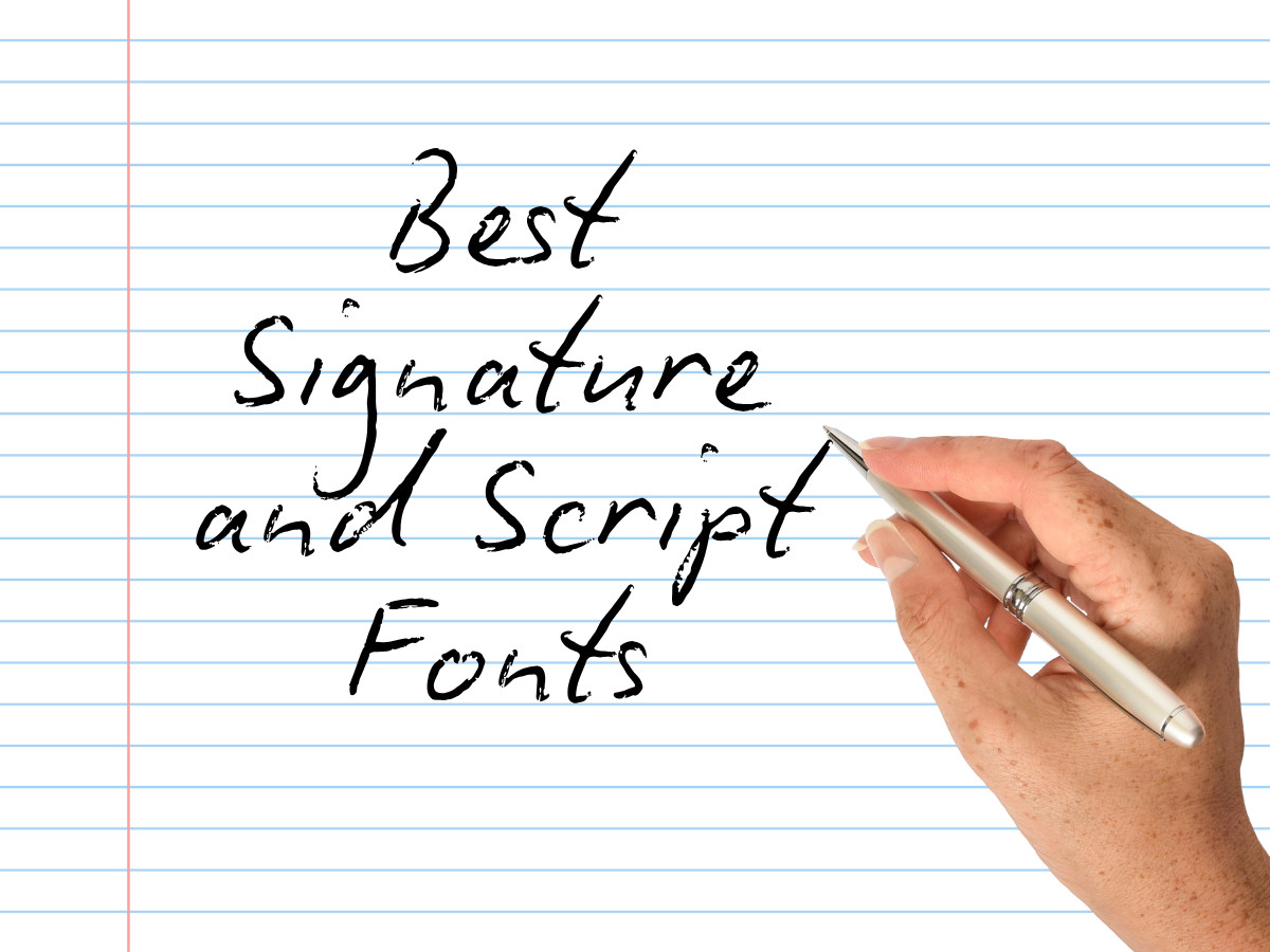
These connect their letters and lean formal, which is why weddings run on them. It is also why the free ones are so overexposed.
- Dancing Script (Pablo Impallari, OFL) bounces its baseline and varies letter size, with big caps that dip below the line, so it feels lively at a glance. The variation is size and position rather than different letter shapes, so it is not a true alternates fix, and years of heavy use mean it now reads as a default choice.
- Biro Script (ingoFonts, Ingo Zimmermann) is the closest thing in this guide to real ballpoint handwriting, and it is also the clearest licensing lesson. The full Biro Script Plus family carries more than 300 ligatures, the exact feature that stops repeated letters from matching, so it genuinely reads as written by hand. The catch is the split: the free download is personal use only, and the version with the ligatures is a paid family at around $106. Set it between 18 and 22 points, where the stroke thickness matches a real pen.
- Beth Ellen (Alyson Fraser Diaz and Rob Jelinski, OFL) is an earthy looping script with an uneven baseline that reads as a quick personal note. It carries no documented alternates, so keep it to short lines where the repeats do not stack up. The designers ask that you send a note to someone you love each time you use it, a rare license request worth honoring.
- Something Wild (MediaLab, via Pixelbuddha) is a loose handwritten script built for posters and flyers that need a human touch. It has no documented alternates. One caveat before any paid job: its Pixelbuddha license is not readable without an account, and freebie terms on that site vary, so confirm the exact rights at the source before you sell anything with it.
What Are the Best Cute Handwritten Fonts?
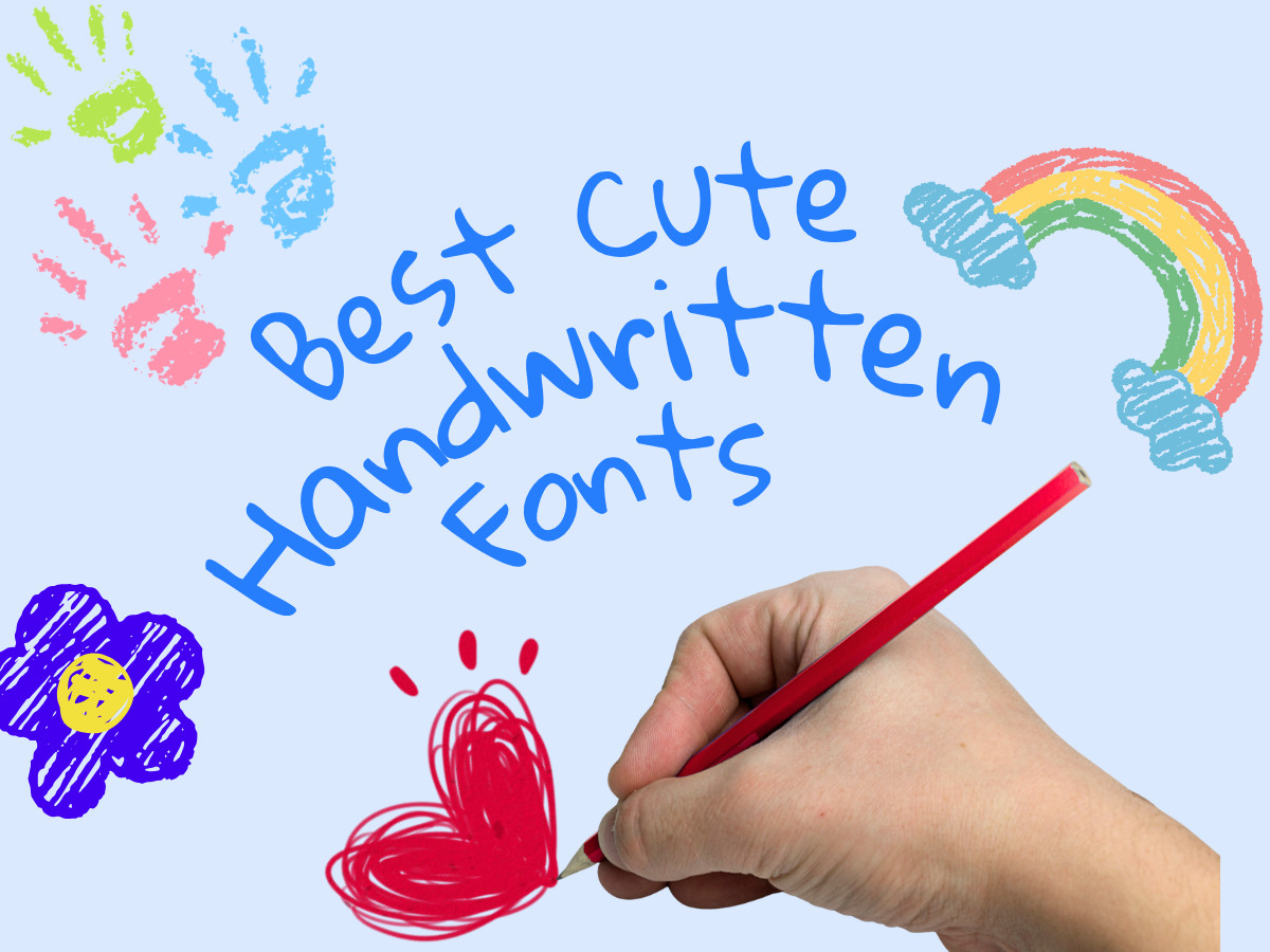
Rounded, bouncy, and aimed at kids and craft. Charm here comes from fat even strokes and wide round counters. Handwriting realism is not the goal here.
- Gloria Hallelujah (Kimberly Geswein, OFL) is a round childlike print with bouncy caps and wide spacing that genuinely reads as a kid's hand. It repeats every letter and stays juvenile, so it works for party invites and little else.
- Chewy (Sorkin Type, OFL) is fat rounded bubble lettering with a thick even line, built for display at size. It is a single-shape font with no alternates, and it turns to mush in body text, so keep it to a headline.
- Coming Soon (Font Diner, OFL) is a soft rounded marker print, the safe friendly default of this group, legible and unremarkable. One weight, no alternates, and a look generic enough that it rarely stands out.
- Schoolbell (Font Diner, OFL) mimics a kid's cursive-print hybrid with light strokes, good for classroom and worksheet themes. The thin strokes drop out at small sizes, and it repeats its letters like the rest.
- Shooting Star (Stefani Letter) is a marker-style hand with soft curves and a childlike bounce, a match for kids' themes and cheerful posters. It is PUA-encoded with ligatures, though those get pasted in by hand rather than swapping automatically. Watch two things: several unrelated fonts share the name, and this one is free for personal use with the commercial license sold separately, so grab the right file and pay for business use.
Two Fonts to License Before You Sell Anything
Author Handwriting (Origin Fonts) and Brittany Signature (Creatype Studio) are both good casual hands, and both are the trap this guide keeps warning about. They are free to download and free for personal projects, but any commercial use, a logo, a product, a sponsored post, needs a paid license, and Author Handwriting attaches a penalty of up to 100 times the license fee for using it commercially without one. Download them for your own party banner if you like. Do not put them on anything you sell until you have paid for the license.
Where Do Handwriting Fonts Belong?
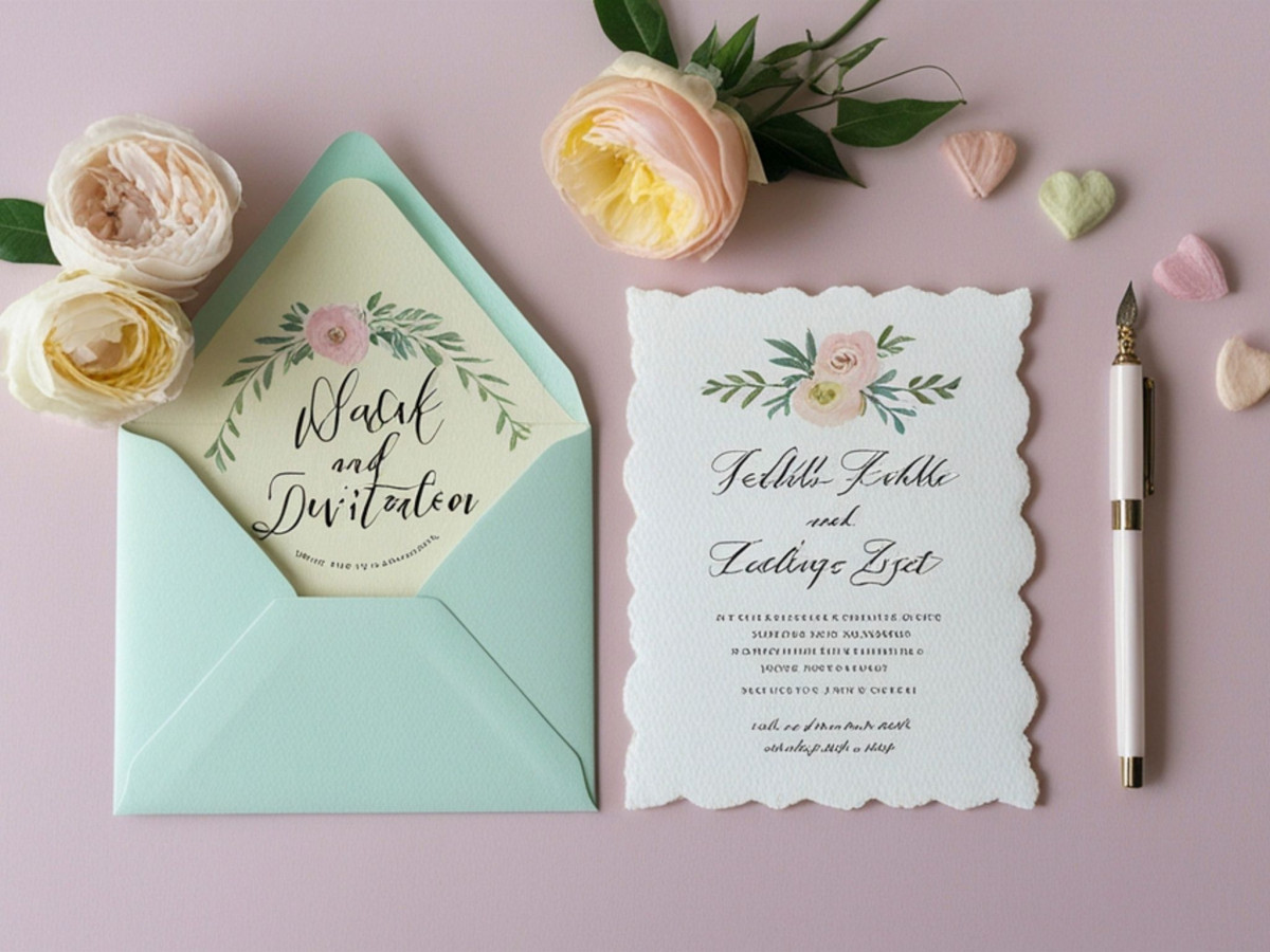
Handwriting fonts work in small doses. Use one for a single line, a signature, a callout, or a short tagline, and set everything else in a plain sans-serif or serif. The contrast between the two is what sells the handwritten part, because one line of handwriting stands out against neutral type the way a handwritten note stands out on a printed page.
Two rules keep you out of trouble. Never set body text in a handwriting font, because the irregular shapes that make one word feel written make a paragraph tiring to read. And never pair two handwriting or display faces together, because two characterful fonts fight for attention instead of supporting each other. One hand, one workhorse, and a clear job for each. For more on building type systems that hold together, the logo design and branding work in any strong identity follows the same restraint, and the same holds across current design trends.
A handwriting font is seasoning, so use a little and use it on purpose. The best faces carry alternates so their letters vary the way a hand does. The free ones on Google Fonts cover commercial work without a fee. The trap is the font that looks free until you try to sell something with it. Run the coffee test, read the license at its source, and the rest is just picking the hand that fits.

Our team ranks agencies worldwide to help you find a qualified partner. Visit our Agency Directory for the Top Logo Design Companies as well as: