
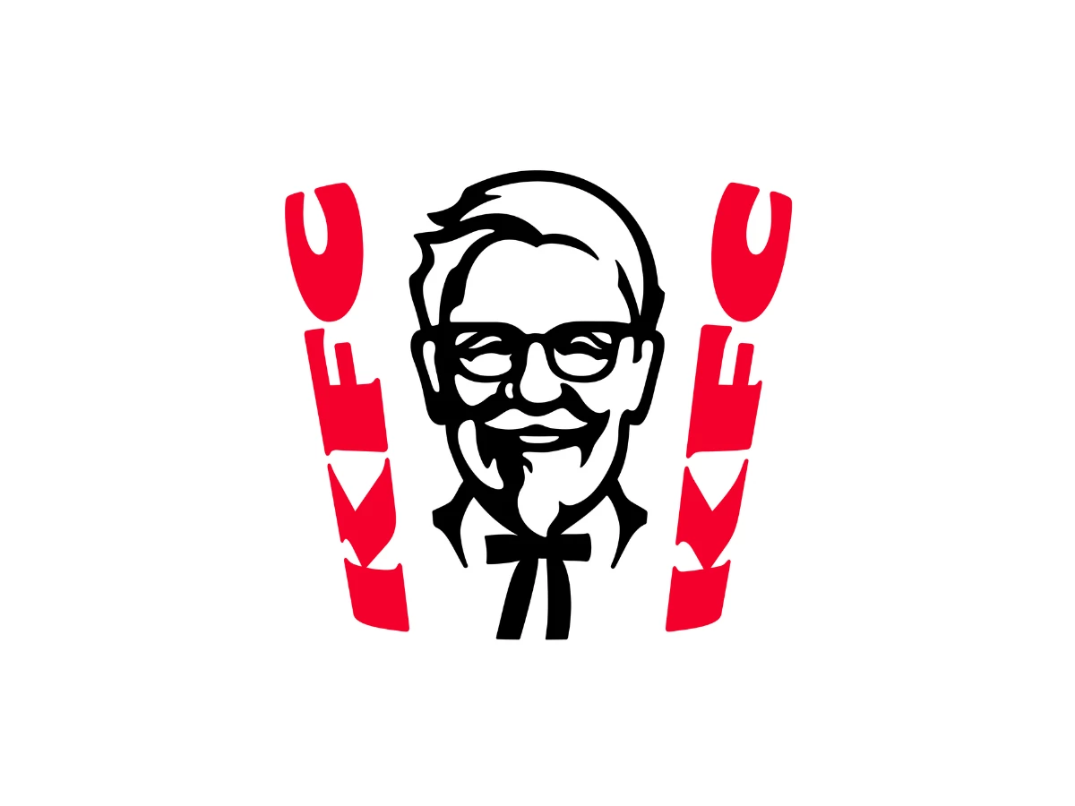

Picture the old man in the white suit shoving through the door of a KFC he no longer owns. He tastes the gravy. He tells the reporters it reminds him of wallpaper paste. Behind him, his own face grins down from the sign, selling the food he just trashed.
That man is the KFC logo, and that is stranger than it sounds. He was a real person, and the company kept his face on the sign for decades after he started publicly trashing the food.
Most logo histories tidy this away and call it heritage. This page keeps the mess, from the founder who disowned the food to the year KFC made him scowl on purpose.
What To Know
- The man on the KFC logo is Harland Sanders, the company's founder, whose portrait has anchored the mark since the 1950s.
- Kentucky Governor Ruby Laffoon made Sanders an honorary Kentucky Colonel in 1935, which is where the title comes from.
- KFC shortened its name from Kentucky Fried Chicken in 1991, and the logo has carried the three-letter abbreviation since.
- Landor Associates added the red apron in 2006, and Grand Army drew the flattened bucket portrait in 2018.
- JKR rebuilt the entire identity around the bucket in June 2026, giving the Colonel a fuller face and a new collar.
The KFC logo is the rare corporate mark that doubles as a biography, and an awkward one, because the man in the portrait publicly disowned the food it sells.
The Man Before The Mark
Harland Sanders was not a soldier. In 1935, Kentucky Governor Ruby Laffoon made him an honorary Kentucky Colonel, a ceremonial title the state hands out for civic contributions. Laffoon handed out thousands of them, including to Shirley Temple and Clark Gable.
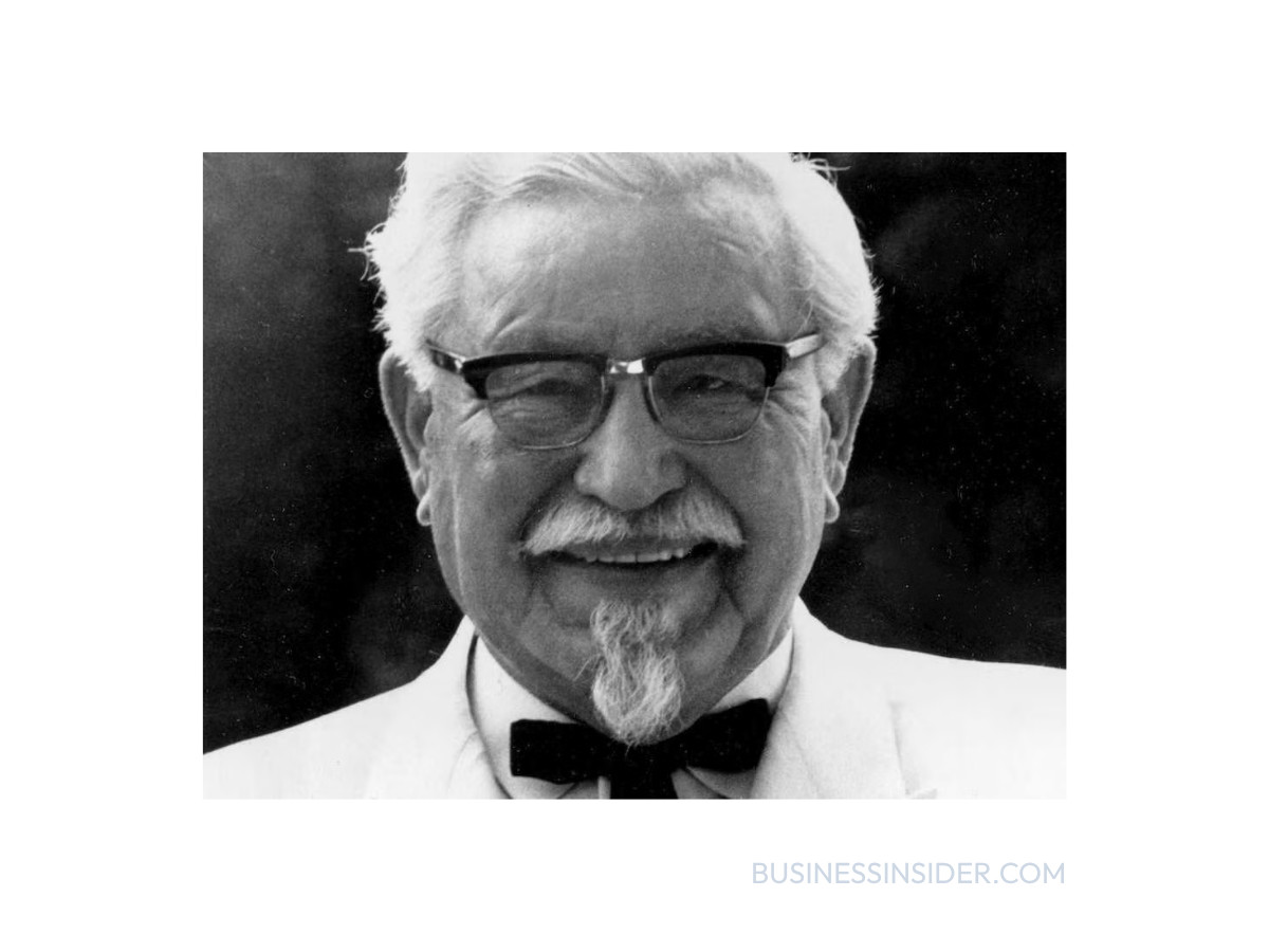
Sanders leaned into the title. He grew the goatee, bleached his mustache to match his white hair, and switched to a white suit that hid flour stains. The look that would become a logo started as a costume he built for himself.
The first franchise opened in 1952, when Pete Harman began selling Sanders' chicken in Salt Lake City. By 1964, there were more than 600 locations, and the operation had outgrown its founder.
Sanders sold the company that year for two million dollars to a group of investors led by John Y. Brown Jr. and Jack C. Massey. He kept a salary and stayed on as the brand's public face. He did not keep control of the recipes, and that is where the trouble started.
1952: The First Formal Mark
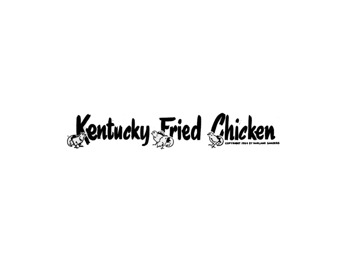
The start of the KFC logo comes with a dispute, and it is worth naming up front.
Some histories date the first Colonel portrait to 1952, the year the brand began. Others put the recognizable hand-drawn Colonel on the mark in 1959. No single authoritative record settles the exact year, so the 1950s are the safe origin, and the surviving artwork does not resolve it.
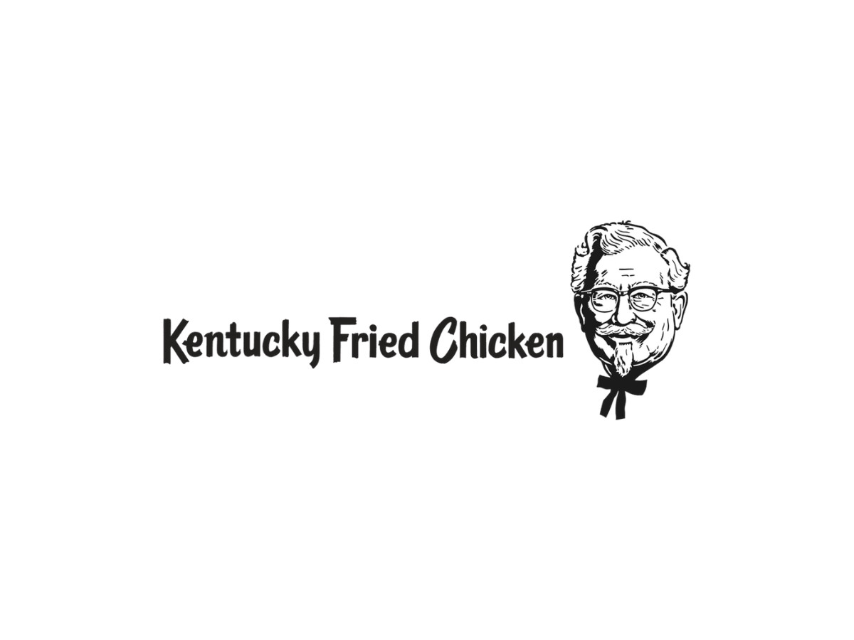
The early mark was a realistic black-and-white illustration of Sanders. The full name Kentucky Fried Chicken ran in a curved banner, and a paper bucket often sat beside it.
Treat the 1950s as the portrait's starting point and the precise year as unsettled. That is a more honest answer than the single date most pages pick.
1959: The Portrait Lockup
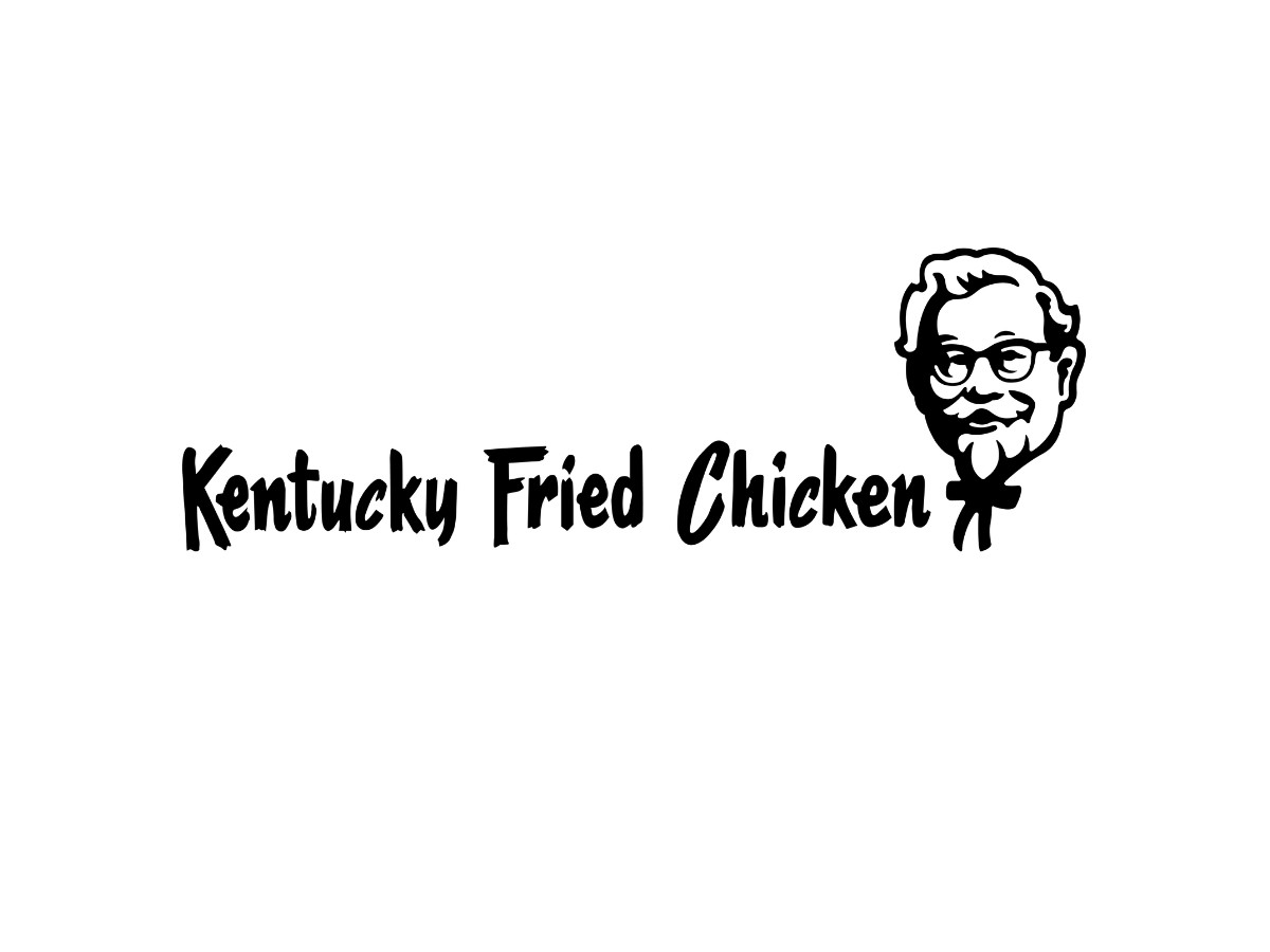
By 1959, the mark firmed up into a lockup KFC kept for two decades.
A hand-drawn wordmark enlarged the K, F, and C, and the Colonel's face sat to the right of the letters. The pairing set the template every later version would rearrange.
1978: The Zanesville Rollout
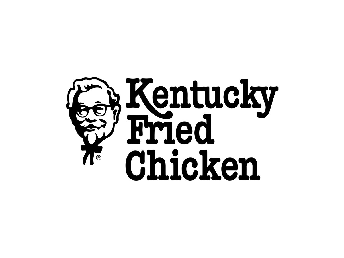
The 1978 redesign is the version competitors skip, and it is the easiest one to verify.
In March 1978, KFC changed the logo as part of a full restaurant overhaul. The first store in the new format opened in Zanesville, Ohio, where customers saw the redrawn Colonel first.
The portrait moved to the left and grew larger. The face softened into a slight smile, and the glasses, hair, and mustache stayed put so people would still recognize him.
The wordmark split into three stacked lines reading Kentucky, Fried, Chicken. The K gained a long tail that hooked under the letters below it, the one flourish that separated this mark from a plain three-line stack.
Red arrived on the logo for the first time here. That red is now KFC's core brand color, commonly published as Pantone 199 C, roughly hex #E4002B.
The rollout was physical, not just graphic. New locations added mansard roofs and tall towers so the chain looked the same from a car window in any state. The Zanesville opening and the mansard format are both on the record, which is why this section can name specifics that no logo-maker blog can.
1991: Losing The Word Fried
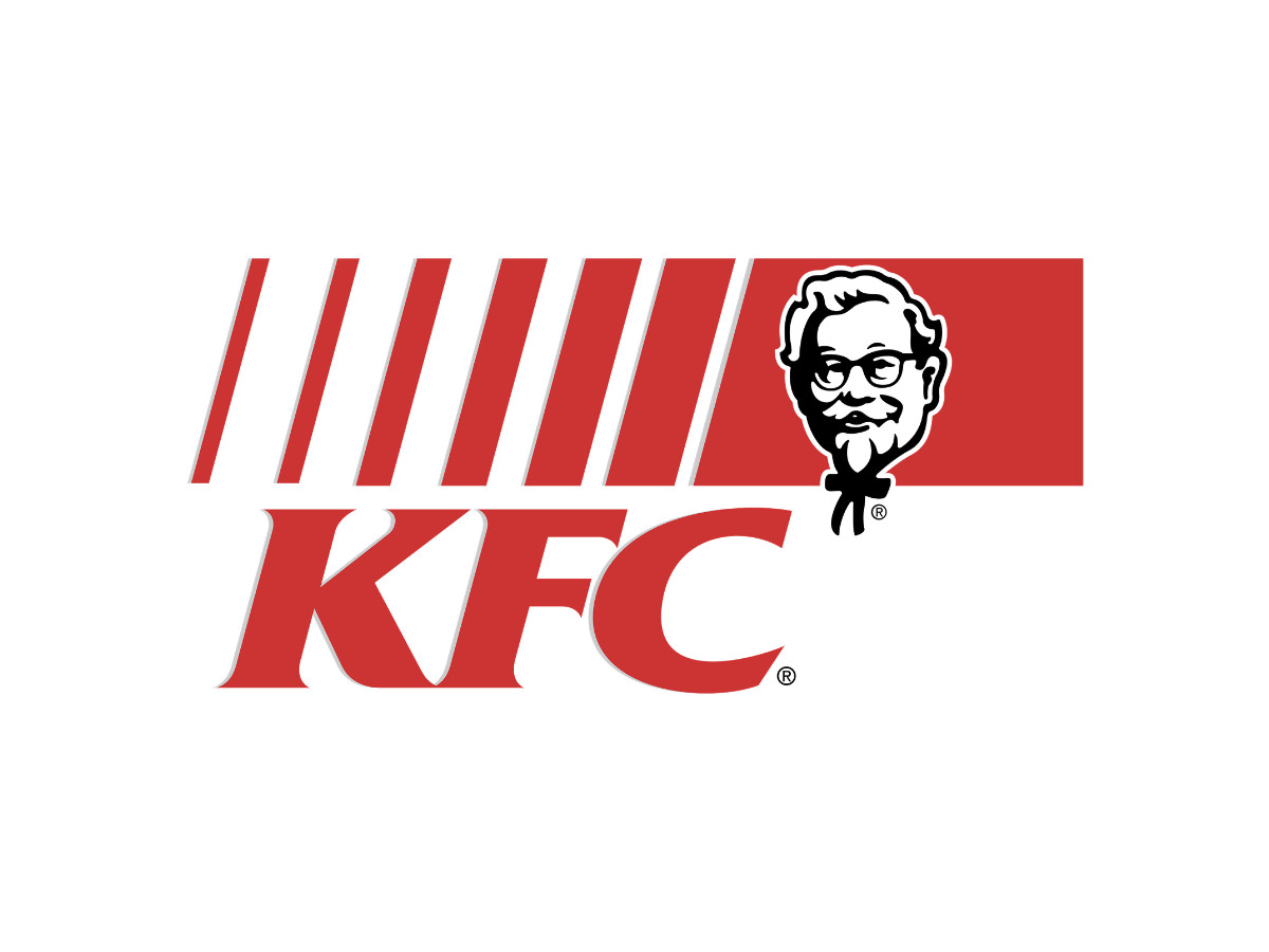
In 1991, Kentucky Fried Chicken became KFC on the sign. The mark set the three letters in italic serif capitals and paired red with blue.
A story has trailed the change ever since. The claim is that the government forced KFC to drop the word chicken because the company was secretly serving lab-grown mutant birds with extra legs.
None of that happened. There was no regulation about mutant animals and no ban on the word chicken. A KFC spokesman had to knock the rumor down again in 2014, calling it an urban legend that keeps returning.
The real reasons are ordinary. KFC wanted to de-emphasize "fried" as diners grew health-conscious, it planned a broader menu beyond fried chicken, and it followed a wider trend of shortening long brand names, the same move that turned International House of Pancakes into IHOP.
A separate rumor says the state of Kentucky trademarked its own name and charged the chain a fee. That one is also thin, and part of it traces back to a satirical "Lost Legends" article written as deliberate fiction. KFC's own public line was always the health angle, so any page that states a legal cause as fact is repeating folklore. We give the same treatment to the claim that the Toyota logo secretly spells TOYOTA: interesting, widely repeated, and not confirmed.
1997: The Square
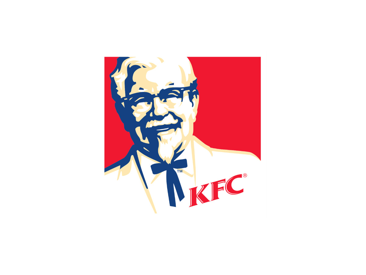
Landor Associates handled the 1997 rebrand as KFC spun off from PepsiCo into Tricon Global Restaurants, later Yum Brands, the same parent behind the Taco Bell logo and the Pizza Hut logo.
The Colonel gained shoulders, a tuxedo, and a blue background, the first time blue pushed past the red-and-white scheme. A small KFC wordmark sat inside a square emblem.
The version read as friendlier and more cartoon-like than the 1978 mark, which was the point during a decade when the chain was chasing families.
2006: The Apron
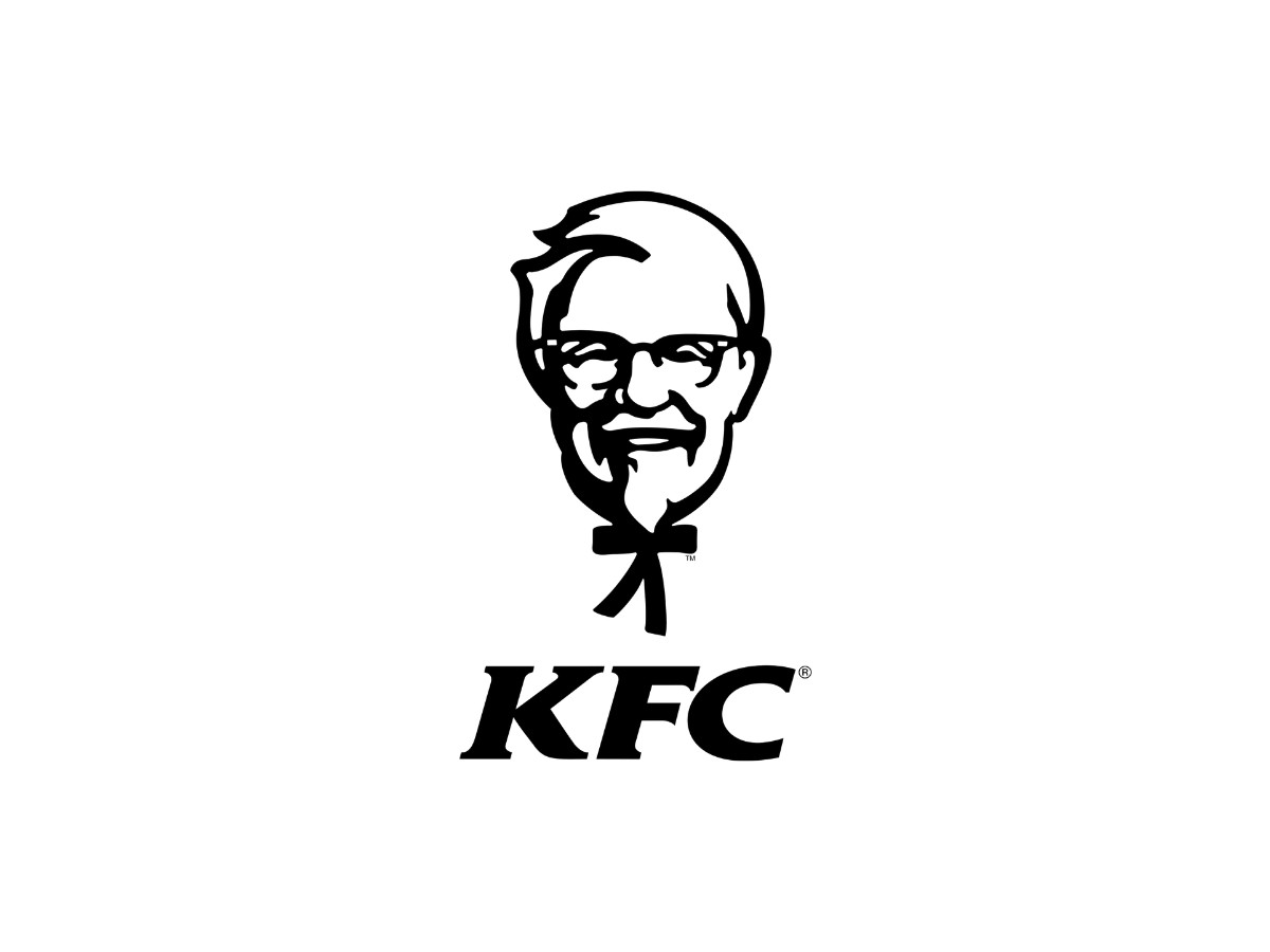
Around 2014, KFC pulled the Colonel back to a plain black-and-white head paired with the KFC letters, a deliberate look backward to the earliest mark. Grand Army developed the throwback treatment.
This one is hard to file cleanly. It arrived alongside a campaign that returned Sanders to television, played by a rotating cast of comedians, and it lived mostly on packaging and advertising rather than replacing the 2006 logo everywhere. Read it as a campaign and packaging revival more than a permanent global logo swap, and note that sources disagree on how wide it ran.
2018: The Bucket
The mark most people picture now came from Grand Army in 2018, and it passes the specificity test that the fluff pages fail.
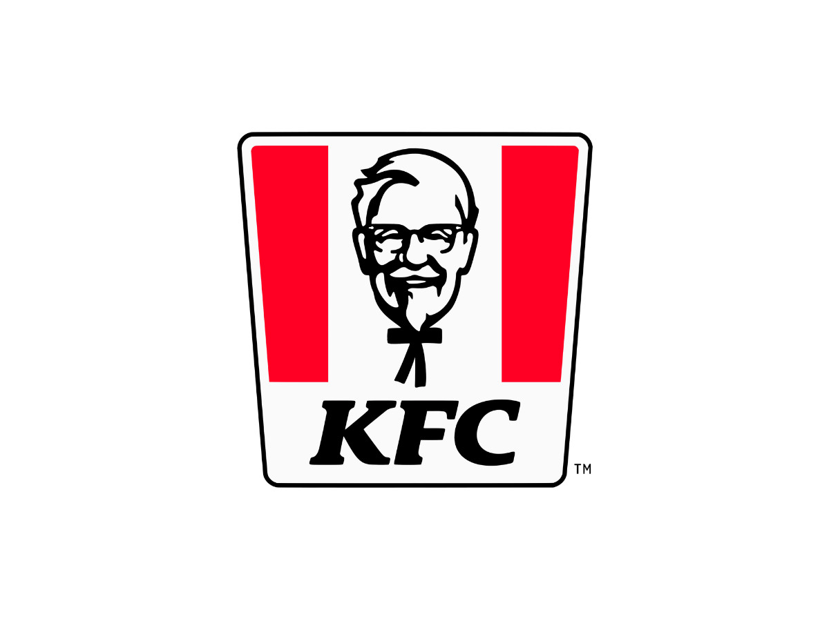
Grand Army flattened the portrait into a vector drawing with no 3D shading. The shoulders, the tuxedo, and the soft modeling came off. What stayed was a short list: glasses, a goatee, a bow tie, and a pair of raised eyebrows.
The container changed shape too. The old tilted square gave way to a trapezoid that reads as a chicken bucket, with the Colonel floating between vertical red stripes and the KFC wordmark below him.
The design was built to survive shrinking. A flat, high-contrast face holds up at app-icon size and in a single color, where the old shaded portraits turned to mud. Stripping the mark to a few heavy strokes is what lets it reverse cleanly on a phone screen, which matters when most people now meet the logo on a delivery app rather than a highway sign.
If you want to see the same simplify-for-mobile logic in a rival, the Burger King logo went the other way in 2021 and returned to a flat, retro bun, while the Wendy's logo kept its portrait and freckles. Fast-food marks are converging on flat faces, a shift you can track across our logo design trends hub.
Late 2018 Onward: Different Colonels In Different Countries
Here is the finding every competitor misses. There is no single KFC logo.
In late 2018, KFC introduced the bucket-shaped mark across many markets, and it did not land everywhere at once. The Philippines got it in 2019, China in 2020, and North America not until late 2023.
The portrait itself varies by region. The late-2018 version tweaked the Colonel's right ear to make it clearer, and some countries still run older marks on their signage today.
The wordmark and the portrait have not always traveled together. Outside North America, the KFC letters and the Colonel appeared side by side for years. North America only paired the wordmark with the 2018 portrait in 2023.
So the honest statement is that KFC has run divergent marks by region for most of a decade. The tidy one-logo timeline you see elsewhere is a simplification, and it is wrong.
2025: The Frowning Colonel
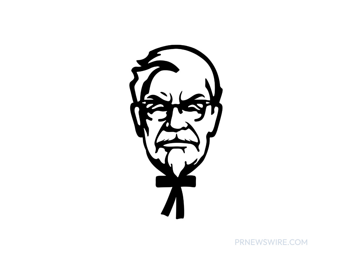
If you searched "KFC logo 2025," you probably found a scowling Colonel and no clear explanation. Here is what it was.
On July 14, 2025, KFC U.S. launched a "Kentucky Fried Comeback" campaign built by the Atlanta agency Highdive, and it flipped the Colonel's smile into a frown. The stern face ran on store signage, billboards, and social channels across roughly 3,669 U.S. locations.
The frown was a message about sales, not a permanent logo. KFC had been losing U.S. market share, and the campaign used the Colonel's displeasure to admit it out loud. KFC's U.S. president, Catherine Tan-Gillespie, said the brand would not smile until its customers did.
Read it as a stunt, and a sourced one. The frown was official, it was U.S.-only, and it was temporary, which is exactly the answer the top search results were not giving.
2026: The Bucketverse
The frown did not hold, because KFC replaced everything a year later.
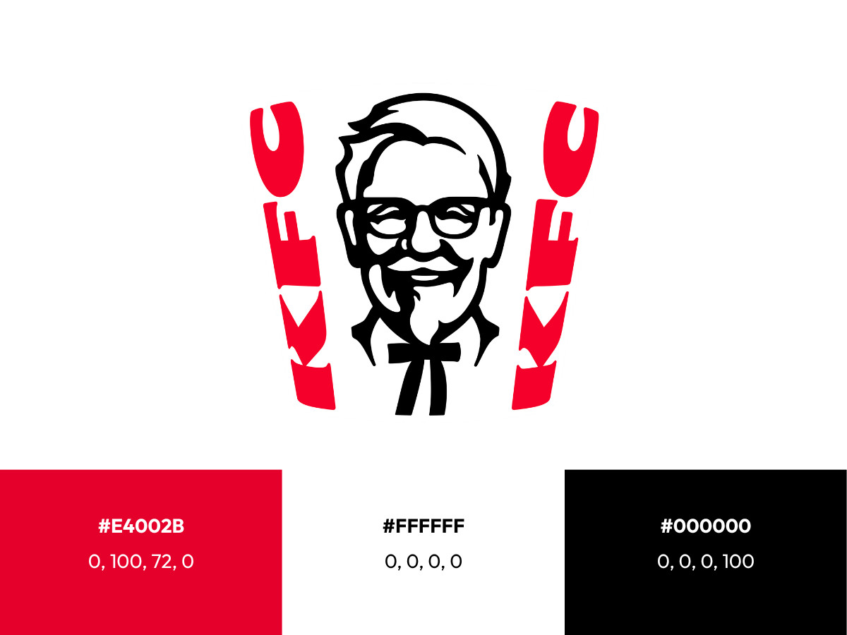
On June 15, 2026, KFC unveiled a global rebrand built with the agency JKR, or Jones Knowles Ritchie. JKR named the platform the "Bucketverse" and put the bucket itself at the center of the identity.
The logo became a three-dimensional mark, and the Colonel got a fuller, more welcoming face. JKR also added a collar around his neck to fix a long-standing problem: without one, the bow tie made him read like a bobblehead.
The typography is new too. JKR commissioned two custom typefaces, Kentucky Fried Serif and Kentucky Fried Sans, drawn with the studio StudioDRAMA and lettering artist Tobias Hall.
The palette held. JKR kept the same KFC red at hex #E4002B, roughly CMYK 0, 100, 72, 0, and paired it with black at #000000, CMYK 0, 0, 0, 100, and white at #FFFFFF, CMYK 0, 0, 0, 0. A secondary range called Herbs and Spices sits alongside the core three as a nod to the original recipe.
The rollout is staged, which is why your local sign may not match yet. KFC started in the UK and Ireland in June 2026, then moved to Australia and the U.S., with the rest of its 34,000-plus restaurants across 150-plus countries following through the year. The bet is that the bucket can carry the brand the way the McDonald's logo carries the Golden Arches. If you want to see who does work at this scale, our branding agency directory lists firms in JKR's league.
The Verdict
What does a brand owe a real person whose face it owns?

Our team ranks agencies worldwide to help you find a qualified partner. Visit our Agency Directory for the Top Logo Design Companies as well as:

_0013f439b45a-preview.jpg)
_6be0e3c6c8b8-preview.jpg)