- Agency: Berriel Brands
- Client: Movanta
- Category: Logo Design — Travel
- Location: Curitiba, Brazil
- Project Brief: Create a travel logo that expresses purposeful movement through a custom logotype and a minimal symbol inspired by a suitcase handle and the letter M.
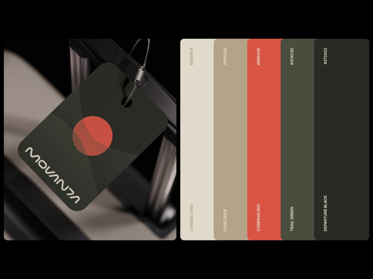
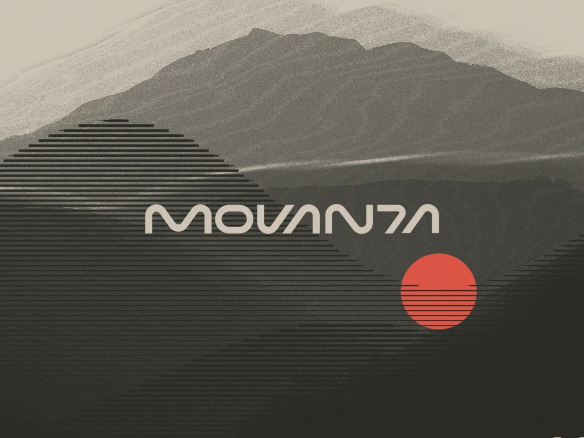
A travel brand logo needs to survive being stamped on a luggage tag and shrunk onto a wax seal. Movanta, a brand out of Curitiba built by Berriel Brands, meets that head-on with a custom wordmark that looks lifted off a 1970s spaceport sign.
The letters curl and connect into each other, with a scooped M and an A that reads almost like a 7. It gives the name a retro-futurist swagger, though the tradeoff is a first glance that can catch "7A" before it settles into "TA."
A red circle anchors the system, rising as a setting sun behind the wordmark, shrinking to a dot on the hang tag, and returning as the wax seal on the envelope. That one shape ties the pieces together and gives the muted sand, beige, trail green, and near-black palette a single warm point to pull toward.
The other mark is a sharp M built from two peaks, reading as mountains and a suitcase handle at once, carried through a line-textured tag, an airmail envelope, and hand-drawn stickers. The one caution is that the wordmark leans so hard on character that readability takes the hit, a fair trade here but worth watching at tiny sizes.