-account-photo_listing.jpg)
-account-photo_listing.jpg)


Our Jury has worked with Prada, Nike, Chanel, Google, and Apple.
Best Travel Logo Designs of 2026
View the Top Travel Logo Designs Below
Best Travel Logo Designs of 2026
4,200+ Submitted Designs
- Advertising
- Agriculture
- AI
- Airline
- Alcohol
- App Company Logo
- Architecture
- Arts & Recreation
- Automotive
- Banking & Finance
- Beer
- Church
- Clothing Brand
- Coffee
- Content & News
- Distribution
- E-Commerce & Retail
- Education
- Engineering
- Entertainment
- eSports
- Farm
- Fashion & Beauty
- Food & Beverage
- Government
- Health & Wellness
- Hospitality
- Legal & Insurance
- Luxury
- Manufacturing
- Non-Profit
- Photography
- Professional Services
- Real Estate
- Restaurant
- Restuarants
- SEO Agencies
- Shoe Brand
- Small Business
- Software
- Sports & Leisure
- Startup
- Technology
- Travel
- Video Companies
- Weed/Cannabis
- Abstract
- Animated
- Artistic
- Bakery
- Black
- Black & Yellow
- Blue
- Bold Logo
- Brand
- British
- Business
- Circle
- Creative Name
- Dental Office
- Done by Freelancers
- Emblem
- Floral
- Geometric
- Glow
- Gradient
- Gym
- Icon
- Illustration
- Lettermark
- Logo symbols
- Makeup Brand
- Marathon
- Minimal
- Modern
- Monogram
- Multicolored
- Nature
- Negative Space
- Rebranding
- Red
- Redesign
- Simple
- Starting With the Letter S
- Successful
- Sunshine
- Trendy
- TV Channel
- Typography
- Unisex Salon
- Vintage
- Water
- Watercolor
- Wordmark

View Design
Rickenbacker Marina Park Logo Design
byChance
View Design
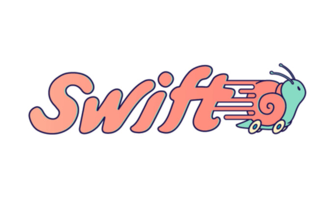
Swift

View Design
Hopper

View Design
Citymapper

View Design
HomeAway

View Design
Tripadvisor

View Design
I Love New York Logo Design

View Design
Expedia

View Design
Via
Get Connected
With The Right Agency Partner
& Receive Proposals For FREE

View Design
Acqualina

View Design
JetBlue

View Design
Ara

View Design
Ombria Resort

View Design
Airbnb
View Design
Lyft Logo

View Design
Uber Logo

View Design
Montreux

View Design
Property Cayman
Ready to elevate your designs?