
- Agency: Sophinka Design
- Client: NKeramics
- Category: Logo Design — Retail
- Location: Lisbon, Portugal
- Project Brief: Create a logo design for NKeramics that reflects its handmade ceramic roots through organic shapes, nature-inspired colors, and a clean retro aesthetic.
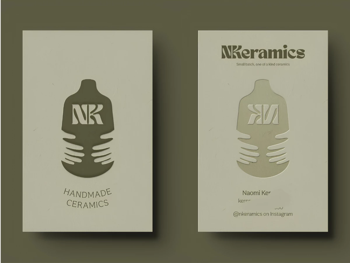
Retail logo work for a maker studio should feel handmade without looking rough. Sophinka Design builds NKeramics around a single clever mark where the "N" and "K" nest inside a vessel cradled by two hands.
The monogram doubles as an image. Locked together, the letters read as initials and as a pot at once, and the cupping hands underneath tell you these are pieces made and held by a person.
The type carries the retro brief. The chunky Tan Nimbus wordmark bends its letterforms with a groovy 70s curve, so the name matches the "retro, simple, cute" aesthetic the studio set out for.
The palette ties the brand to its material. Earthy dark red, dusty pink, retro yellow, and muted greens pull straight from clay, glaze, and studio plants, grounding the identity in ceramics.
The system flexes across contexts. The embossed business cards, the illustrated hands-and-pots pattern, and the standalone NK mark all hold together, so the brand reads as one piece from card to packaging.