- Agency: Sophinka Design
- Client: Blooming Dahlia
- Category: Print Design — Retail
- Location: Amsterdam, Netherlands
- Project Brief: Create retail print materials that reflect Blooming Dahlia’s floral style and values through expressive typography, botanical illustrations, and a cohesive visual system.
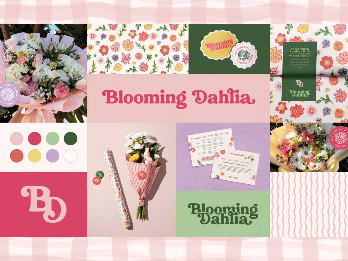
Retail print work should hold together across a bouquet wrap, a care card, and everything tucked in the box. Blooming Dahlia, a San Diego florist rebranded by Sophinka Design, builds that full kit around one chunky retro wordmark and a garden of hand-drawn flowers.
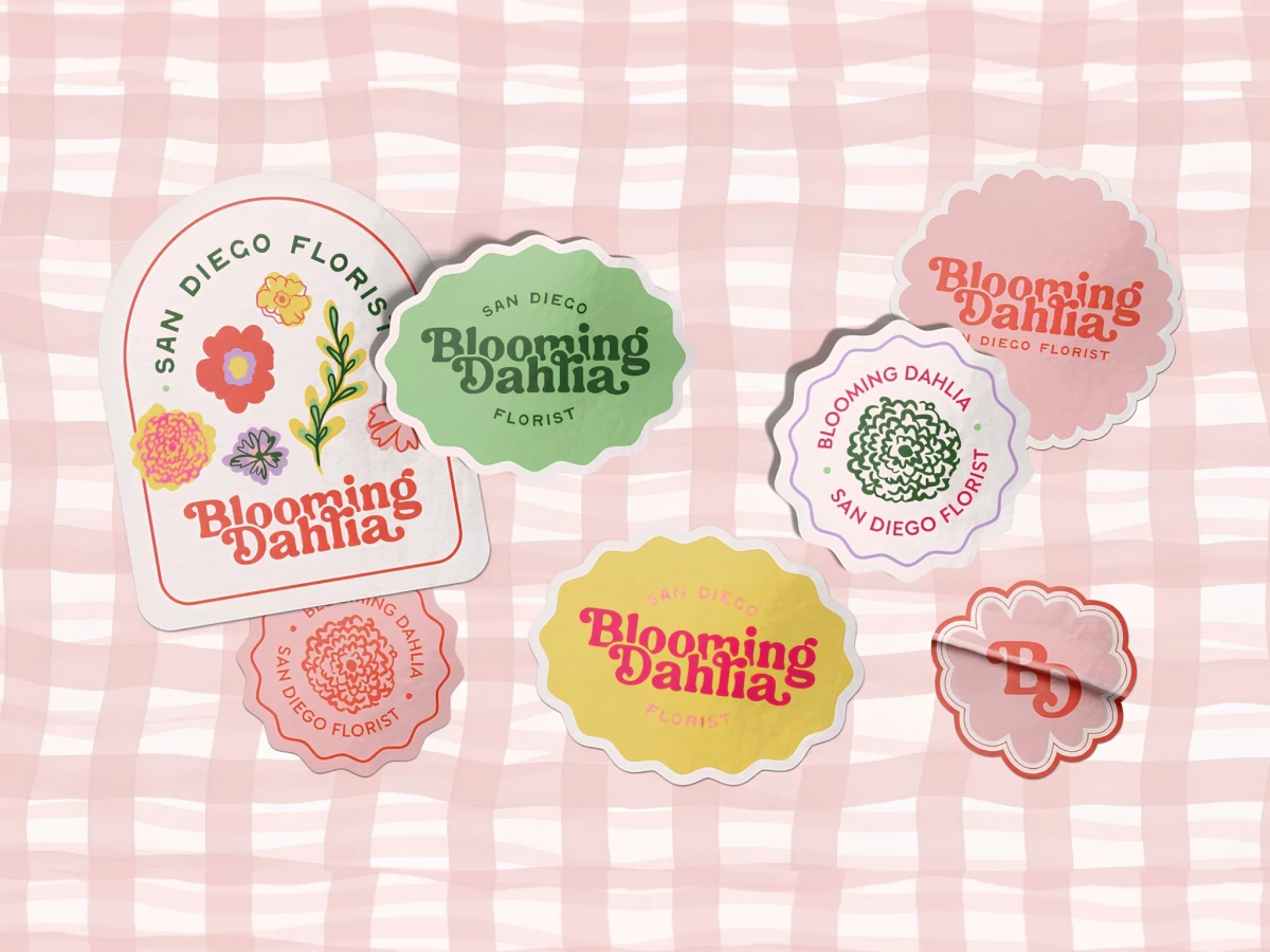
The logotype carries the mood, curvy and warm, flexing from hot pink on yellow to forest green on mint. It stays feminine without turning delicate, so the name holds up loud on a sticker or stretched across wrapping paper.
The illustrations do the connective work, with loose sketchy blooms and wavy stripes running over patterned paper, gift wrap, and the flower-care insert. That hand-drawn texture keeps the system off the corporate path and close to the just-picked look of Ruth's arrangements.
The reach is the strength and the risk at once, spanning stickers, note cards, bouquet sleeves, and a deep pattern library across the full palette. It hands Ruth a flexible kit for every touchpoint, though so many shapes and colorways court a moment where two pieces hardly read as the same shop.