
- Agency: Sophinka Design
- Client: Libra Wealth Consultants
- Category: Logo Design — Finance
- Location: Amsterdam, Netherlands
- Project Brief: Create a logo design that conveys balance, trust, and a personal approach to wealth consulting through a clean and versatile identity.
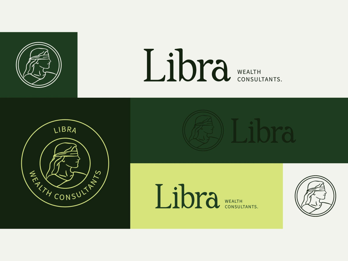
A finance consultant logo trades on the promise that someone steady is watching your money. Libra Wealth Consultants, a Texas planning firm branded by Sophinka Design, builds that promise around a blindfolded Lady Justice struck like a face on a coin.
The mark sets a line-drawn Justice in profile inside a double-ring coin, tying the Libra scales to the idea of impartial advice. A warm serif wordmark sits beside it, lending an old-institution steadiness that a bank-style sans would make colder.
The palette works two greens against each other, a deep forest and a bright lime, so the money association reads without turning to cliché gold. That contrast keeps the coin motif from feeling stuffy, giving a traditional symbol a fresher, more current tone.
The character illustration is where it gets brave, drawing Justice mid-stride hauling an oversized hundred-dollar bill in a loose, cartoonish hand. It adds welcome personality, though the sketchy figure sits awkwardly against the precise coin seal, and the two styles never fully agree on how serious the brand wants to be.