- Agency: Studio Paack
- Client: Voyage Privé
- Category: Logo Design — Travel
- Location: Paris, France
- Project Brief: Create a travel logo and adaptable visual identity that conveys escapism, discovery, and premium experiences across multiple brand touchpoints.
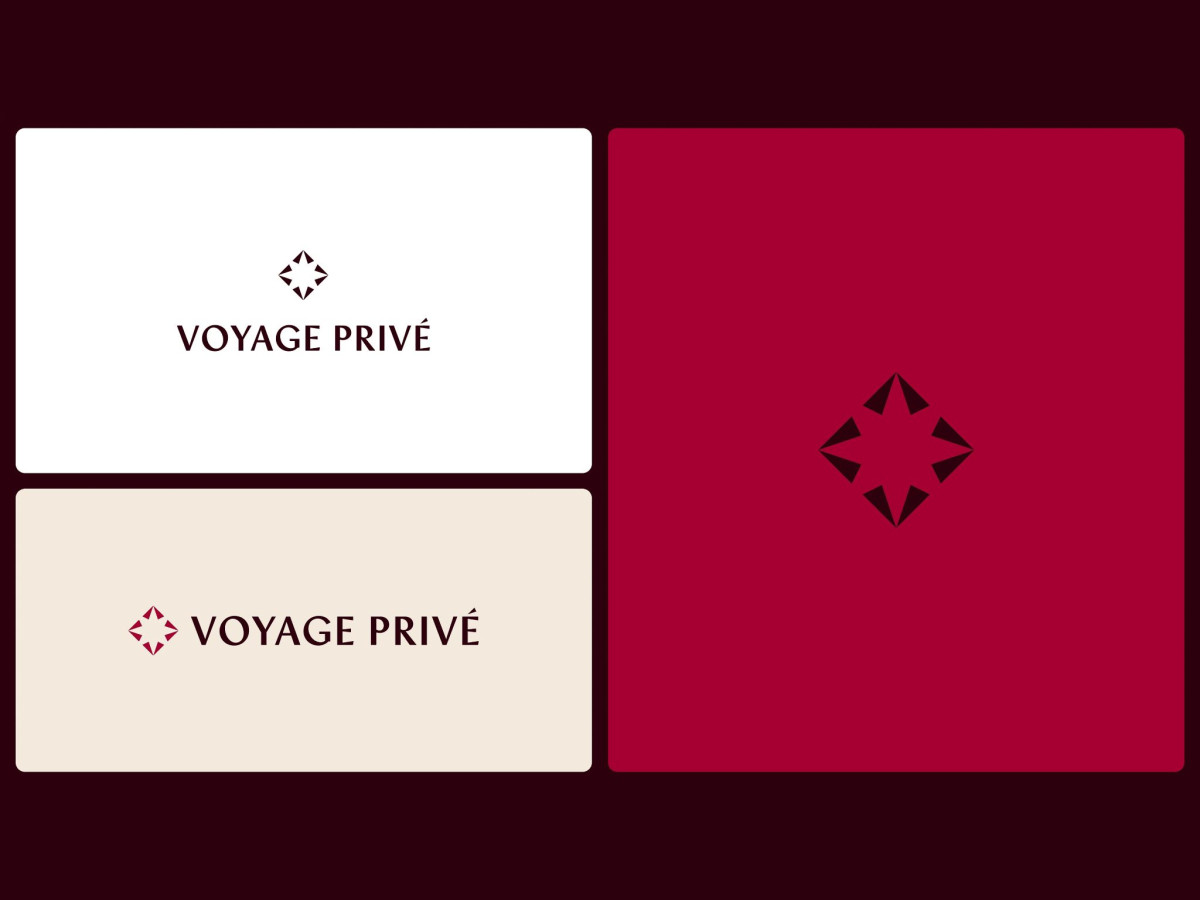
A travel logo trades on the promise of somewhere better than here. Voyage Privé, reimagined by Studio Paack for a Paris agency tender, builds that promise around a single compass-star mark in deep burgundy.
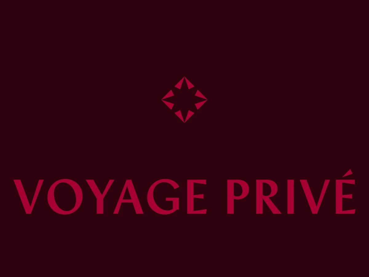
The symbol reads as a four-point star nested inside a diamond, part compass rose, part cut gem. It splits the difference between wayfinding and luxury, which is the exact register a premium travel brand wants.
The wordmark sets Voyage Privé in a high-contrast serif with a clipped, angular É that echoes the star's sharp points. That thin-to-thick stroke carries the upmarket tone, though the very fine hairlines risk dropping out at small sizes or on cheaper print.
The pasted street posters show the range, pairing saturated destination photography with flat burgundy panels that let the mark and type breathe. It sells escapism without clutter, and even the "PRIVATE DAYS" sale poster holds its composure instead of shouting the discount.