
Standout Features:
- Bold, energetic illustrations
- Vibrant color schemes
- Iconic, easily recognizable branding
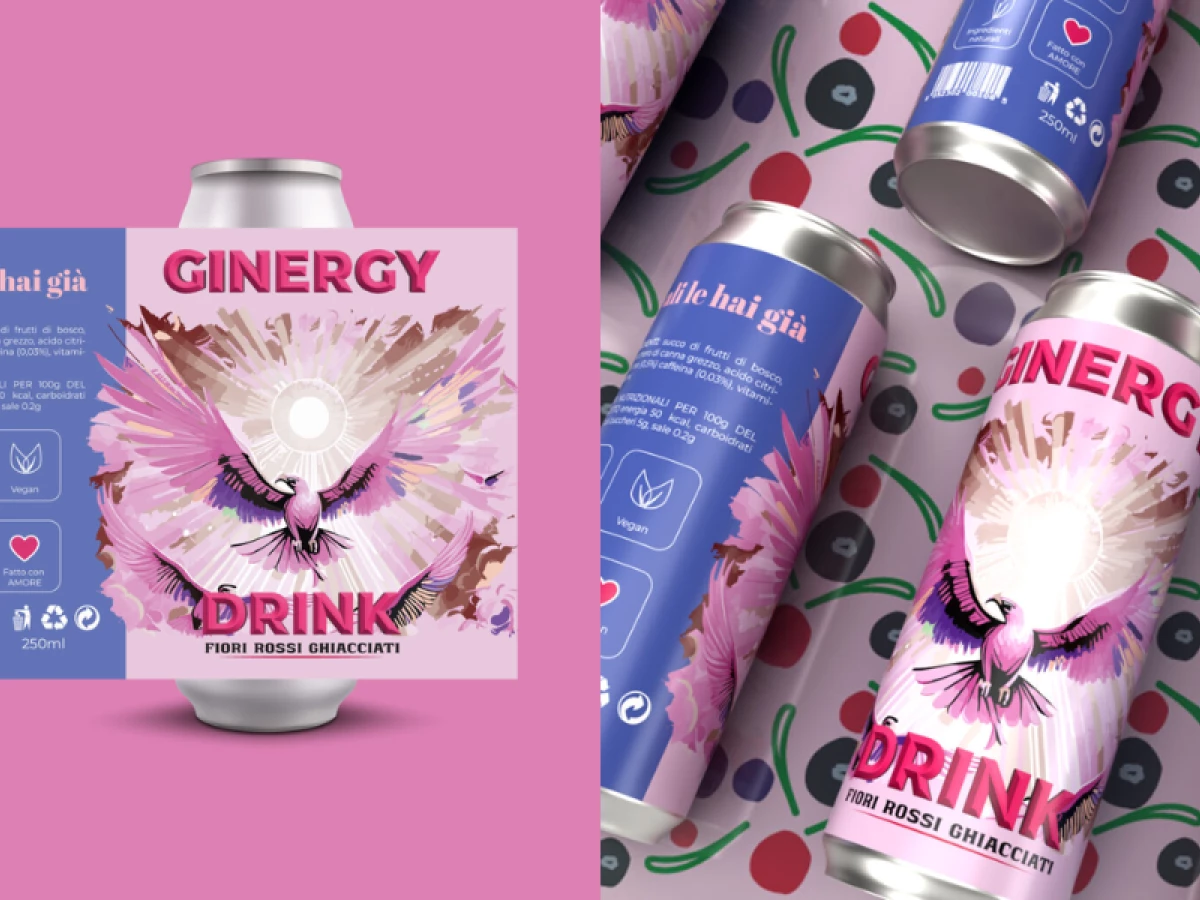
Ginergy, a revolutionary alcoholic energy drink, needed packaging that would reflect its bold and lively nature. The design by Oltreildisegno meets this challenge head-on by using energetic illustrations, vibrant colors, and strong branding to ensure that the product stands out in a crowded market.
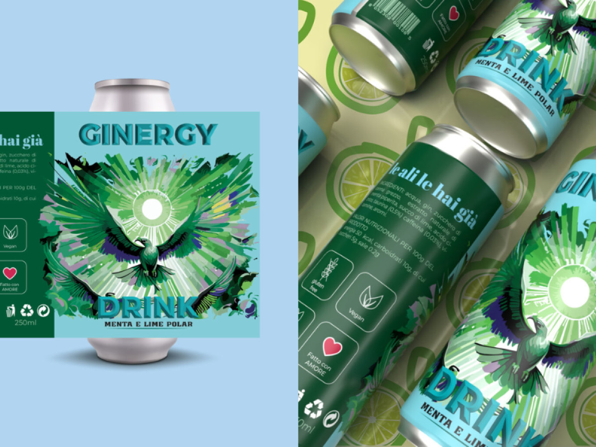
Each can feature a dynamic image of a bird in flight, symbolizing freedom, energy, and empowerment—perfectly reflecting the brand’s slogan "You already have wings." The vibrant, almost explosive visual effect evokes a sense of excitement, making it immediately clear that this product is all about high energy and fun.
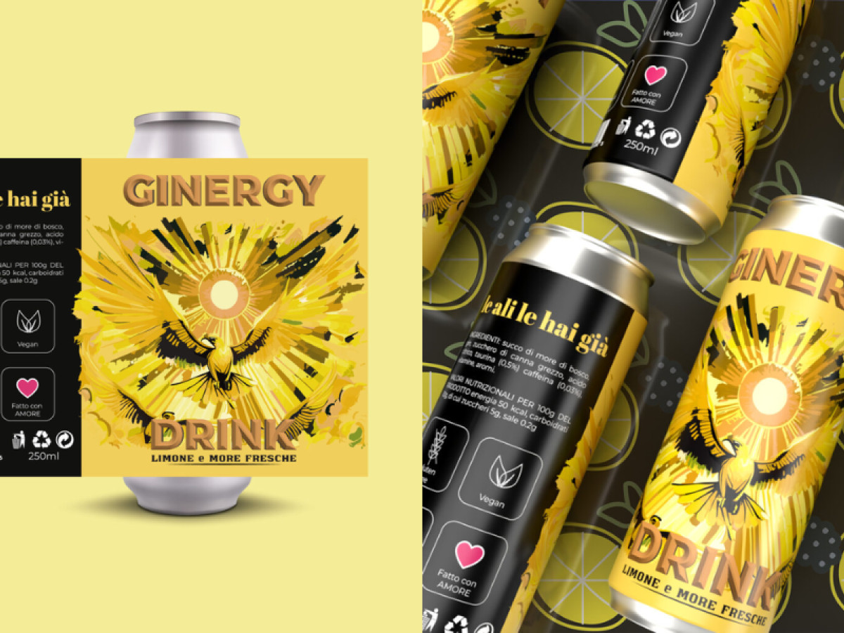
Each variant, from hibiscus lemonade to lemon and fresh blackberries, has its distinct, bright color palette. The use of bold pinks, yellows, and greens adds to the visual impact and ensures that the cans catch the eye from a distance. This consistency in color and design helps establish a strong visual identity.
Finally, the easily recognizable branding, with its clear and bold typography, ensures that Ginergy’s unique identity remains front and center. The prominent "Ginergy" wordmark paired with the energetic visuals makes the product instantly identifiable, contributing to a consistent and memorable consumer experience.
In conclusion, the packaging design successfully communicates the brand’s mission to bring fun and energy to every occasion. For a product that promises the best food and beverage packaging in the energy drink sector, Ginergy's design delivers excitement in every can.