Merlin’s Elegant Packaging Design Showcases a Blend of Nature and Indulgence
La Primera, a renowned name in the wine industry, introduces Merlin, a collection of exquisite red and white wines that embody the perfect harmony of nature and indulgence.
Meticulously crafted by the creative minds at oltreildisegno, the packaging design elevates the wine experience beyond mere taste.
Merlin's most striking feature is its unique conical bottle. This unconventional shape immediately sets it apart from the sea of rectangular bottles typically used by competitors.
The graceful curves of the bottle enhance the wine's visual appeal and speak to the character and craftsmanship that define the Merlin brand. The conical design also hints at the complex flavors and aromas that await within.
Overall, Merlin's commitment to a natural and premium experience is evident in every aspect of the design.

Merlin’s Wine Bottles Offer Customer Satisfaction by Featuring Natural and Minimalist Elements
Merlin's packaging design reflects its commitment to delivering a top-grade experience. Each bottle features a cork closure, which preserves flavors and aromas while adding a tactile element.
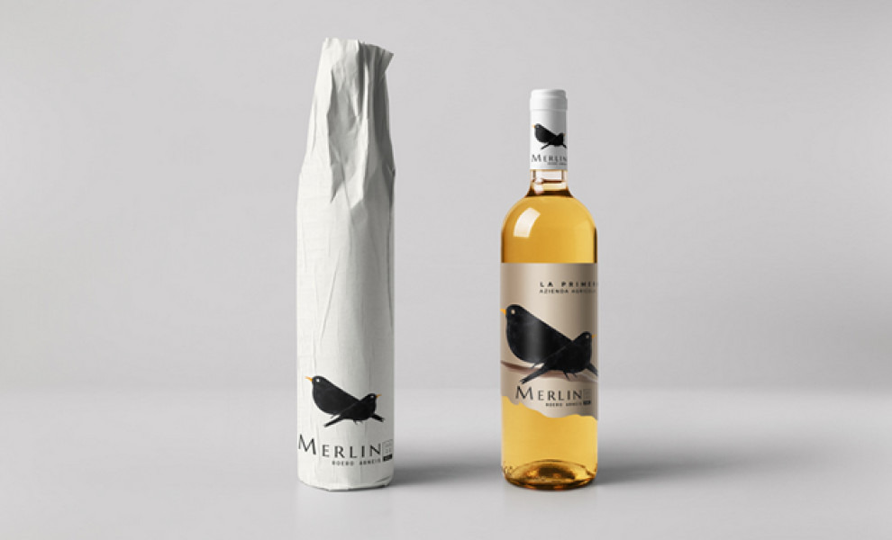
The clear glass bottle showcases the wine's rich hues and invites appreciation before tasting. A minimalist central wrap features only essential details, such as the product and brand name.
This design reinforces elegance and simplicity, allowing the wine's natural beauty to take center stage. Many top packaging designers have relied on naturalistic elements to relay certain powerful messages, and this one is no exception.
Simply put, the minimalist design aligns with Merlin's refined luxury and timeless appeal, resonating with consumers seeking a sophisticated aesthetic.
Browse our collection of the best bottle packaging designs for more inspiration.
Merlin's Packaging Design Delivers an Artistic Flair Through the Bird Illustration
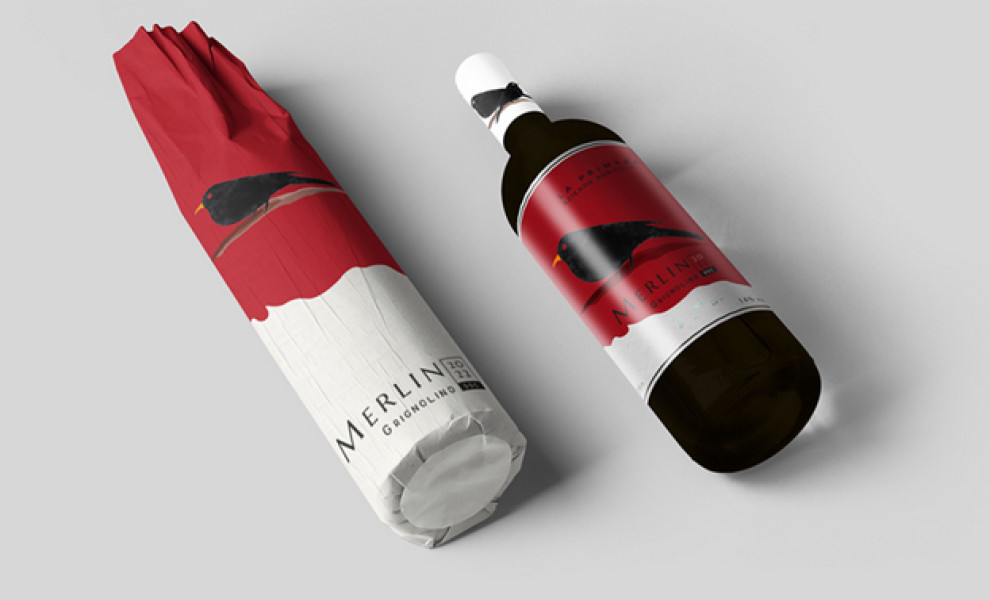
Merlin's label design features a striking illustration of a Merlin falcon, reinforcing the brand name and evoking the bird's qualities of swiftness and fierceness.
A symbol of power and freedom, the falcon adds allure to the packaging design. The bird's colors adapt to complement each wine variant. Many top packaging designs have the best labels, and this is a prime example.
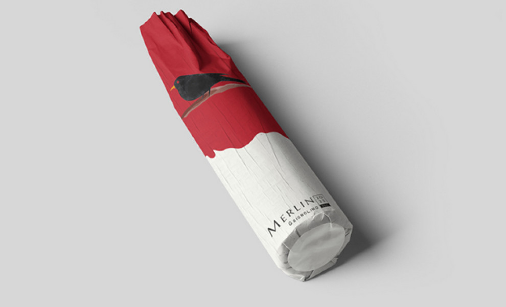
Additionally, the packaging design uses a deep red and white for the red wine and muted gold and white for the white wine. The black falcon remains a constant feature, blending seamlessly with the background colors.
This artistic touch elevates the packaging, sparking curiosity and inviting consumers to try it out.
Discover unique product packaging design strategies to spruce up your projects.
Merlin’s Packaging Exemplifies Elegance in Typography and Unboxing Experience
Merlin's packaging design is an excellent example of how the simplest details evoke elegance, and the unique conical bottle sealed with a natural cork immediately sets it apart. The clear glass showcases the wine's rich hues, while a minimalist label featuring a falcon illustration adds an artistic touch.
The sans-serif font exudes sophistication, elevating the brand to greater heights. Meanwhile, the unboxing experience enhances the brand's connection to nature through a simple wrapping paper for the outer packaging.
This meticulous attention to detail and commitment to a natural aesthetic create a premium brand journey, making Merlin a well-deserved recipient of the Best Design Award.